In today’s fast-paced world, a relaxing home to retreat to at the end of the day isn’t just desirous—it’s necessary. Some people accomplish this with cool blues and ocean motifs, others wrap themselves in warm browns and neutral shades of taupe, whatever color scheme best lowers the heart rate and steadies breathing. For homeowners Jill and Jan, this was achieved through a connection with nature. “My husband wanted a lot of windows, and I wanted a lot of natural light,” says Jill. “Northeast Ohio can be pretty gray to begin with in the winter and limited in terms of how much time you can spend outside, but if you get a lot of natural light into your house you feel like you’re spending more time outside.”
Modern delight
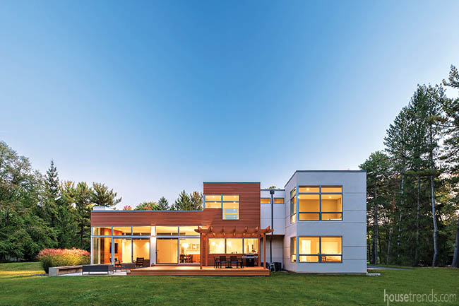
From the outside in, the home is characterized by strong, clean lines that firmly establish it as a modern build, a trait that the homeowners deeply desired, and one of the main reasons that led them to select the team from Dimit Architects as their architects. “We actually are friends from Lakewood. We lived near each other and knew each other from that,” says Jill. “It just so happens that they’re amazing when it comes to modern architecture, and it’s exactly what we wanted to do. It was sort of meant to be, that we would do this project together.”
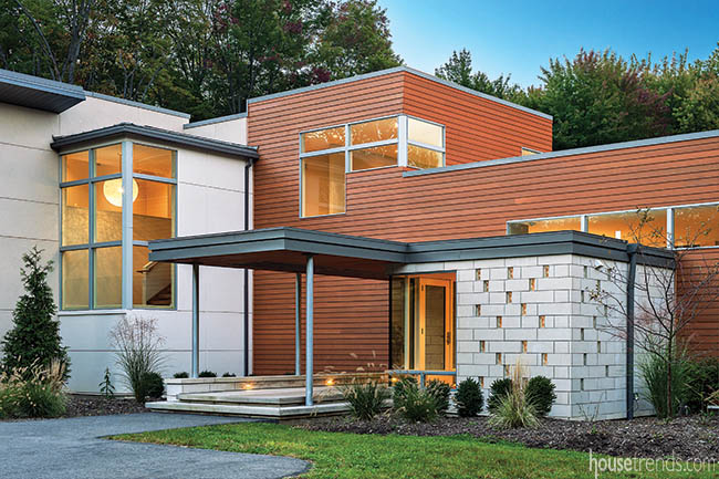
Boasting a mix of materials, including warm strips of stained wood, pale stucco and cool stone, the home is set against a backdrop of woods that encircles the rear of the property, a gorgeous section of nature that the owners can enjoy on a daily basis.
The front of this unique home is dotted with windows here and there, some horizontal, some vertical—all placed very specifically. “The clients have young children and wanted plenty of light and a view,” says Analia Dimit. “The front of the house is more private and closed, while the back is largely open to the very private back yard spaces.”
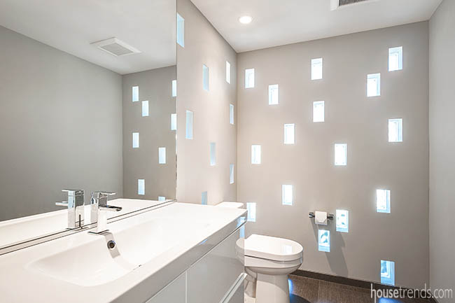
Perhaps the most striking feature of the front of the home, the one that guests automatically accept with their first perusal of the property, but constantly glance back at is the exterior of the first floor powder room. A rectangular box jutting out of the main level of the three-level home, the smooth stone cladding is dotted with holes that, upon closer examination, turn out to be a series of windows, an architectural wonder crafted by Scott Dimit. These windows follow no set design. They’re not placed once every three stones or in a way that creates a pattern if you tilt your head and squint your eyes. Feel free to stare and try to puzzle it out, but Scott insists that they’re set just so to create a stunning effect on the interior of the powder room.
Fine dining
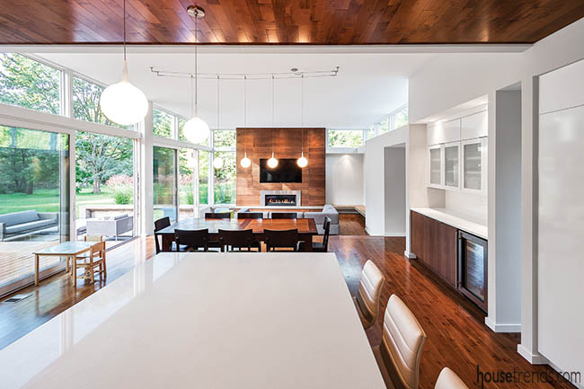
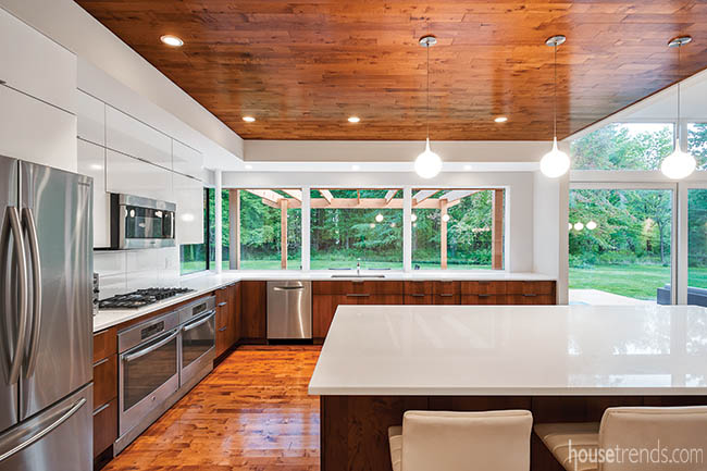
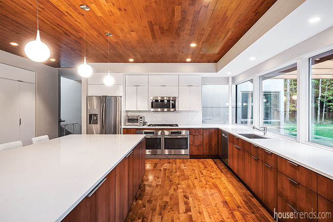
With its spacious open floor plan, the interior is perfect for this young family. “It works really well for our family that someone can be in the kitchen and the living room, and we can open up the patio and we’re all still together,” says Jill. The kitchen is a show-stopper, with a large island dominating the space. Chairs tuck neatly underneath the pristine white countertop, ready to be pulled out for an afternoon homework session, or for Jan or Jill to perch on as one cooks dinner. “I do most of the cooking, but he’s a better cook,” laughs Jill.
A unique ceiling treatment made of maple mirrors the floor underneath. Cutting off at the very edge of the cooking area, this helps to add definition between the kitchen and dining area. “While working with the clients we really fell in love with the material and thought that it would bring a beautiful, warm look to the kitchen,” says Analia.
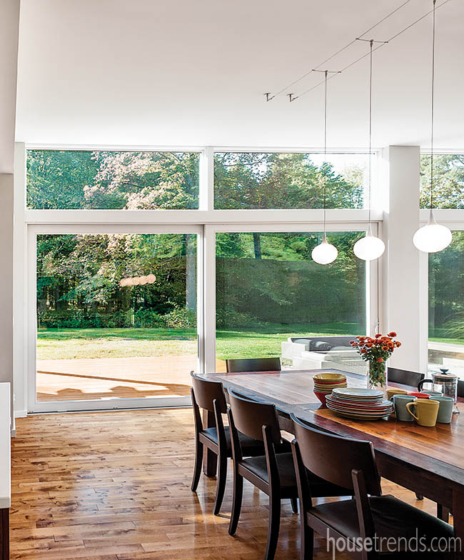
The long dining table has been with the homeowners since they were married, it’s top slightly marred and scarred with memories of arts and crafts projects and family dinners. A grouping of round dome lights dangles over the table, the very same lights that can be found hanging over the kitchen island, something the homeowners did purposefully to keep a connection alive between the two spaces, despite the open design.
Making memories
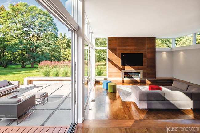
The home flows naturally from the kitchen and dining portions to the living room, where guests can seat themselves on the sofa or one of the many colorful ottomans. “They’re fun pops of color. The wall colors are sort of a cool gray palette, so we wanted to add some color, and decided on those,” says Jill, who maintains that they wanted most of the focus to be on the view. “To start adding furniture in a lot of color, it was going to start overwhelming the house in a way we didn’t want.”
A low concrete wall skims the perimeter of the living room before being carefully continued to the back patio, an architectural feat that took some time and consideration. The homeowners say that they often use this as an extra seating option when they entertain, particularly for their big Fourth of July party when they throw open both of the patio doors and create one large open-air entertaining space. This low wall may be a favorite feature of the architects, but Jill says it’s hard for her to pick a favorite part. “It’s just adding the memories on,” she says of the new home. “Holidays, and times with our kids. Meal times when everyone catches up with each other.”
Resources: Designer: Analia Dimit; Architect Dimit Architects; Builder: Payne and Payne Builders; Flooring: Marshall Carpet One; Kitchen cabinetry: Maple, Pleasant Valley Woodworking; Kitchen countertops: Eternia white, Granex; Kitchen sinks: Blanco, Edelman; Kitchen faucets: Moen, Edelman; Dishwasher and cooktop: Bosch; Refrigerator: Samsung; Oven GE; Lighting: Cleveland Lighting, Cleveland House of Lights; Furniture: West Elm, Blu Dot, Crate and Barrel

