Location, location, location—everyone knows it drives real estate values. This location is quiet, wooded, and commands a 52-acre lake view.
“It’s the view that sold us,” say the homeowners who were already living in the same neighborhood when this house became available. They moved quickly to buy it.
Before moving, they spent a year of transformation since the 14-year-old structure needed updating. The homeowners were looking to change the style too, from conservative to “organic contemporary”—blending natural materials like granite and wood and accentuating the view.
“Our inspiration was to bring the colors, movement and textures of the lake, landscape and sky inward,” says the wife.
“We gutted the entire house inside and out,” she says. A high priority was installing floor-to-ceiling windows with transoms to maximize the view of the lake. The water and seasonal changes are themselves a design element. The couple used the palette of nature to achieve their organic contemporary style.
For the renovation they tapped the talents of interior designer Laura Einstein of Ultimate Interiors and Dave Norton of Ellis Kitchen and Bath Studio.
“I love to cook creatively,” says the homeowner. She collects recipes and takes the hobby seriously–and this kitchen shows just that.
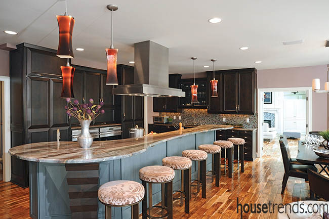
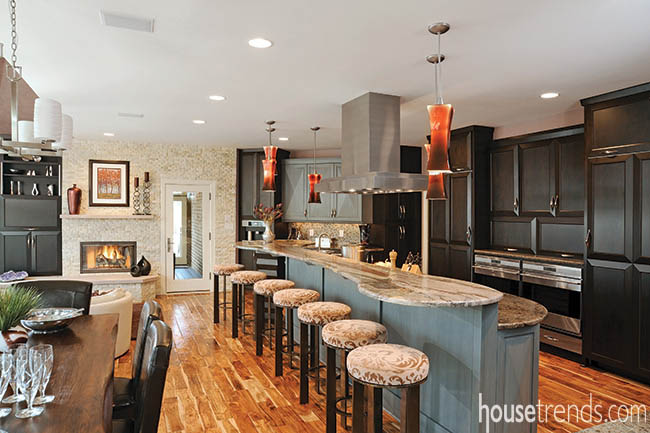
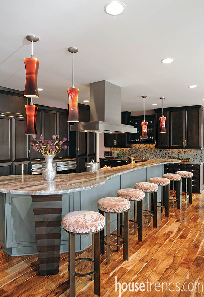
The kitchen is part of an open space that includes dining and informal seating areas. Wide Asian walnut planks connect the rooms. “The vibrant, but soothing, color palette provides an organic richness and depth,” notes the homeowner.
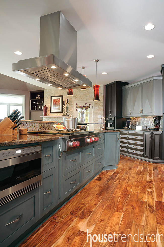
Because of the time the family spends in the kitchen, Dave Norton oriented the layout around the lake. For example, the Wolf cooktop faces the cook toward the water. For ventilation, they selected a Modern-Aire hood for its high power and clean rectilinear lines.
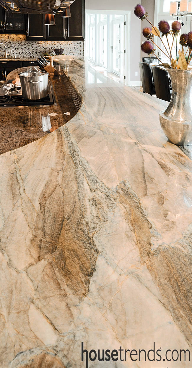
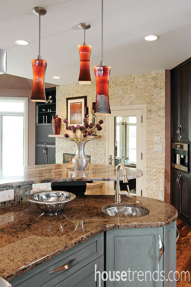
The island is large and seats seven. Norton says the goal was to create a buffer between the working part of the kitchen and guests so he designed two tiers: a higher countertop to rest elbows and hors d’oeuvres and a lower level for the cook.
The back wall of the kitchen is anchored by a Miele freezer on one end and a Miele refrigerator on the other end. The wall also has double ovens which are raised so the cook doesn’t have to stoop to open the doors.
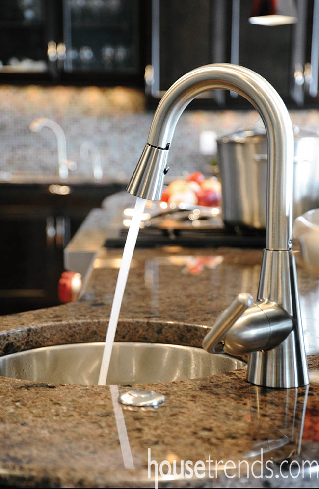
“We also designed separate work zones, each anchored by a sink, to allow two people to work in the kitchen simultaneously,” says Norton.
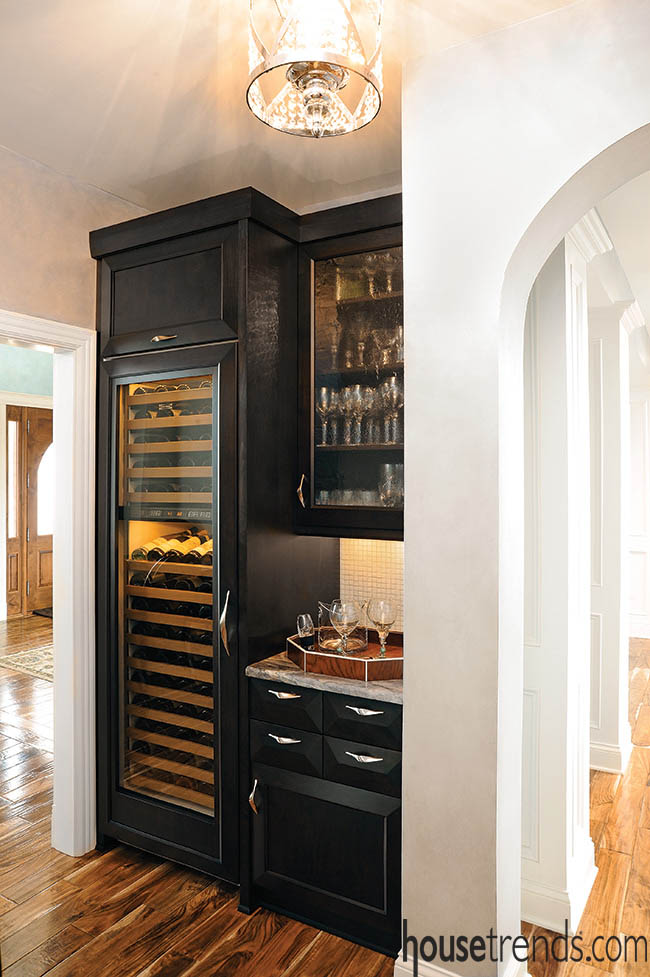
A butler’s pantry has a Sub-Zero wine storage unit and glass front cabinets.
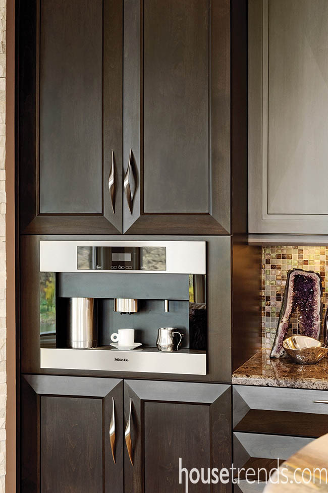
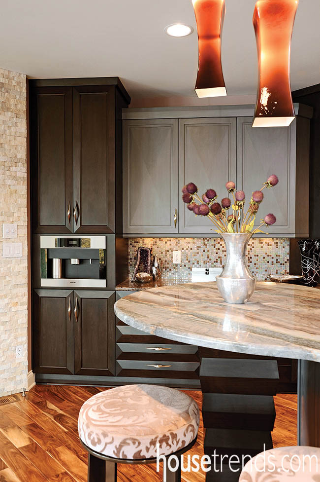
Nearby are a built-in coffee station, additional cabinets, and a warming drawer.
“The name of the kitchen island granite is ‘Renoir Blue’. It truly evokes impressionism,” says the wife. “It brings to mind water and sky with blues and purples. It almost looks like moving water,” she observes. The countertop also flows—it has a freeform shape and soft edges.
“There is a trend in kitchens for a more contemporary feel,” notes Norton. “We see that manifested here in the cabinets, the counter shape, and the hardware,” he adds.
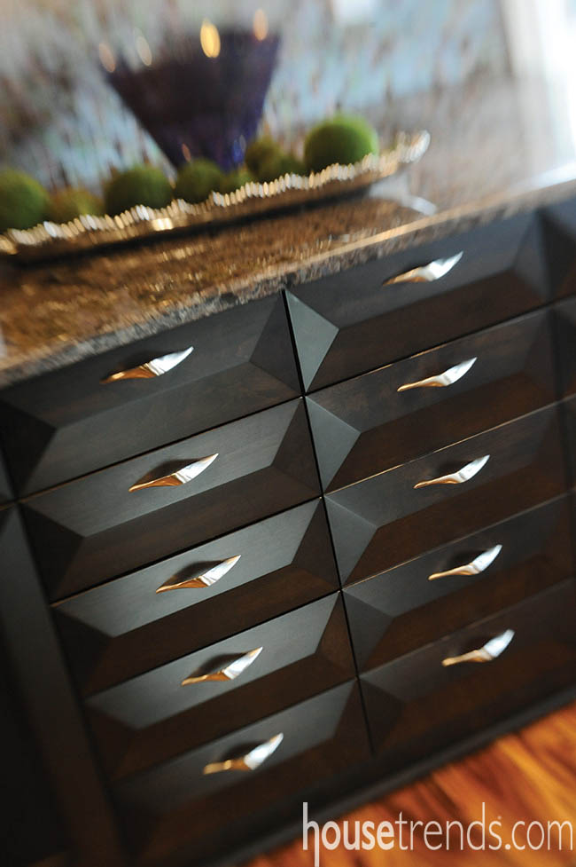
The cabinets are by Bentwood, which Norton describes as a high-quality custom manufacturer with the flexibility to accommodate specific design requests. One large drawer and cabinet are designed to look like two stacks of small drawers by using dummy drawer heads. It adds visual interest and breaks up expanses of large cabinet fronts.
Also adding visual interest are the supports for the island countertop. The inverted pyramids are covered in a series of stacked wood trim with the same espresso finish as some of the cabinets. The molding is geometric creating shadows and the appearance of different colors.
“The hardware has movement too, almost a wave to it,” says the homeowner. The stainless steel pulls by Richelieu all are the same style but in three different sizes.
Designer Laura Einstein selected eggplant amethyst colored pendant lighting for over the island. The shape, size and placement of the lights fit the grand scale of the kitchen and reflect the homeowner’s color and style preferences.

