At Housetrends we are fortunate to see a multitude of beautiful homes in a variety of locations – and that never gets old. However, every once in a while some particular spaces in these homes take amazing to a new level. These rooms can evoke a “wow” from even our most seasoned staff members. What follows are some of our favorite “wow rooms” from Housetrends markets.
BRIGHT idea: One for the books
Photos by Brent Madison
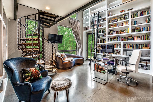
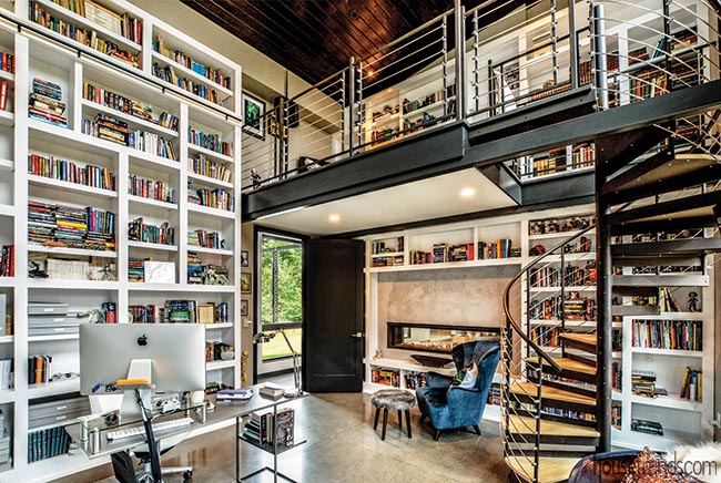
Perhaps the crown jewel of this home in the Pittsburgh area is the extraordinary library, a peaceful sanctuary that pulls double duty as the homeowner’s private office. Like the rest of the home, the library has comfortable and modern elements. The bookshelf concept was initiated by the architect’s interior renderings. A spiral staircase is the only access point to the small loft, where a cozy chair is tucked into the corner, providing another reading nook with spectacular views of the outdoors. Floor-to-ceiling shelves house a myriad of books, which are organized in an elaborate system.
To see more photos of this home, go to housetrends.com and search: A natural fit
RESOURCES Architect and interior design Gaskill Architecture; Builder DJ Beam Construction; Recessed lighting Nora, Repco; Painting Colorworks; Polished concrete flooring Wexford Contracting, LLC; Windows Marvin, Allegheny Millwork; Fireplace Heat & Glo Mezzo, Fireplace and Patio Shop
BRIGHT idea: Use windows to connect with nature
Photo by Christian Phillips
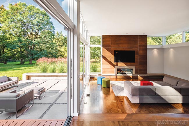
Indoors or out, guests are sure to enjoy the gorgeous view of the surrounding landscape of this home in Northeast Ohio. Characterized by simple, clean lines the owners chose to spotlight their surroundings with floor-to-ceiling windows and retracting doors that offer easy access to a patio. Bright colored ottomans rival the natural colors of the outdoors, while a sofa beckons friends and family to relax. Aside from the playful ottomans, the owners opted to keep their furniture selections simple and neutral colored, feeling that anything else would overwhelm the contemporary home.
To see more of this contemporary home, go to housetrends.com and search: Windows to the soul
RESOURCES Designer and architect Dimit Architects; Builder Payne and Payne Builders; Flooring Marshall Carpet One; Lighting Cleveland Lighting; House of Lights; Furniture West Elm; Blu Dot; Crate and Barrel
BRIGHT idea: Make an artistic statement
Photo by Lucas Harris
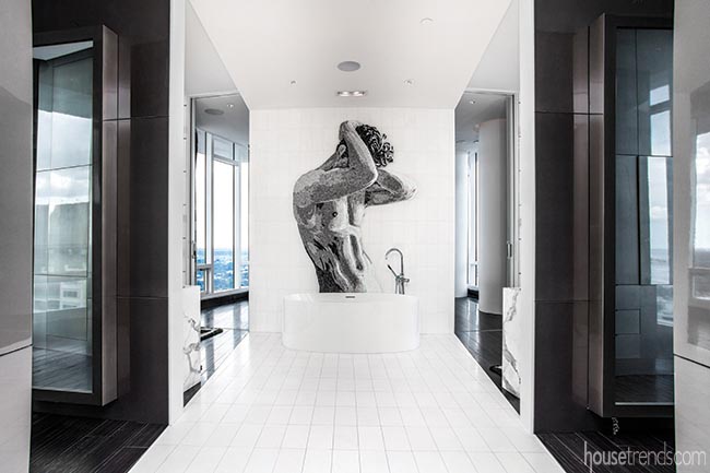
The human form has always been a popular subject in visual art. It evokes a variety of emotions and encourages creative expression. The massive art piece positioned above the bathtub in this St. Petersburg, Florida home elicits a powerful response, making it virtually impossible to shift your focus. The stunning piece is made of cut glass mosaic tile from Sicis in Italy. The mosaic is held to the wall with five bolts, allowing it to be removed if the homeowner chooses to move or redesign the space.
To see the rest of this penthouse, go to housetrends.com and search: Changes in latitude
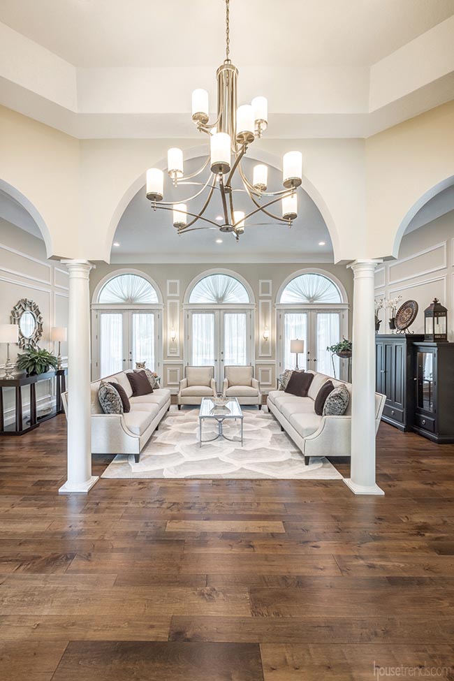
BRIGHT idea: Preserve things of beauty
Photo by Dawn M. Smith
After gutting their 1990 Dayton, Ohio home down to the studs, the owners set out to bring it back to its former glory. Despite years of neglect, the original solid mahogany front doors were completely restored. Inspired by the arched front entry, the homeowners incorporated a series of arches and pillars throughout the house, including in the entrance to the elegant great room. Decorated in soft cream and rich chocolate brown hues—and featuring a beautiful area rug with plenty of visual movement—the great room is the perfect focal point to greet guests as they enter the home.
To see the rest of this house, go to housetrends.com and search: Marvel of a transformation
RESOURCES Contractor and interior design Kitchens By Design; Hardwood flooring Hallmark Floors; Lighting Southlite Fan City; Furniture Bernhardt; Morris Home Furnishings; Painting Sherwin-Williams, A&E Painting, LLC
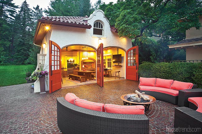
BRIGHT idea: Reimagine and repurpose
Photo by Ross Van Pelt
Wanting to create an outdoor entertaining area, a Cincinnati couple turned their attention to a carriage house that they no longer needed for cars – thanks to a nearby three-car garage. The circa-1911 Spanish Revival structure was ripe for new possibilities. They told architect Chris Kepes they wanted the renovated structure to include a Parrilla grill, which is traditionally used in the wife’s home country of Argentina. When weather invites the crowd outdoors, the motor court transforms into a sitting area. Hardware, cabinetry and woodwork all were selected with a 100-plus-year-old home in mind. Existing doors were stripped, re-glazed and painted to add a warm
punch of color.
To see more renovations like this one, go to housetrends.com and search: Outside looking in
RESOURCES Architect Chris Kepes AIA, Kepes Architecture; Contractor Stegman Construction
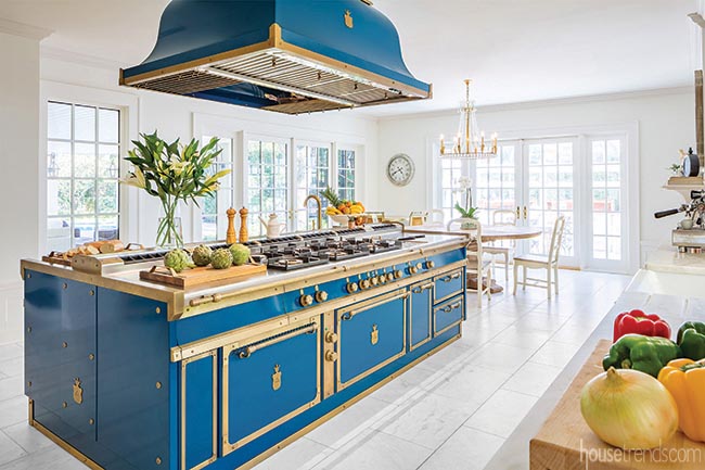
BRIGHT idea: Add a little brass
Photo by Russell Missonis
Brass accents are all the rage right now in kitchen design, and this culinary masterpiece in Clearwater, Florida takes that trend and runs with it. The centerpiece of the kitchen is the massive Officine Gullo island made of solid steel and brass, which was imported from Florence, Italy. The custom island, which has a price tag of roughly $134,000, features a beautiful Ocean Blue finish and houses gas burners, a prep sink, counter space and a pasta maker.
To see more of this kitchen, go to housetrends.com and search:Wave of nostalgia
RESOURCES Contractor Nelson Construction & Renovations, Inc.; Kitchen island Officine Gullo
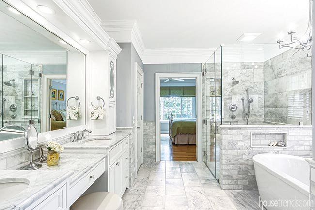
BRIGHT idea: Play with marbles
Photo by Jeff McCutcheon
While planning to brighten a dated master bath, Columbus area homeowners knew they wanted to include white cabinetry and marble in the renovation. They were set on a marble countertop, but didn’t think they could afford to use marble on the rest of the project, which included the floor, entire shower and half of the walls. When it came to their attention the porcelain they selected might actually be comparable to marble, they decided to splurge a little and get what they really wanted. This would be the year the couple decided to do something solely for themselves – create a luxurious, spa-like retreat in their master suite.
To see more of this home, go to housetrends.com and search: Playing with marbles
RESOURCES Designer and contractor Jim Deen, Kitchen Kraft; Cabinetry Holiday Kitchens, Kitchen Kraft; Fixtures Kohler shower, American Standard bathtub and Craftmade lighting, Ferguson; Countertops Honed Carrara marble, Perrotta’s Marble Shop; Sinks and faucets Kohler, Ferguson; Tile Honed Bianco Venatino Marble and zero-entry shower floor, Hamilton Parker Company; Custom frameless shower door Buckeye Custom Glass
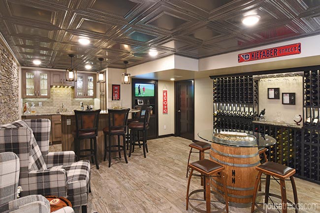
BRIGHT idea: Establish a theme in the lower level
Photo by Daniel Feldkamp
As wine aficionados, the owners of this Dayton, Ohio home set out to incorporate a taste of Napa Valley into the design of their finished lower level. What originally started out as a functional and visually appealing storage plan for their wine collection ultimately led to an entertaining space that includes a sitting area and a full bar. Rich black wine storage racks, tin ceiling panels and porcelain tile flooring mimicking the look of hardwood all work together to create the elegant, yet cozy, space.
To see more of this lower level, go to housetrends.com and search: Adventures in remodeling
RESOURCES Contractor Remodeling Designs, Inc.; Flooring Daltile Season Wood porcelain tile in Orchard Grey; Ceiling Armstrong Metallaire Hammered Border Tin in Lacquered Steel; Cabinetry Omega Dynasty; Wine racks Wine Racks of America with Sherwin-Williams Black Magic paint; Backsplash Sonoma Tilemakers Euphoria in Tres Chic; Countertops Langdon Cambria; Furniture House Dressing Interior Design, Ltd.; Appliances Custom Distributors
Article appeared in Housetrends Cincinnati – November/December 2018
