Unlike a fine wine, everything does not get better with age. Some kitchens of the late 1980s were ahead of their time, offering large islands with counter seating and an abundance of counter space. But wear and tear and trends that go in and out of style eventually take a toll. Such as the case with Ann Miller’s kitchen in her Centerville home. “We bought the home 13 years ago due to its location and the fact that it is a ranch,” Ann says. “Since then we’ve essentially remodeled the entire house. The old kitchen served a purpose, but ultimately its basic design didn’t make sense.”
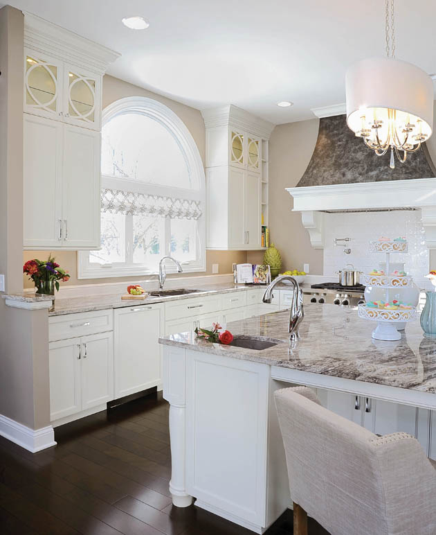
Mike Burger of Under Construction LLC was brought in as general contractor. He suggested adding the beautiful arched window above the sink. Eye-catching trim around the window highlights the impressive crown molding on the cabinetry. The pattern of the sheer window treatments mimics the Walker Zanger tile backsplash behind the range. “Everything was carefully planned out, which shows in these small details,” says Ann.
Thanks to photos and magazine clippings, Ann had a vision of how her new kitchen would come together. She teamed up with Vicki Waker, Bill Mann and Tracy McLaren-Baur, the creative force behind Cabinet Creations, to help bring her ideas to life. “We went back and forth for about two years, designing this kitchen and making sure it contained the classic and timeless look Ann was going after,” Waker says.
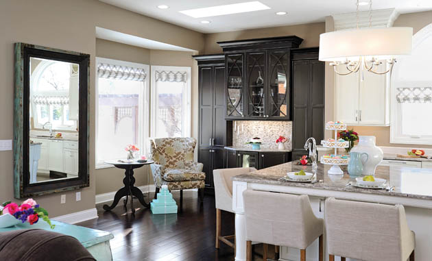
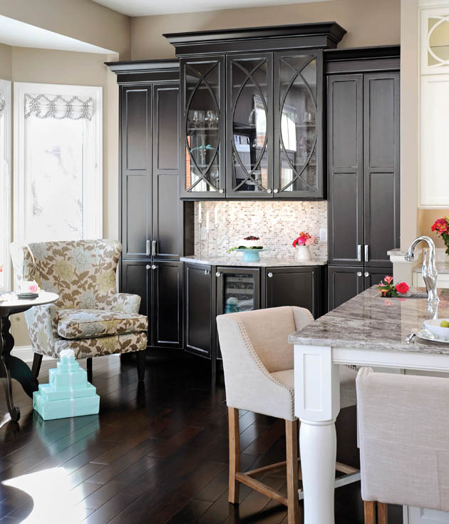
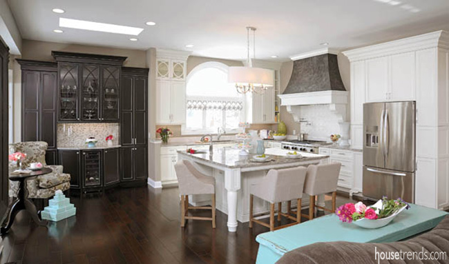
The basic black and white color scheme is the dominating factor in the space. Ann says she loved the clean look of white cabinetry, but was also drawn to the bold presence of black. Waker granted both wishes by incorporating white-painted maple cabinetry into the main kitchen design and added the black buffet as the accent piece. “We stepped back the original wall that separated the old buffet from the kitchen,” Waker adds. “This really opened up the space and allows the buffet to become part of the room.” A small granite countertop, paired with the iridescent glass tile backsplash, crystal knobs and glass-front cabinets, add a touch of formal elegance to the buffet.
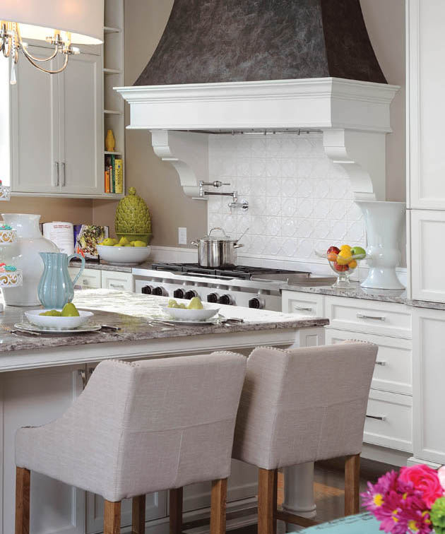
Home to a prep sink, Sharp microwave drawer, double trash bin as well as an eating area, the 6×6-foot island is the hub of the kitchen. A white drum chandelier hangs above the island, adding a bit of glamour, while the Silver Persa granite countertops pull the black and white theme together. Since the renovation led to the open floor plan that has gained popularity in new construction, Ann chose to replace the original flooring with new 4 ¾-inch thick Sumatra hardwood. “Ann’s kitchen is a good example of what you can do in an older home,” Waker says. “Nearly every outdated space can be brought back to life.”
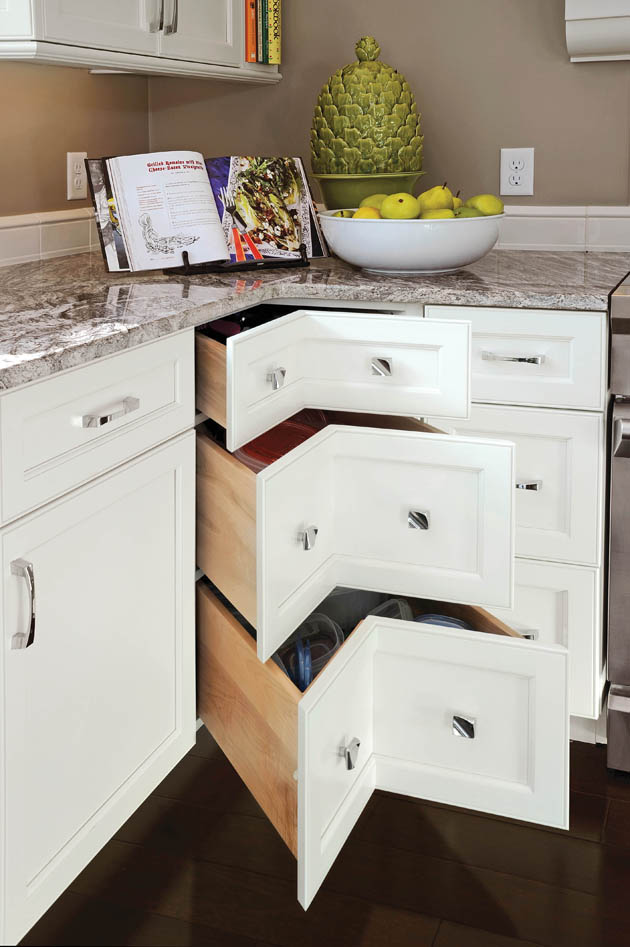
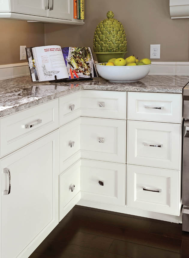
One of Ann’s most important requirements was a clutter-free space. “The island in the old kitchen was incorrectly proportioned,” she says. “Some of the counter space wasn’t utilized properly, and it just ended up collecting junk.” The Cabinet Creations team took Ann’s request for unique storage options and ran with it. Instead of a Lazy Susan—something Ann felt she couldn’t benefit from—Waker installed a trio of corner drawers.
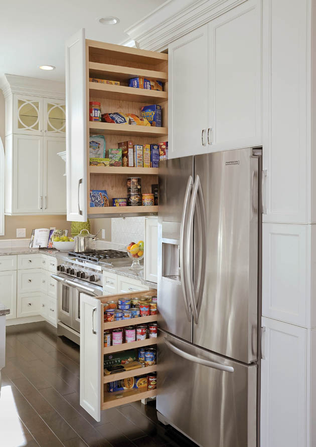
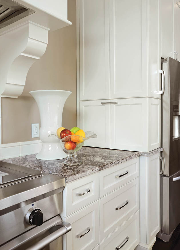
Pullout cabinets along the refrigerator hold a myriad of cooking items, while a small appliance garage hides the toaster. By carrying the wall cabinetry up to the ten-foot ceilings, Waker was also able to add a pair of cabinets with tray dividers and adjustable shelves above the refrigerator.
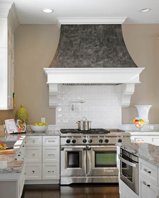
A large KitchenAid gas range and oven replaced Ann’s old electric slide-in range. “My husband was fairly hands-off with the entire process,” she says. “But he loves cooking bacon on the weekends, so the cooking capability of the range and hood was very important to him.”
The range area serves as the focal point in the kitchen. Waker hired Amy Korab to add a black and white faux paint finish to the hood. Korab, who contributed to the renovation of the Frank Lloyd Wright home in Springfield and is known for her corporate work, has collaborated with Waker on several faux painting projects. “When I want something special I call her,” she says.
The chrome and white color scheme keep the kitchen modern and seemingly clutter free. A decorative bowl of fruit, however, adds a splash of just the right colors to keep the area interesting, yet still sophisticated.
The corner of the kitchen often hides valuable space and makes it unusable, but these angular drawers, designed by the Cabinet Creations team, offer storage space of varying sizes.
Although there are many different options of hoods available, they can be grouped into a few main categories: under cabinet hoods, chimney hoods, island hoods, wall-mount hoods and downdraft hoods. The type of hood that you incorporate in your kitchen depends on a multitude of factors: what kind of sight line you’d like, what area you do most of your cooking in and how much space you have, to name a few.
By: Christina Kleiner/Photos by Daniel Feldkamp
Article originally appeared in Housetrends Dayton March/April 2014

