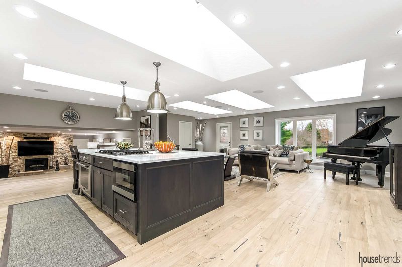
Today’s open floor plan may seem ubiquitous, but this wasn’t always the case. One of the defining moments in home design history was when forward-thinking architects decided that the traditional foyer/living room/dining room/kitchen combo, separated by walls, would be improved by a more seamless flow. As the saying goes, the walls came tumbling down and the open floor plan was born.
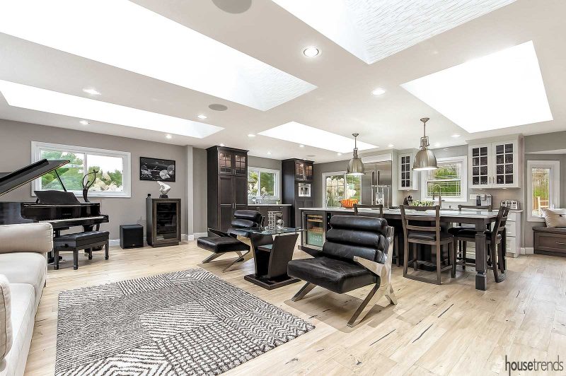
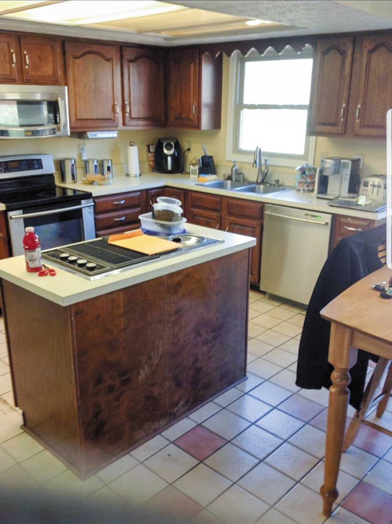
The value of this change cannot be overstated, and homeowners Dr. Jamar Williams and his fiancée Tonya would certainly agree. Their traditional split-level home, built circa 1992 in Westerville, cried out for more open space and light. The couple loved the home as a whole, but not the divided layout, with dark corners throughout and walls blocking the property’s enviable views.
“Lighting was very important,” says Jamar. “I was to the point where I thought, if I can’t get more light in the house, I may have to sell it.”
Tonya had the vision to remove existing walls to create the desired open floor plan that would be centered around an updated kitchen.
The couple partnered with designer Keith Rupp of Kitchen Kraft to create the new kitchen, and L&L Contractors and Home Remodeling to handle the construction end of things—including removing walls and executing creative lighting solutions.
Island living
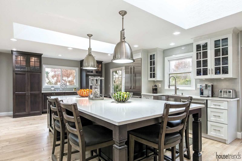
The end result is a modern, updated floor plan encompassing shared kitchen, living and dining spaces, perfect for socializing and preparing gourmet meals. Fittingly, the kitchen became the centerpiece of the downstairs and the large five-by-ten-foot quartz island became the focal point of the kitchen.
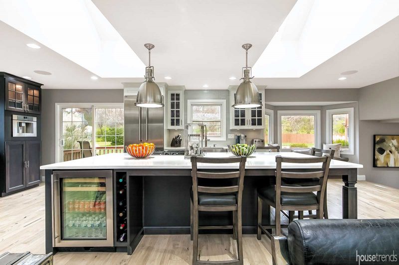
The homeowners cite the island as their favorite feature. They opted not to incorporate a dining room table (though there is ample space for one) because the island serves this purpose, with chairs on three sides, allowing for the easy flow of conversation.
“I like the design where people can face each other as they’re seated at an island, versus the diner feel,” says Rupp. “It creates a more social element to seating.”
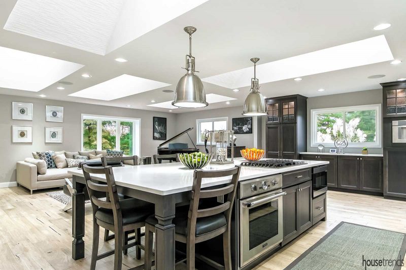
The island incorporates several high-end appliances, including a cooktop range with downdraft functionality, ideal in an open-concept kitchen, as no additional ventilation is required; a luxury under-the-counter stove by Thermador; an under-the-counter microwave; and a beverage cooler and wine rack. The beverage cooler has an interior LED light that provides a soothing, ambient look at night. As for the wine rack, “Usually you would see dividers, but the bottle ‘holders’ are recessed in the back of the cabinet, so they look like they’re floating. You also don’t have to worry about dusting,” explains Rupp.
A warm, fresh face
Another modern element? The color palette. Previously a generic beige, the kitchen now boasts fresh gray and white hues. The designer used the warm shades of the earthy, driftwood-toned flooring to complement the island, and from there, washed the cabinetry and window seat in a lighter stain finish. Finally, the warm shades within the beautiful stone fireplace are pulled in as well.
“They loved that room, so I drew a lot of inspiration from the tones that were already in there,” explains Rupp. “And my personal style is to use a lot of different tones that work together. I like the high contrast because it creates drama.”
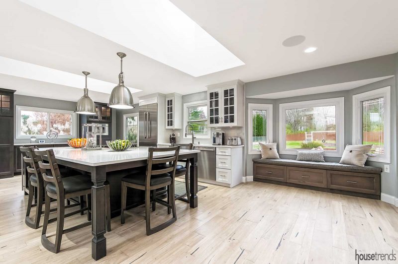
“It all takes on the light very well,” adds Jamar. Indeed, the color scheme is amplified by the unique lighting, both natural and man-made. As part of the renovation, a window wall topped by skylights was added. Jamar suggested the series of skylights, which he says opens up the ceiling. These, in conjunction with under-cabinet, interior cabinet and recessed can lighting, fill the space with light and warmth. Over the island, nautical-inspired pendant lights complete the look.
“There’s so much light from sunup to sundown,” Jamar says. “When you walk in and see it, it’s unbelievable.”
Personal touches
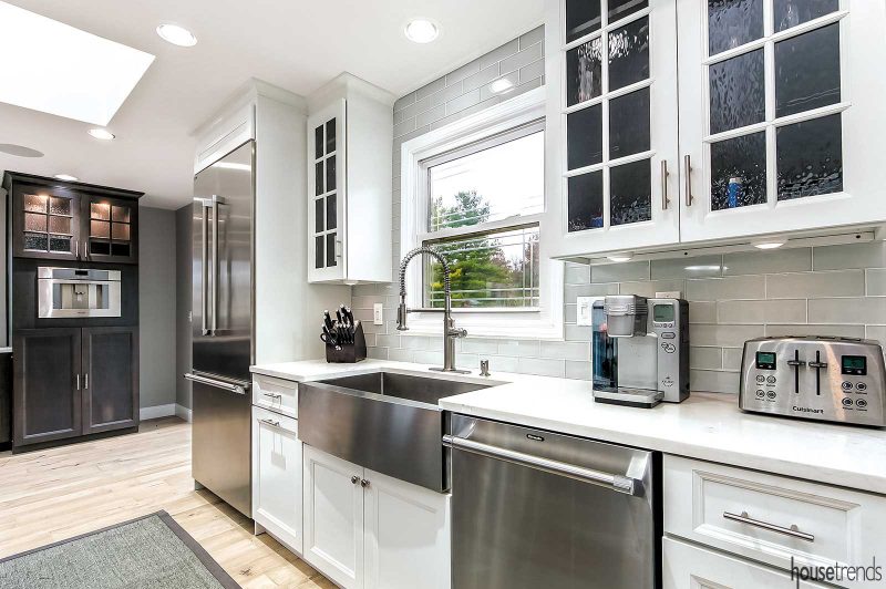
The homeowners injected personality into the room with several other distinctive elements, including the urban, stainless steel, farmhouse sink—a nice spin on the traditional farmhouse sink—and a window seat beneath the bay window overlooking the deck and out into the yard.
“Tonya and I made the cushion that rests on the window seat top as part of a weekend project,” he says. “It’s a good place for conversation and there’s storage under the seating.”
Finally, the black of the grand piano, juxtaposed against the gray wall, lends the room a modern look. But it’s not just for show—Jamar, a jazz piano player who grew up surrounded by music, still plays it every day under the light that streams into the space.
Jamar has some advice for anyone thinking about renovating their own home or kitchen: Obtain a professional layout of what you want ahead of time and decide upon your top priorities as you approach the project. For him, open space and abundant lighting are the hallmarks of the renovated home, resonating with all who enter.
RESOURCES Designer Keith Rupp, Kitchen Kraft; Contractor L&L Contractors and Home Remodeling; Cabinetry Holiday Kitchens, Kitchen Kraft; Countertops LG Minuet; Countertop fabricator Lang Stone; Backsplash Element Glass 3×12 in Mist; Sink Stainless Steel Farmhouse Single Bowl; Lighting Restoration Hardware
Article appeared in Housetrends Columbus – March/April 2019

