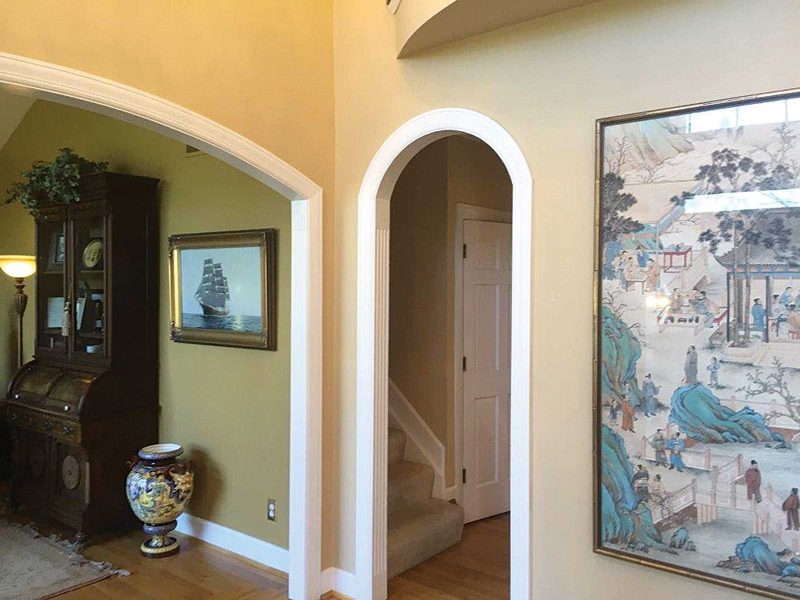
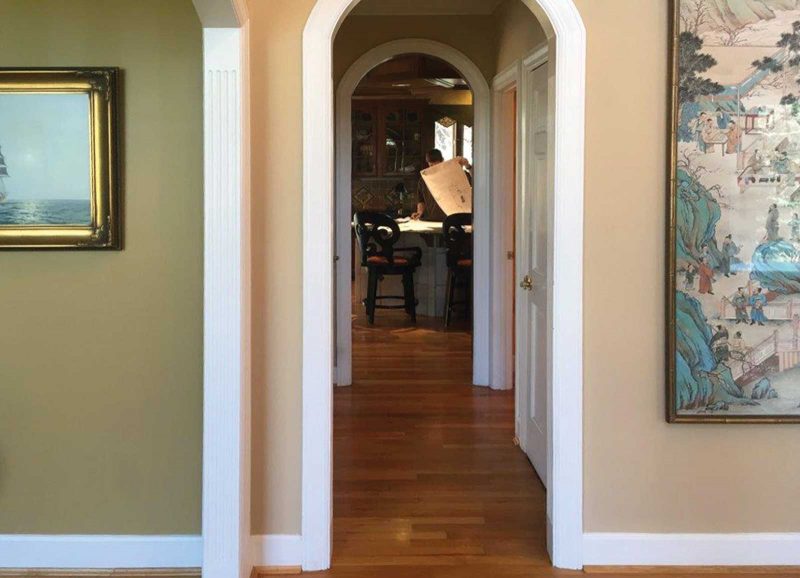
The foyer often establishes the spirit of a home, and in this Montgomery residence, the foyer makes a very good first impression indeed. It wasn’t always so. Before the recent renovation, compartmentalized rooms off the center hall characterized the home’s 1980s floor plan. A narrow passageway led out of the foyer, past an enclosed staircase and offered a shadowy glimpse of the dark cherry kitchen beyond.
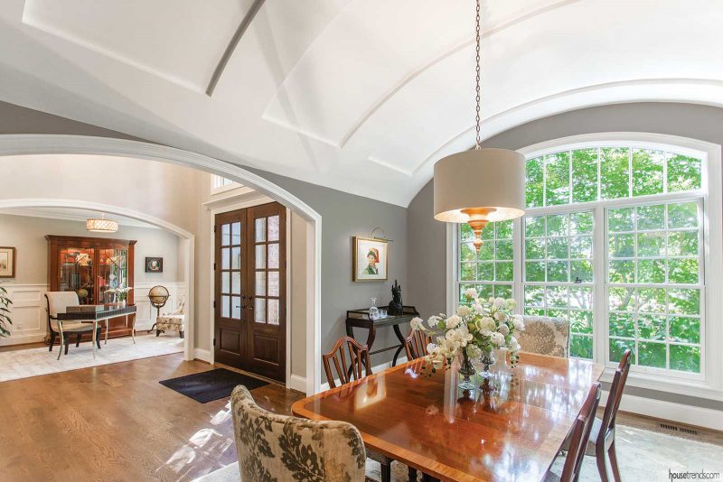
Fast forward a number of months, and today, oversized front doors in rich paneled wood open to a dramatic foyer filled with a light and airy ambience. Arched entryways lead to rooms off the center hall and are mimicked by the curving sweep of the dining room’s ceiling and large picture window. Sunlight fills this space and illuminates the wall of windows visible beyond in the kitchen, where clean, white cabinetry provides a serene backdrop.
“My husband and I realized that our house was outdated and the formal, dark rooms no longer worked for us,” explains Molly, the homeowner. “We considered building a new home somewhere else, but we loved our location, our neighbors and our yard. We decided to remake the house to reflect the way we wanted to live now—with lots of light, an open flow and an incredible connection to the back yard.”
Letting their light shine
Of the overall renovation, Molly says that she and her husband “melded some of our best pieces and existing artwork with new pieces to create a much more updated, lighter-feeling world.” To reach this lighter-feeling world, the family engaged the services of contractor Bill Haussler of Legacy Builders Group.
Haussler explains the scope of the makeover: “It was essentially a whole house renovation with an added extension off one side of the house. We touched on every room, completely changed the two stairwells and revamped all of it to make it more open.”
The renovation was very much a team effort, which included Judy Reid of Rosebank Design, who handled space planning and interior design; Matt Evans of Arcanum Architecture, who drew up the plans; and Cal Weigold Jr. of The Discerning Eye, who fine-tuned every last detail.
The team also reworked the living room and dining room. The former living room became the new dining room and an office that Molly says she’s in “all the time” took the place of the former dining room. In the new dining space, the existing cathedral ceiling was replaced with an elegant white barrel-vault one. A statement light fixture lends additional punch to this space. Molly tried and rejected several other fixtures before running across this one in an eclectic little design shop, where she met Weigold. “The light literally illuminated my way to Cal, who helped with so many details on the house.”
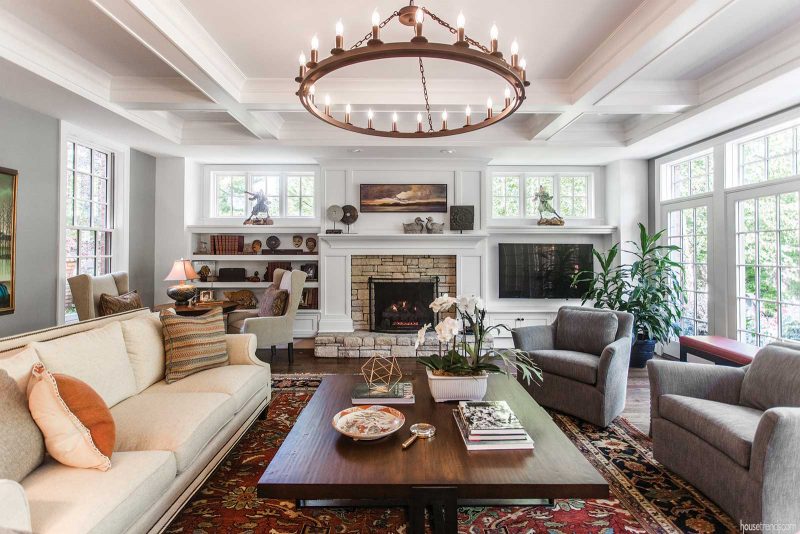
The family room houses various art pieces from Molly’s father’s travels around the globe, including the unique Samurai men comprised completely of leather and masks from Africa. The architectural elements in this room, much like the dining room, are exquisite. The beamed tray ceiling soars above a television niche, flanked by crisp white built-ins—all part of the home’s extension—as well as a wall of French doors that overlook the back yard.
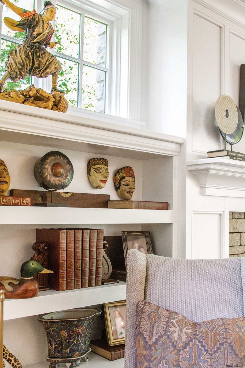
The room’s fireplace mirrors the one in the hearth room. “They loved the stonework on the original fireplace and wanted to duplicate that. We found the right stone and a craftsman to work it up in the same manner to meet their wishes,” explains Haussler.
Now they’re cooking
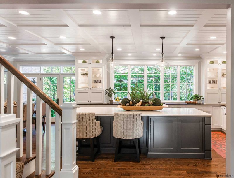
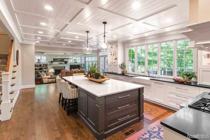
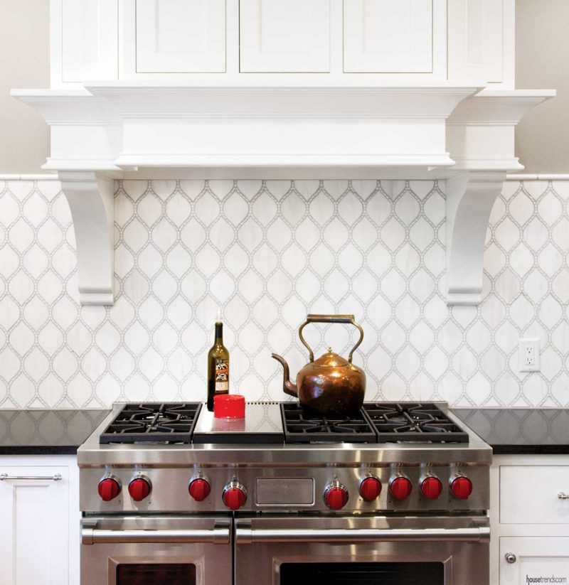
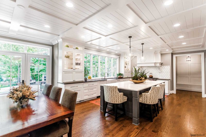
The incredible ceiling in the kitchen was part of Reid’s design for this space, along with opening up the formerly closed-in staircase. Haussler’s team changed the openings on the rear of the house, as well as the back wall, to create a sunlight-filled space that serves as the home’s epicenter. Everything was designed in a way to brighten up the room, to showcase the backyard and create a pleasing entertainment hub.
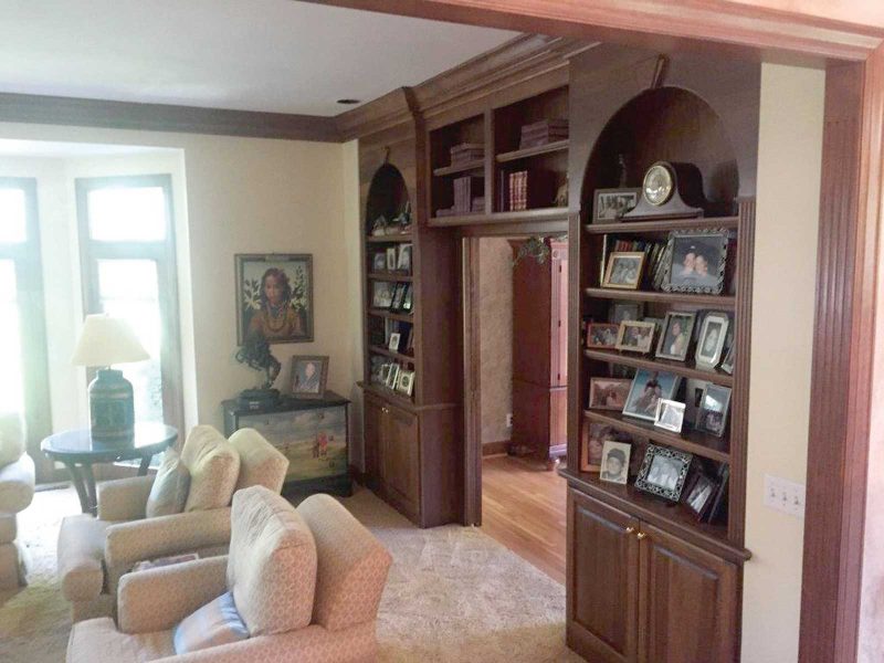
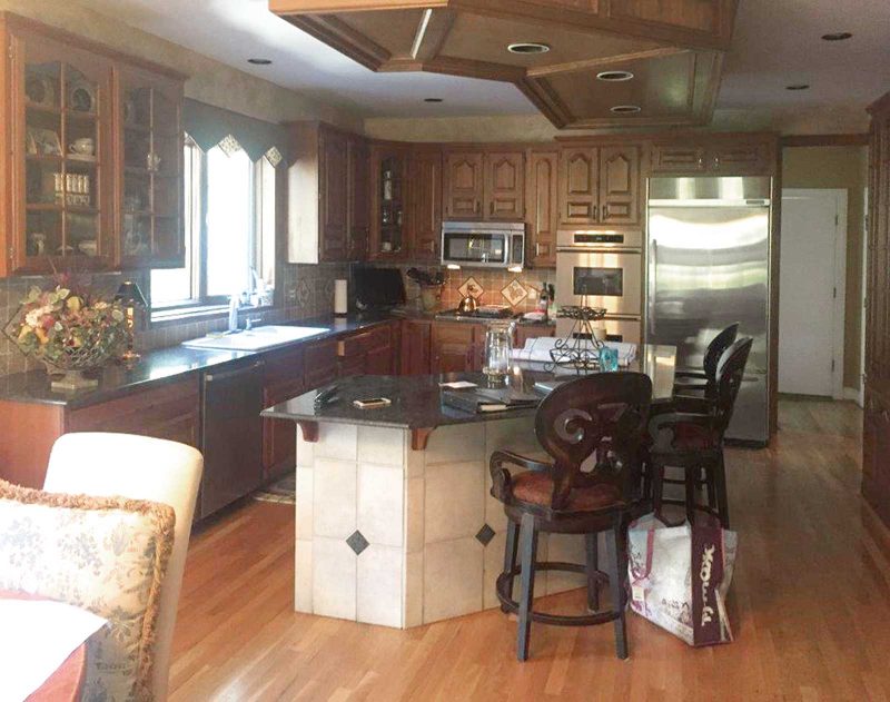
“My dark, 26-year-old, Tuscan kitchen was not what I wanted anymore,” explains homeowner Molly. “The open, white and light approach has taken off and I like it very much, trend or no trend.”
“All of the panels and doors of cabinets are simple and clean-lined, but also give a lot of pop in the design,” says Haussler. “The whole kitchen and breakfast area is set up for amazing entertainment and the island is the showpiece in the center.”
“I’m set up for a pastry school,” says Molly with a laugh. “I couldn’t get over the island when it was installed!”
Her spacious pantry also took some getting used to. The space that was taken away from the old dining room became, as Molly says, “the most wonderful pantry ever.”
“It’s not just a space with Cheerio boxes in it. Two of my favorite things about my house are the closets and the pantry,” she adds.
Finally, there’s the mudroom, which is equally functional and aesthetically pleasing, with built-in floor-to-ceiling cabinetry, cubbies with doors, a seating area and European-style washer and dryer to supplement the second floor laundry. Molly says her family finds it extremely convenient, as they and their guests usually enter the home through the garage door near the mudroom.
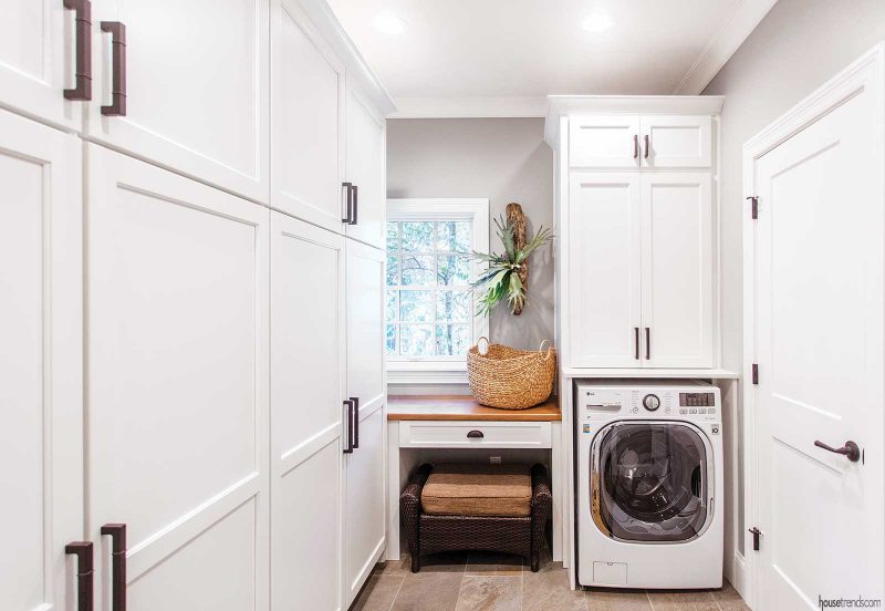
“It’s not that often that people, including us, come in another way,” she explains. “It’s very pleasant and pretty. And when things have a place, it stays that way.
“The point of our story is that we took a 25-year-old home and we made it new again,” concludes Molly. “One of our neighbors said they had never seen a house built ‘from the inside out’ before. But you can build a house from the inside out if you love your lot and your neighborhood and the wonderful community of Montgomery.”
RESOURCES Interior designers Judy Reid of Rosebank Design and Cal Weigold Jr. ASID of The Discerning Eye; Architect Matt Evans of Arcanum Architecture; Contractor Bill Haussler of Legacy Builders Group; Tile Louisville Tile; Hardwood and carpet JP Flooring; Cabinets J&N Distribution and Design; Countertops Sims-Lohman; Lighting Ferguson; Windows and doors Pella; Appliances Sub-Zero, Bosch, Wolf, all from Keidel Supply; Interior trim Carter Lumber; Hardware Norwood Hardware
Article appeared in Housetrends Cincinnati – March/April 2019

