When developers began the second phase of an eco-friendly development, Clifton Pointe Eco-Homes in Lakewood, Tracy Parker knew she wanted one. Their sustainable modern twist on row houses attracted her with generous multi-level footage and a rooftop deck overlooking the Rocky River. Analia Dimit of Dimit Architects, the firm responsible for the project’s architecture, seemed a natural choice to create her ideal living space, given Tracy was already starting with a strong modern vision.
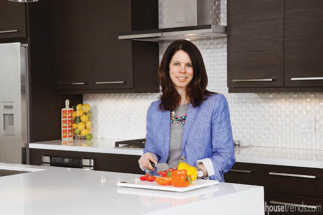
“I was very naïve about the number of decisions I would have to make,” says Tracy. “Analia kept me on track with my vision. She understood what I was looking to accomplish.” Tracy wanted a cohesive modern living space that enhanced the clean-lined architecture of the exterior of the Clifton Pointe project. Of particular importance to her was that the kitchen both welcomed visitors to linger and encouraged them to socialize between the multiple levels. “
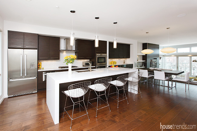
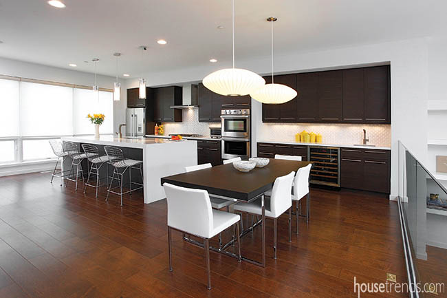
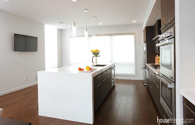
We try to achieve a balance of materials,” explains Analia. “Too much white or too much wood is no good. We keep to the same materials and palette throughout the house. Balancing warm and cold—all this is what gives it this modern design.” Done in the the minimal palette of dark honeyed browns, bright white, and the metallic grey of stainless steel, the kitchen exudes a sense of clean efficiency, while the accents of yellow and nickel add a splash of character and fun. This carries over into the dining area of the space. The dark cabinets continue in line to dominate the built-in buffet ending in the swan of a Moen faucet over the Blanco bar sink inset in the white granite countertop. A wine refrigerator centered on the nook keeps the bottles chilled and easily accessible to diners.
The kitchen space is bright, airy and neatly defined by vertical lines of glass. A bank of windows on the left lets in lots of light, while a glass half wall separates the kitchen/dining space from the living room, where floor to ceiling windows frame dramatic views of the water and marina. “It’s a beautiful view and I didn’t want to take away from that. The view is artwork in and of itself.” Keeping to the consistency of a modern aesthetic, aged maple flooring runs throughout the home in 6.5-inch-wide boards stained a warm gingerbread that highlights the natural grain. The smaller than normal length creates a gridwork that is then picked up elsewhere in the design on the vertical surfaces. This is particularly true in the kitchen, where dark maple cabinets create a strong rectilinear shape with a subtle echo of that same grid effect.
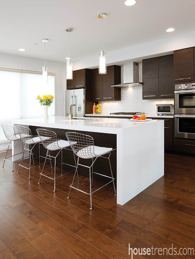
The cabinets set the tone with a horizontal wood grain melamine in Midnight Echo, a newer addition to the Shiloh Eclipse Series at Somrak Kitchens. The textured wood Metro Door style lends itself to a modern design, accented further by long metallic handles set close to the midline of the kitchen’s overall design. “The warmth of the wood keeps the kitchen from being a cold modern,” says Tracy. The cabinets offer generous storage, ensuring the countertops are kept clutter free keeping the lines of the stark white expanse of countertop clean. The Cambria White Cliff quartz forms a solid vertical midline in the kitchen, breaking up the dark cabinets.
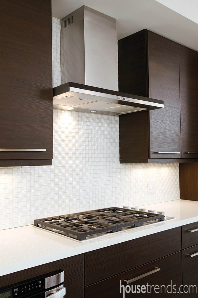
The Dual Bianco backsplash from Porcelanosa features unique tiles that alternate a convex and concave design, creating a subtle quilted pattern that catches the light cast by the LED under cabinet lighting. The cumulative effect is “that high contrast look with dark and extremely light played against each other along with the sparkle and reflective quality of stainless steel appliances and accessories,” says Paula Marianek of Somrak Kitchens, who worked closely with Tracy and Analia on the layout. Focused on functionality as well as form, the kitchen is decked out in top of the line appliances; the stainless steel refrigerator and double ovens create symmetry, while the microwave drawer and two-drawer dishwasher, also stainless, hide in the lower cabinets and island. The striking DCS stainless steel hood adds the splash of industrial feel with the five-burner gas cooktop set below it. “The stainless steel is sleek and simple and didn’t take away from the cabinets,” says Tracy in explaining her choices.
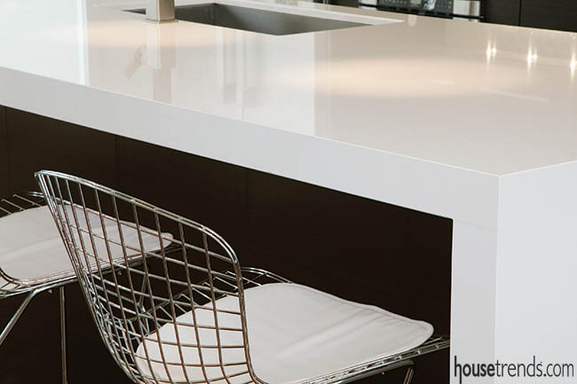
The oversized island is an art form that almost glows against the dark contrast of the cabinetry. The waterfall effect of granite flowing seemingly seamlessly down either end creates another strong rectangular shape that adds another visual layer to the kitchen. A Moen 90° faucet arches elegantly over the stainless steel sink inset into the surface of the island. “I just love this faucet. I put Moens from this line with every sink in the house,” says Tracy.
Seating for four in the steel basket chairs with white leather cushions allows guests to keep the chef company while the game on the flat screen TV entertains them all. “The TV keeps me in the kitchen cooking and doing things. I also use the space as a mini-office.” The large pantry opens onto the kitchen with shelving enough not only for foods, but wrapping paper and Tracy’s home office, including bright yellow file cabinets. The half bath is tucked around the corner done in the same palette and minimalist style.

