Since moving into her Dublin home two and a half years ago, Nancy Sanford has been peeling off the decades—quite literally. Built in the 1980s, the home was “very well-maintained, but very little had been done to it” in terms of updating the finishes or style, Sanford says. Plush white carpet ran from wall-to-wall-to-wall, almond-colored laminate coated the kitchen cabinets and wallpaper ran rampant—even covering some ceilings.
Despite her efforts, Sanford knew it was going to take more than cosmetic editing to shake the ‘80s and make the home her own. Although she lives in the traditional-leaning Muirfield community, Sanford adores a minimalist, contemporary style—and admits to devouring design magazines “ad nauseam.”
To implement her thoroughly modern vision, Sanford turned to Brigid Norton, an interior designer and family friend, and Kristi Youles, a kitchen designer with The JAE Company. Working together, the trio created a carefully considered contemporary design that’s easy on the eyes, and the body.
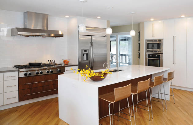
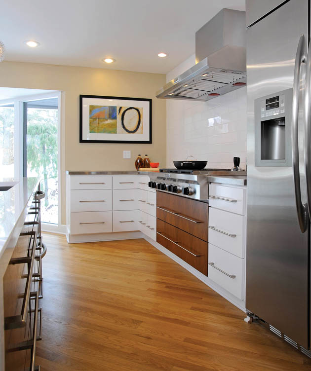
In addition to improving the flow of the kitchen—by removing a V-shaped peninsula that angled out into the room—and adding appliances like a stainless steel refrigerator, Sanford’s short list of must-haves included clean, uncluttered lines and no wall cabinets over the countertops. “I’ve found as I’ve aged, I’ve gotten shorter and just don’t use the upper cabinets,” Sanford explains.
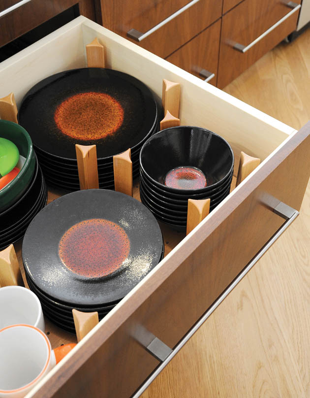
Easy-access, smooth-slide drawers with clean slab fronts were the answer—resulting in strong visual lines, an open, airy feel and enhanced ergonomics. Starting with a “needs assessment,” Youles and Norton designed the space quite literally around Nancy. By looking at factors such as her height and which items she uses most frequently, they were able to determine the optimum placement for everything from canned goods in the pantry to cutlery, pans and plates in the customized drawers, all of which helped to achieve the ultimate kitchen organization.
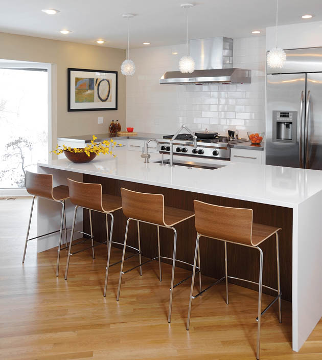
But there’s more to the kitchen cabinets smooth façade than clean-lined storage. Walnut drawer fronts—found on the oven and the base of the island—are book-matched, allowing the grain to continue from drawer to drawer. And even in spaces where drawers weren’t feasible, beneath the sink and in a desk area, the designers continued the look with cabinet doors crafted to resemble drawers.
The visual continuity of these lines might not be as impactful if it weren’t for the careful selection of contrasting finishes. The designers filled the space with pure, glossy white—using a specific type of quartz, White Cliff by Cambria, to accent the bold rectangular design of the island. Then, to break up the expanse of accompanying white painted drawers, walnut was selected to bring the contrasting warmth and grain of wood without red undertones. It is commonly found in modern furniture design, as well as current productions of mid-century designs like the iconic Eames Lounge Chair from Herman Miller, Youles says.


