When it comes to placing modern kitchen design in a traditional home, we can learn a thing or two from our European contemporaries.
“If you go to Italy, you walk into homes that are 400 to 700 years old, but then the kitchen is clean and modern,” says Leah Heinsius, the senior designer with Faralli Kitchen and Bath Design Studio in Willoughby Hills. “It’s a space with its own identity, not necessarily trying to match the rest of the house.”
That was a welcome concept for a homeowner in Gates Mills, who was seeking to modernize his traditional kitchen with high-tech amenities and a sleek, minimalist style. Undeterred by the home’s staunch Colonial architecture—complete with white columns on the façade—a modern space was constructed that is beautiful and simply perfect for the owner. For the rest of us, it offers a Pinterest-worthy look at design trends that are shaping kitchens both here and abroad.
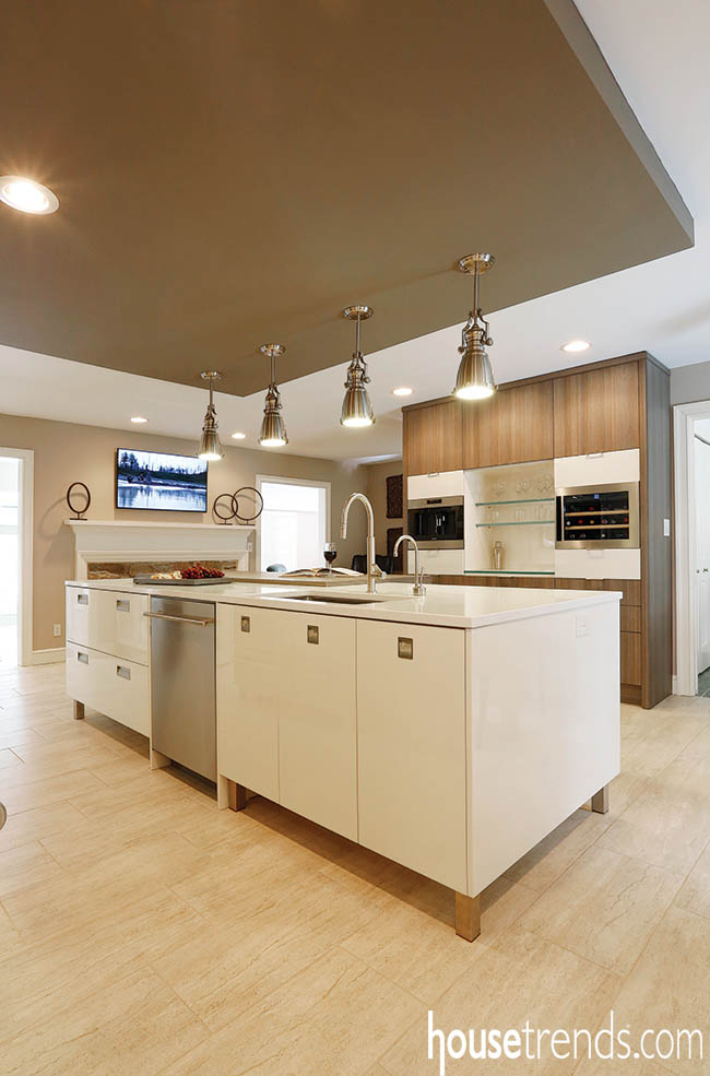
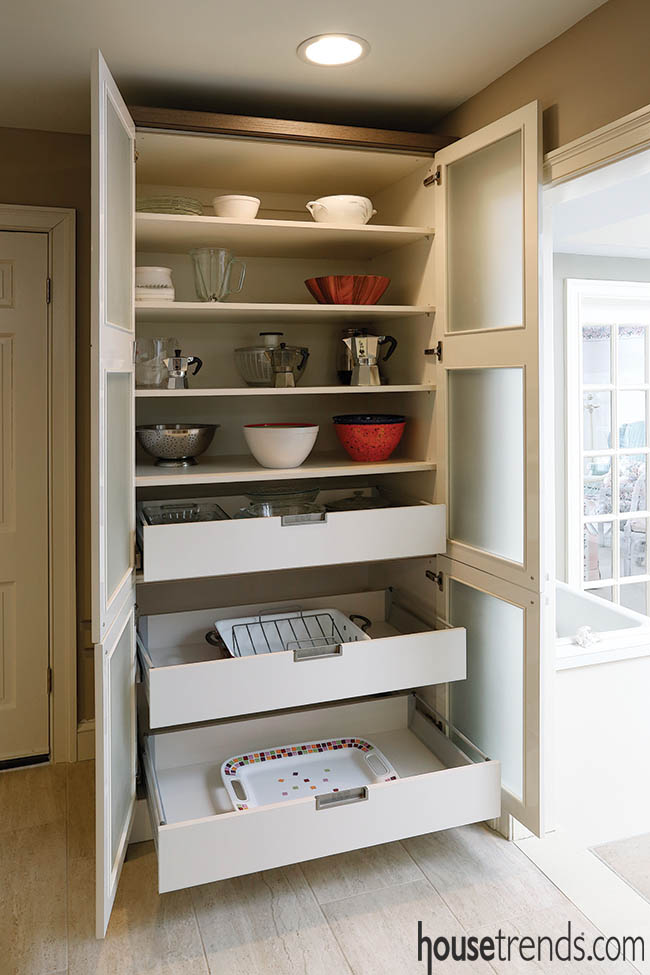
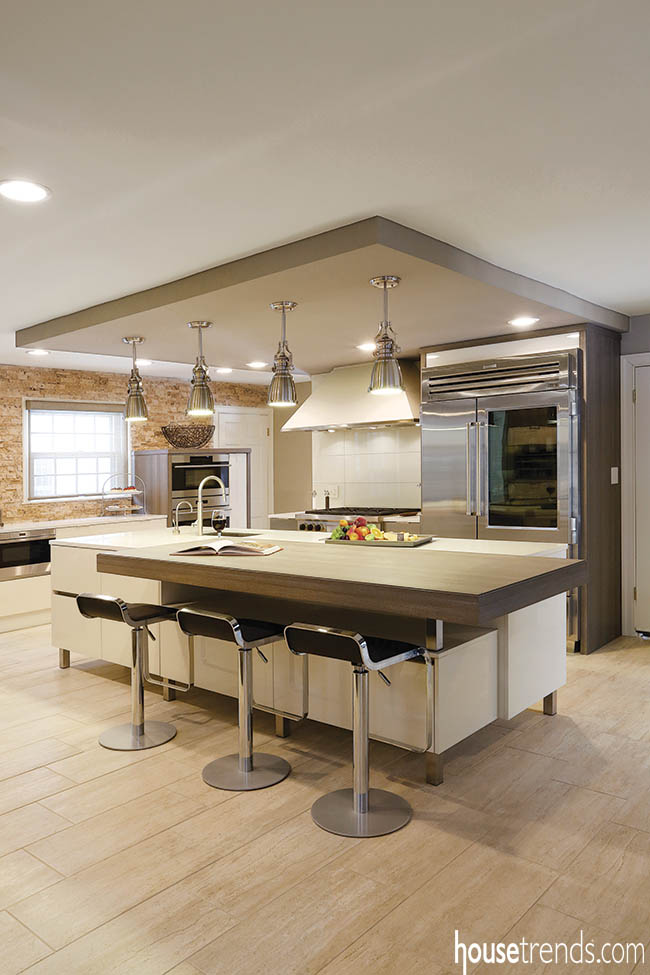
In this kitchen, Heinsius introduced clean lines, then aesthetically connected the space to the adjoining rooms. High-gloss lacquer cabinetry with minimal pulls and oversized slab-style fronts establish a crisp composition, while nested roll-out drawers make it easy for the owner—who loves to cook—to keep utensils organized and out of sight.
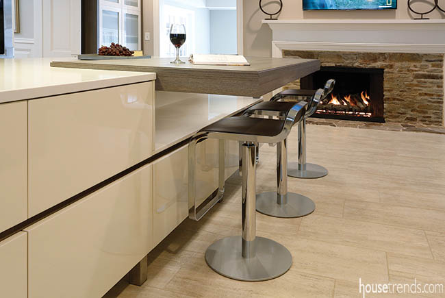
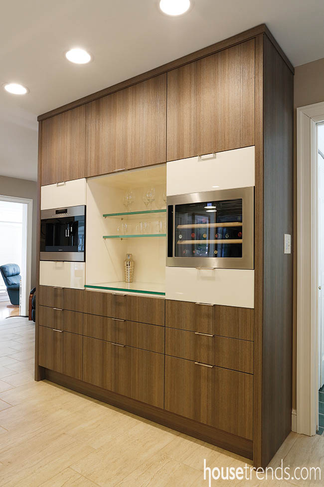
Yet the use of natural materials and colors gives the space a warmth that feels slightly traditional. The bartop and perimeter cabinetry are finished with brown textured melamine, and the lacquer is a soft cream, rather than cool white.
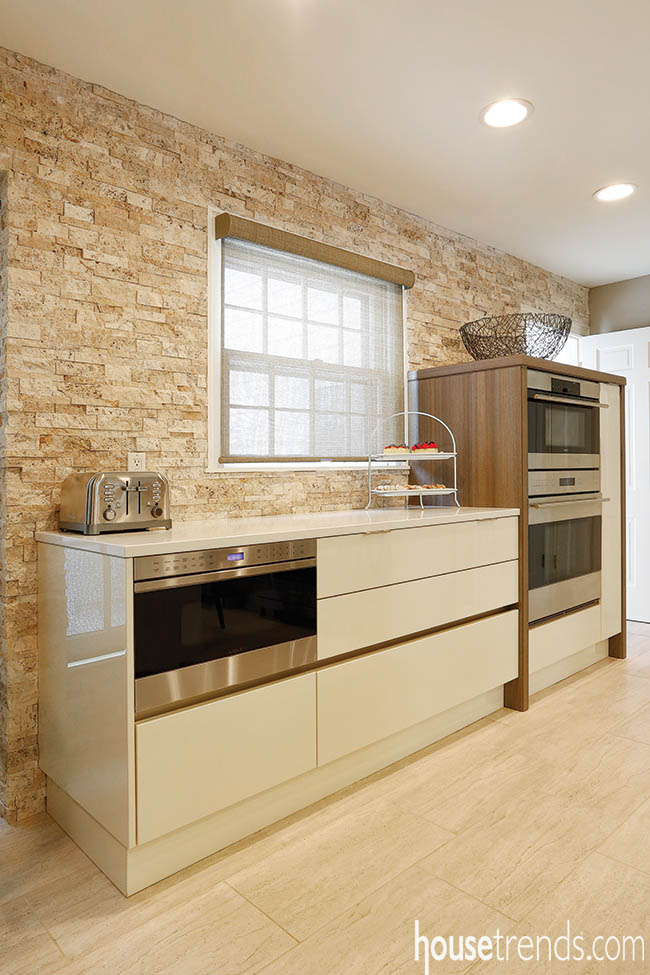
On one end of the kitchen, a wall is wrapped in a split-face ledger-style travertine veneer, to play off the original stone fireplace that faces it from the family room.
For the flooring, a 12-by-24-inch vein-cut porcelain was selected, which, the designer says, delivers the natural appeal of extra-wide textured planks in a more contemporary way. It’s less susceptible to damage than the real thing and has a more authentic look than other imitations, made of laminate or composite materials.
Another overseas concept that is slowly migrating into American kitchens? Pieces that at least look like mobile furniture. In Europe, owners typically take kitchen cabinets and appliances with them from home-to-home, Heinsius says. In this kitchen, only the pantry is truly modular, but that doesn’t mean that the designers didn’t try to create the illusion of modular furniture.
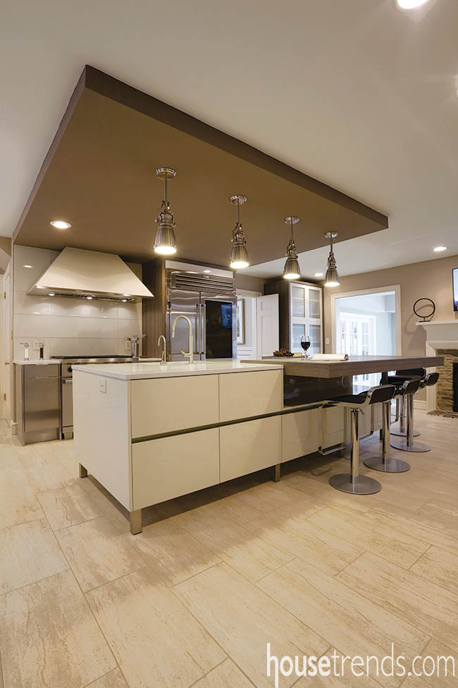
The built-in cabinetry is given a freestanding feel through details like slender stainless-steel feet on the island. Using both lacquer and melamine cabinetry also makes the components look like separate furniture pieces.
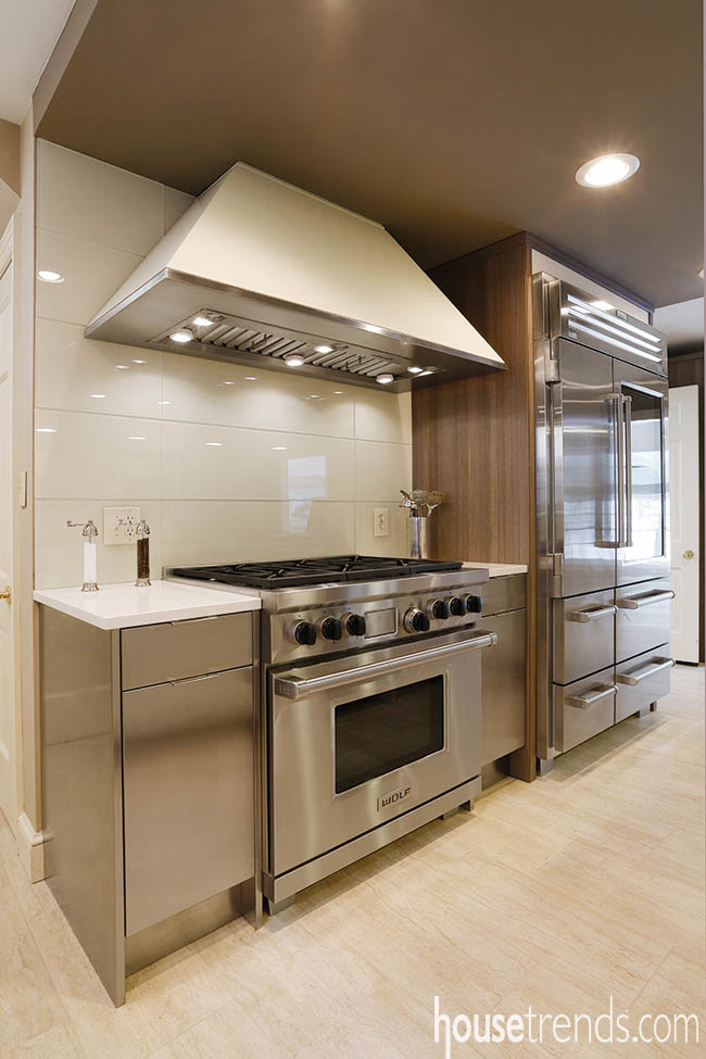
The home’s Sub-Zero Pro 48 refrigerator reflects another aspect of the European mindset: If your kitchen moves with you, then invest in the best—and show it off. The commercial-quality refrigerator is a centerpiece of the kitchen, with a compartment illuminated behind a glass door.
The other appliances—including a steam oven, convection oven, microwave drawer, built-in coffee maker and built-in wine refrigerator—share a stainless steel finish, but are notably separate, sprinkled throughout the kitchen. Individual appliances like the ones in this home are in high demand today, particularly from those who wish to veer away from combination units and truly customize their kitchen.
The death of the soffit is nothing new. For decades, homeowners have reclaimed this space to add storage and visual height. But there are relatively new ways to reroute electric, plumbing and exhaust lines, if the soffit serves as a conduit. In this home, a dropped ceiling platform offers the ultimate union of form and function. Painted a warm brown, it extends from the wall over the island, concealing the mechanicals while complementing the elevated offset bartop below.
While the homeowner initially was unsure about the architectural element, he soon appreciated the undeniable focal point it created, highlighting the kitchen’s functional work triangle and approachable modern aesthetic.
“It’s so enjoyable to prepare meals here,” he says.
Minimalist Design Aesthetic
The clean lines of this modern kitchen help to connect the space to the rest of the Cleveland, Ohio home. High-gloss lacquer cabinetry with minimal pulls and oversized slab-style fronts establish a crisp composition, while nested roll-out drawers make it easy for the owner—who loves to cook—to keep utensils organized and out of sight. The kitchen is softened by the bartop and perimeter cabinetry, which are finished with brown textured melamine.
Resources
Contractor: Faralli Kitchen and Bath
Kitchen designer: Leah Heinsius
Cabinetry: Downsview Fine Cabinetry

