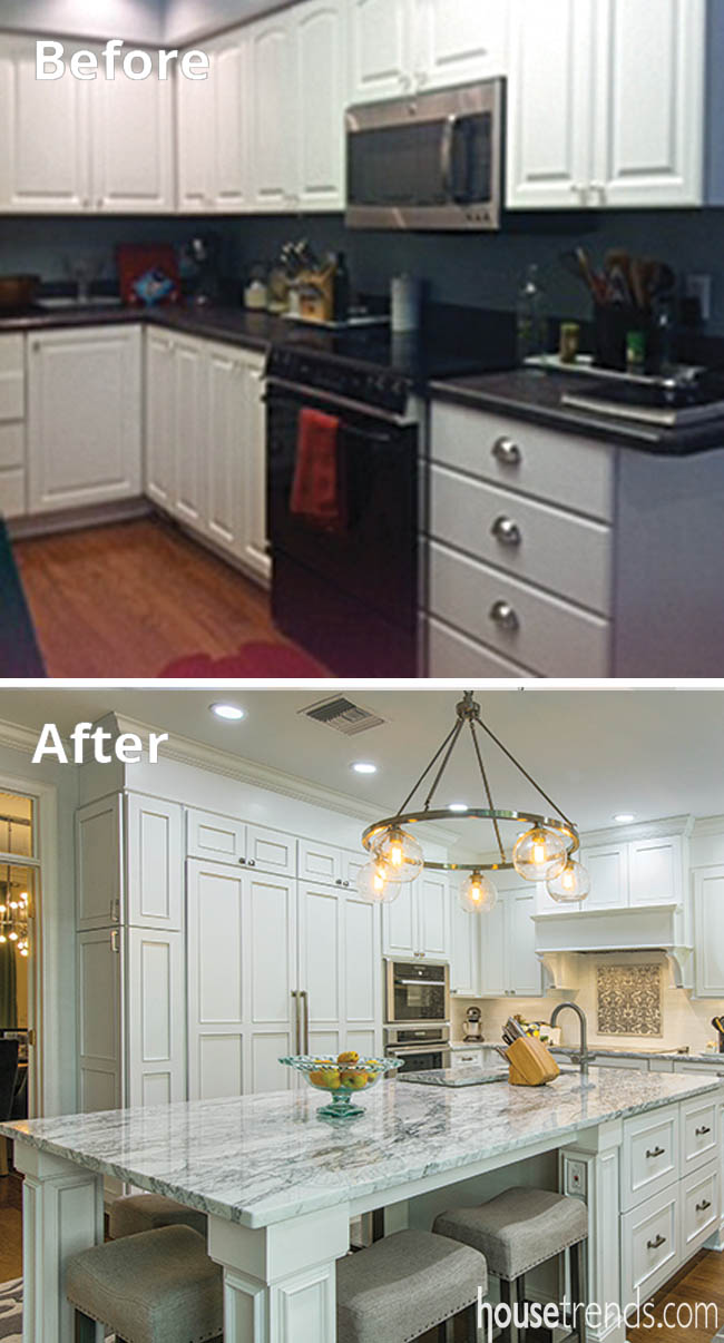
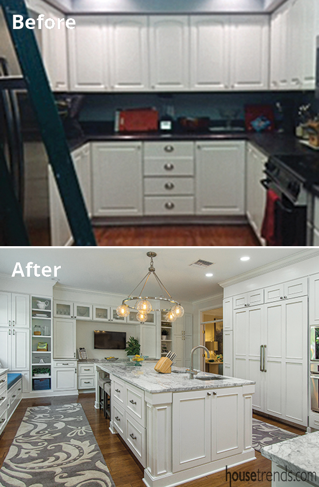
Laura and Travis Gleason found a fantastic house in Carrollwood, but they knew going in that the kitchen needed a full remodel. “A bachelor built this 3,600-square-foot house in 1994, but it had a tiny, galley kitchen that did not fit the rest of the house,” explains Laura. Four years into living there, a leak pushed the couple into focusing on a kitchen remodel sooner than expected. Laura had a vision in mind and looked to Kitchen Creations to help it come true. She had heard positive word of mouth about the company, so it was a no-brainer to go there after others could not quite figure out a crucial piece of the puzzle: how to work around the kitchen A/C vent and plumbing pipes.
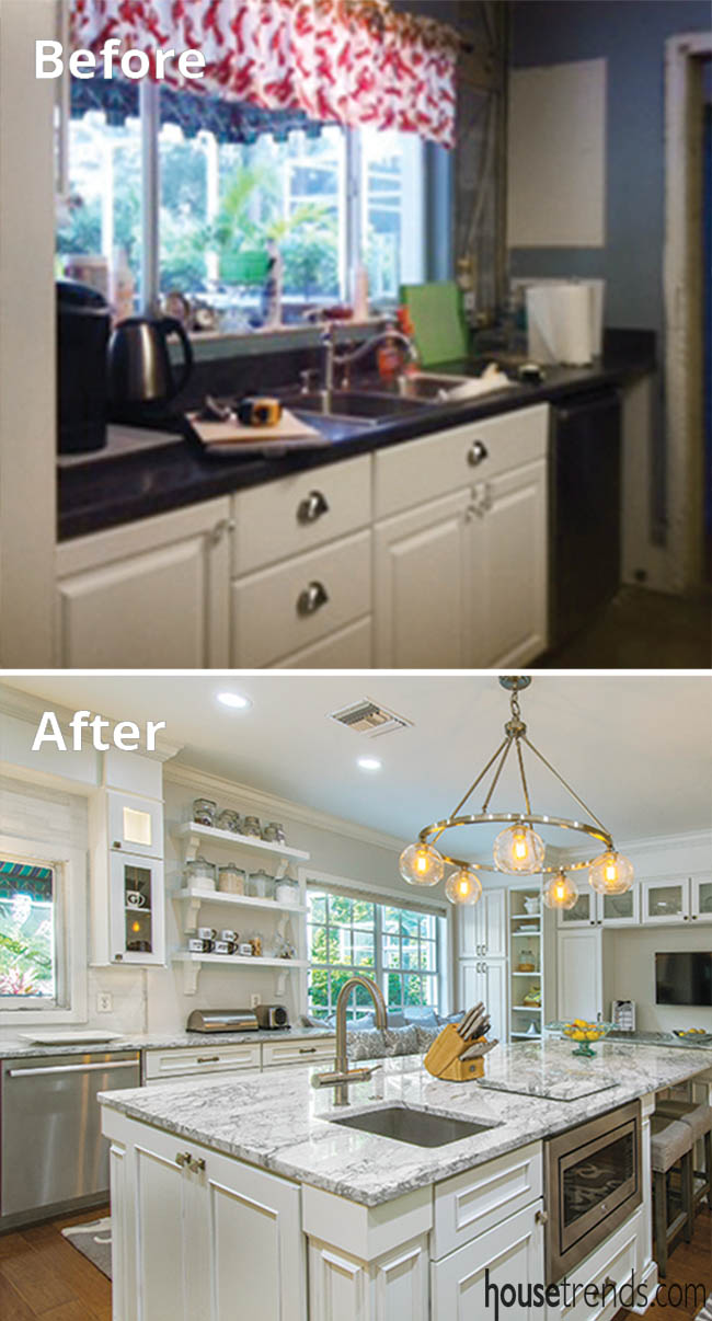
Yes, the layout design had to overcome that one glaring problem: how to move the plumbing and/or vent the A/C duct work that was very much in the way of Laura’s kitchen design dreams. “We worked with a few companies, but nobody could figure out the A/C vent and plumbing,” explains Laura. “We even had a company give us a bid of $15,000 for coffered ceilings to make the plumbing work,” which meant the Gleasons would have had to eliminate other parts of the design in order to stay on budget. In the end, the kitchen sink remained where it was originally and kitchen designer Mireille Fernandez and the Kitchen Creations team were able to resolve the A/C duct-work problem in a very clever manner.
“It’s a second story home, so there was no way to vent the A/C ductwork upstairs,” explains Fernandez. “I have never faced that big of a challenge and trying to figure out how to put it into the design.” Finally, the conclusion was to have the ductwork run in plain sight with a twist; it would be hidden behind 14-inch fascia board that would go above the cabinetry and reach the ceiling to give the whole design a seamless look.
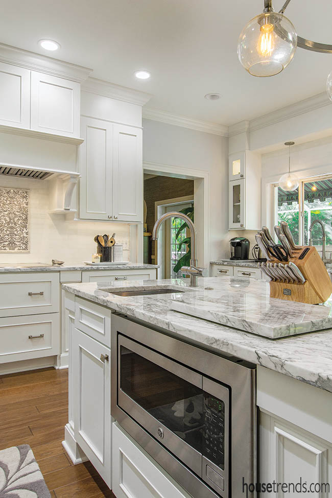
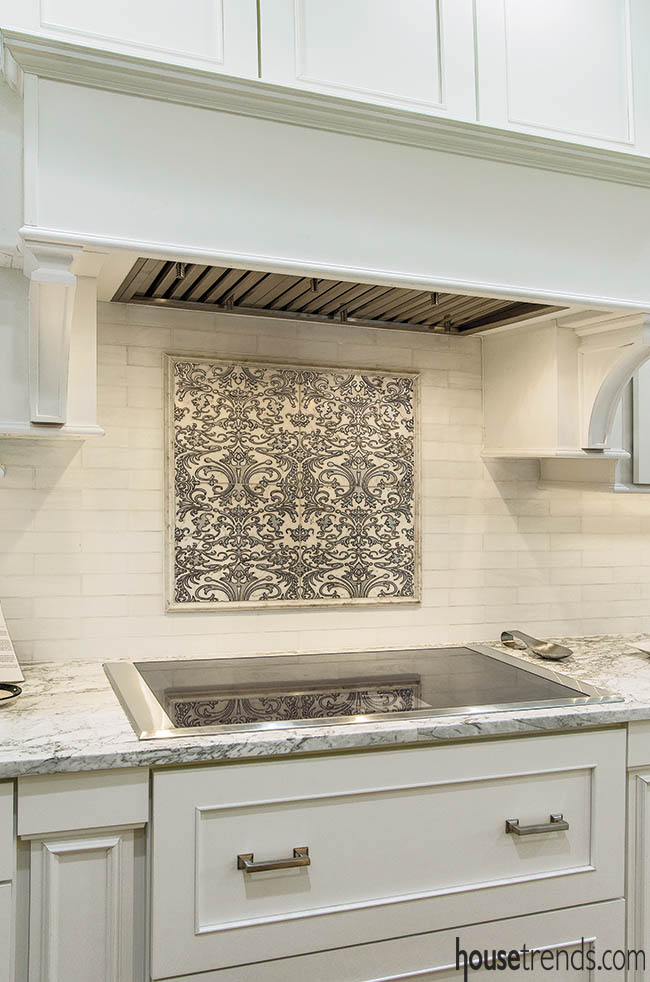
Laura wanted two, 30-inch refrigerator and freezer columns. She shares, “We have a son who has allergies and we follow his diet as a family. We did not need a big pantry, but needed a big freezer for his types of foods.” That large refrigerator/freezer combination was integrated to match the cabinetry, but the other appliances offer a sleek stainless steel look that complements the hardware and faucets. A Thermador single wall oven, a steam oven, induction glass cooktop, microwave in the island and dishwasher round out the list of new appliances chosen for the room.
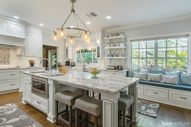
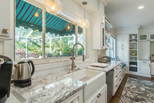
The original space was very small, so the wall to the dining room was removed in order to maximize the room for cooking and entertaining. The Gleasons wanted to capture a timeless, classic look in their kitchen, something leaning more towards the 1920s but with modern touches. They wanted a bright, welcoming space with clean lines. The footprint itself changed only slightly, with the main sink staying by the large window to the back yard, but the refrigerator moved to create the open floor plan. “The space is very inviting and very open, but also offers plenty of seating for the children at the island or the cozy window seat with accent pillows,” says Fernandez. Laura adds that her husband likes to hang out on the window seat and chat with her while she is preparing meals for the couple and their three children.
The island is the main focal point of the kitchen, a piece that has that “wow factor,” according to Fernandez. A prep sink in the island was a must as well as backless counter-height stools that offer seating for five. “I felt that chairs would take away from the island, so shorter stools were the right choice,” says Laura.
Laura says that a part of the kitchen she loves the most is something she found herself, which is a water filtration system. She did not want a water dispenser in the refrigerator because it takes away from precious food storage space. Instead, she had the Grohe Blue Pure water faucet installed in the island. The faucet has separate internal waterways; one side offers filtered water that can be used to clean fruits and veggies in the sink, while the other offers unfiltered tap water.
Laura wanted to incorporate a desk area so that she could keep her computer there or use the space to organize her child educational resources and papers, so the wall was turned into a built-in hutch to stay in character with the rest of the kitchen. “My husband dominates the main office in our house, so I wanted a ‘mom office’ in the kitchen for myself,” shares Laura. That includes open shelving, glass-front cabinets, closed storage and a small pantry. A television also resides above the desk so that Laura can be inspired by cooking shows while utilizing her beautiful new space.
Overall, the Gleasons are thrilled with their kitchen remodel. “Travis is happy that I am happy,” giggles Laura, adding in all seriousness that her husband did have a say in a lot of design decisions. For instance, he asked that the microwave be housed in the island and that panels matching the cabinetry should be on the refrigerator/freezer combo.
“We love to entertain family and friends. We live in an amazing neighborhood where we all take turns hosting each other for different festivities,” says Laura. “One thing I learned with a galley kitchen is no matter how small, people will always gather in the kitchen. We now have a beautiful space where everyone can come and enjoy good food and great company.”
Resources: Kitchen designer: Mireille Fernandez, Kitchen Creations; Electrician: Tim Fuxan Electric LLC; Cabinetry: Dura Supreme Silverton; Countertops: Quartzite Super White, Granite World, Inc.; Backsplash: Decorum Tile & Stone; Sinks: Kohler; ProHome Supply; Appliances: Thermador, Famous Tate; Range hood: Faber Inca Pro Plus

