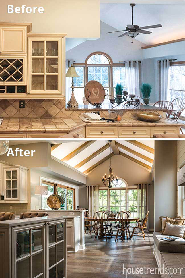
Even the most compatible people can disagree wildly on interior design. And when a husband and wife don’t have the same taste, the design process can feel less like spouses working together and more like distant cousins trying to agree not only on style and color scheme, but also on the nuances of cabinetry and countertops.
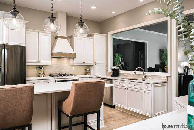
That said, Annie and Mark Laufersweiler of Dublin are a shining example of how people with different tastes can work well together. With the help of kitchen designer Olivia Kern Meadows, their renovated kitchen is a marriage of Mark’s preference for rustic, natural features and Annie’s sleek, modern style.
“Their kitchen remodel features clean, sleek lines but also textured and rustic elements, finished off with more modern-edge detailing,” explains Olivia.
“It was an interesting start,” adds Olivia, who works with The Cleary Company, the team that handled design and construction. “Mark loved the house and wanted to stay, but Annie was ready to downsize and move somewhere else. It was a love-it-or-list-it kind of thing.” They decided to “love it.”
Good idea and a good design
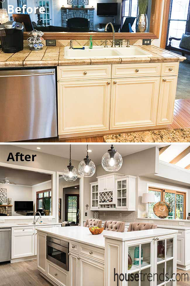
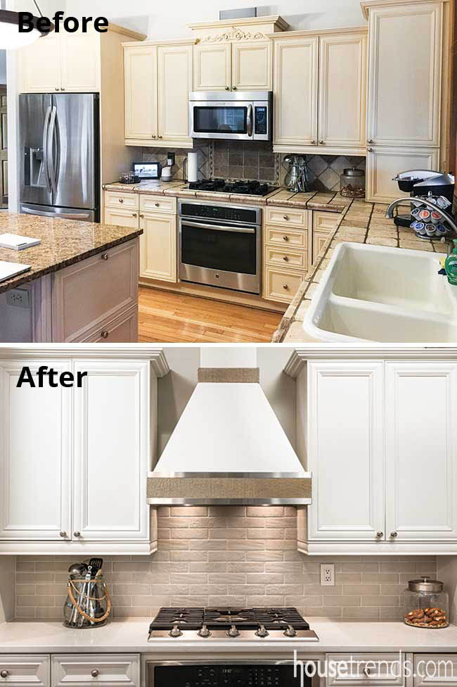
Annie’s not ashamed to admit that she found some inspiration from HGTV. While watching the network, she saw a sleek range hood and wondered if the look could be replicated. The design team had already suggested Annie remove the microwave that was previously situated above the range, so it was a win-win. The microwave was relocated to the island, in a space that previously housed an unused second oven. Then Olivia found a cabinetmaker who could match the profile of the rest of the island, adding storage in the form of a baking sheet drawer. “You can’t even tell it wasn’t part of the original design,” says Olivia.
To fully showcase the island – and the rest of the kitchen – the team updated the light fixtures that shine down upon it, opting for pendant lights and improving the canned lighting in the ceiling as well. “The lighting was a lot of fun to shop for. It was like a candy store for my husband,” says Annie with a laugh.
In shiplap shape
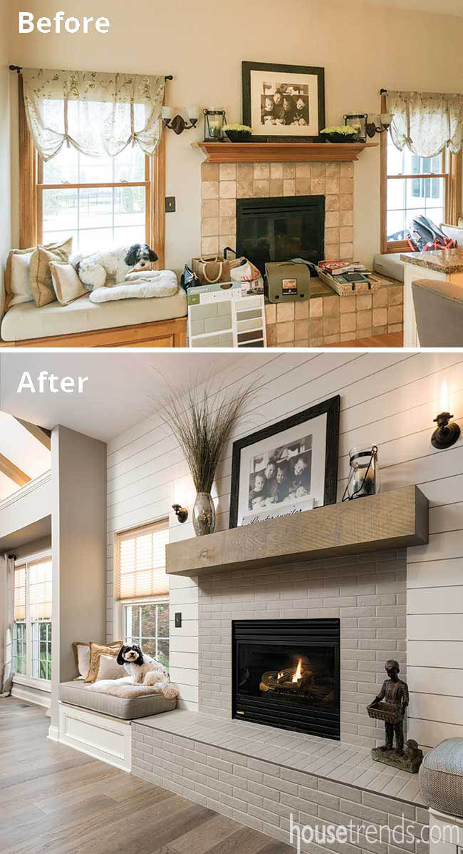
The fireplace provides another source of light, but more so, warmth and a distinctive touch of character. The original kitchen also contained a fireplace, which the family used non-stop, but it needed a makeover. Previously, it was plain drywall with square tiles. The vision for the new fireplace was to make the wall more of a focal point and connect this fireplace with a nearby fireplace in the family room. The latter was accomplished by extending the shiplap wall in the family room into the kitchen and using reclaimed wood on the mantel to tie the two rooms together.
“The shiplap wall was also a way to combine Annie and Mark’s two conflicting tastes,” says Olivia. “We gave it clean lines and a semi-gloss, but it also lends itself to his taste because it’s rustic.” And the aforementioned dogs? Their favorite seat in the house is the window seat flanking the fireplace.
The stainless steel around the mantel mirrors the appliances, not unlike the way the ceiling mirrors the floor. The ceiling’s exposed beams, added as part of the renovation, create visual interest and, once again, lend themselves not only to Mark’s taste but also to Annie’s refined one. “The room already had the uplighting in there, so it was screaming for the beams,” says Olivia.
It’s no surprise that this project won a regional Contractor of the Year (CotY) award from the National Association of the Remodeling Industry. But accolades aside, the remodel was ultimately about updating the look of a kitchen with great bones while creating a functional space for a busy family of six – not to mention their beloved dogs.
Resources: Contractor: The Cleary Company; Designer: Olivia Kern Meadows, MASM, IIDA Associate; Project manager: Mike Farrenkopf, CLC; Hood and custom cabinet: David Pollner, Grey Haus Studio; Cabinetry paint: Benjamin Moore Pale Almond; Flooring: Antiquity Medieval Oak engineered hardwood, from Mohawk; Countertops: Caesarstone Quartz, London Grey w/ pencil round edge profile; Countertop fabricator: Konkus; Backsplash: Bricktown in Fawn Terrace, by American Olean; Kohler sink; Delta faucets; Sharp microwave drawer; Faber hood insert, all from Ferguson; Lighting: Corbeille Stardust chandelier by Sea Gull Lighting; Feiss Pendant lights, all from Ferguson; Ceiling beams and mantel: White Oak reclaimed lumber, Cardinal Building Supply; Shiplap accent wall: MDF painted in Benjamin Moore Acadia White

