
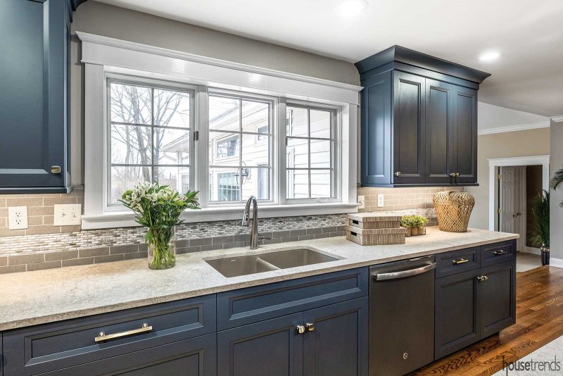
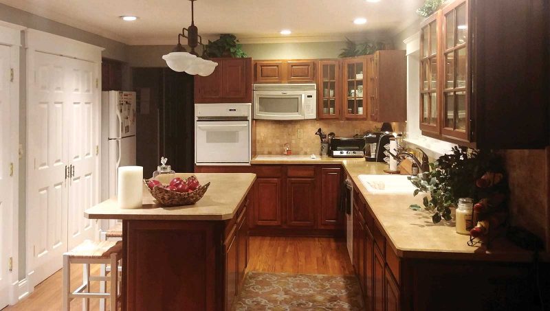
When Sam Ison decided to redo his Middletown kitchen, one thing he knew for sure is that he wanted a “wow” factor incorporated into the design. Sam purchased the 1993 Colonial in 2013. While there were no major issues with the kitchen, he felt that the look was outdated and unappealing.
An inspiring color choice
Sam, a high school principal who taught history, was drawn to the Colonial style, but the former cherry cabinetry needed an upgrade, as did the arrangement of appliances.
With the help of kitchen designer Vicki Waker, owner of Cabinet Creations Design Gallery in Kettering, Sam now has one of the most unique kitchens in the area, and perhaps, one of the bluest. “The old kitchen was builder’s grade and Sam is a man of style,” Waker says. “It really didn’t fit his personality at all.”
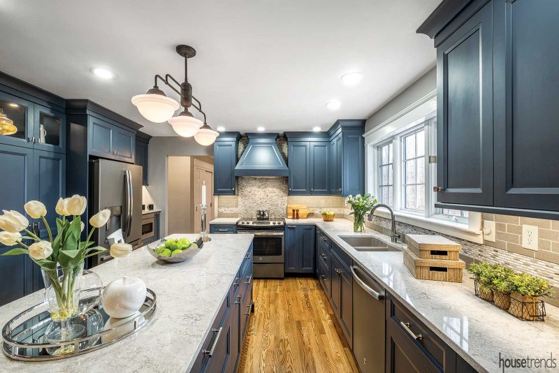
Inspired by his blue leather sectional in the adjacent family room, Waker installed custom maple cabinetry with beveled flat panels and painted them a deep blue color akin to navy blue. “When you walk in, you capture both spaces with your eyes,” she says. It made sense from a design standpoint to carry the color into the kitchen as well. Plus, the flat panel cabinetry gives the kitchen modern, clean lines.
Another bonus is that blue is not a color that you’d expect to see in a kitchen, which is one of the reasons why Sam likes it so much. “I was initially thinking white cabinets, but Vicki suggested the blue and I trusted her opinion,” Sam says.
Stylish storage
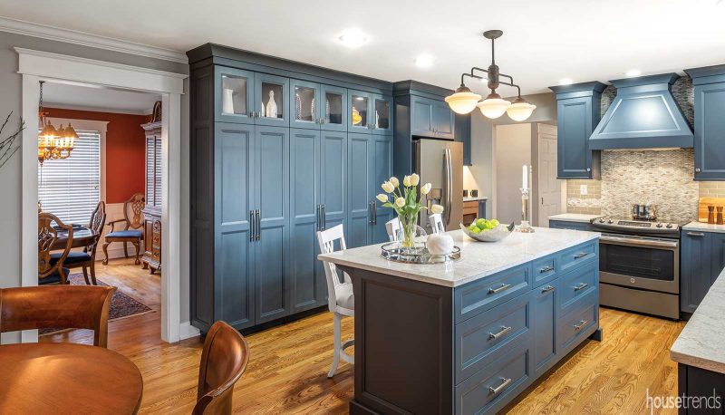
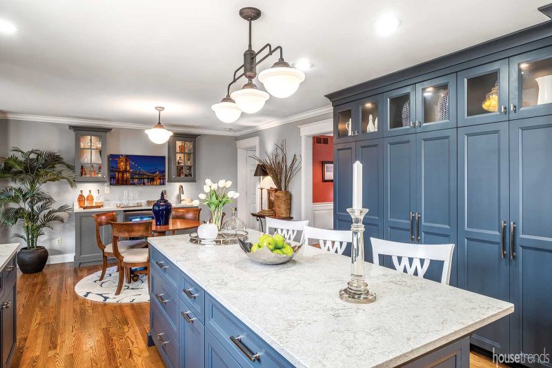
One of the main issues with the former kitchen was the 24-inch deep pantry; it jutted out too far and too close to the kitchen island, getting in the way of the surrounding chairs. Replacing the pantry with one that is only 18-inches deep solved the problem. “By pulling it back, we gained over six inches in the pathway, so when people come over and stand by the island, they don’t feel like they have to tuck themselves in when someone walks by,” says Waker. The new floor-to-ceiling pantry offers abundant storage and adds to the overall style of the kitchen.
The new island is larger than what had been there previously and contains extra storage space. The ivory quartz countertops, installed on both the island and perimeter cabinetry, offset the dark blue color.
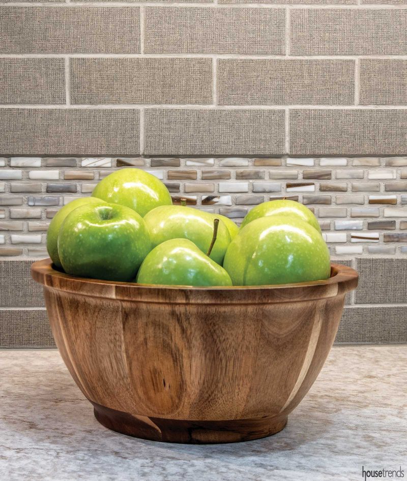
Another standout aspect of the kitchen is the glass mosaic backsplash in various brown and gray hues that adorn the entire wall above the range. A strip of the mosaic tile runs through the gray matte flannel subway tile used to create the backsplash in the rest of the kitchen. “It gives the kitchen a distinguished look and I think it fits in with what I think of as Colonial mode,” says Sam.
A few elements from the previous kitchen remained—the hardwood floors were stripped and refinished, and Sam maintained the same layout with one exception: Waker repositioned his new refrigerator so that it was not as much of a focal point in the space, but more integrated with the rest of the kitchen.
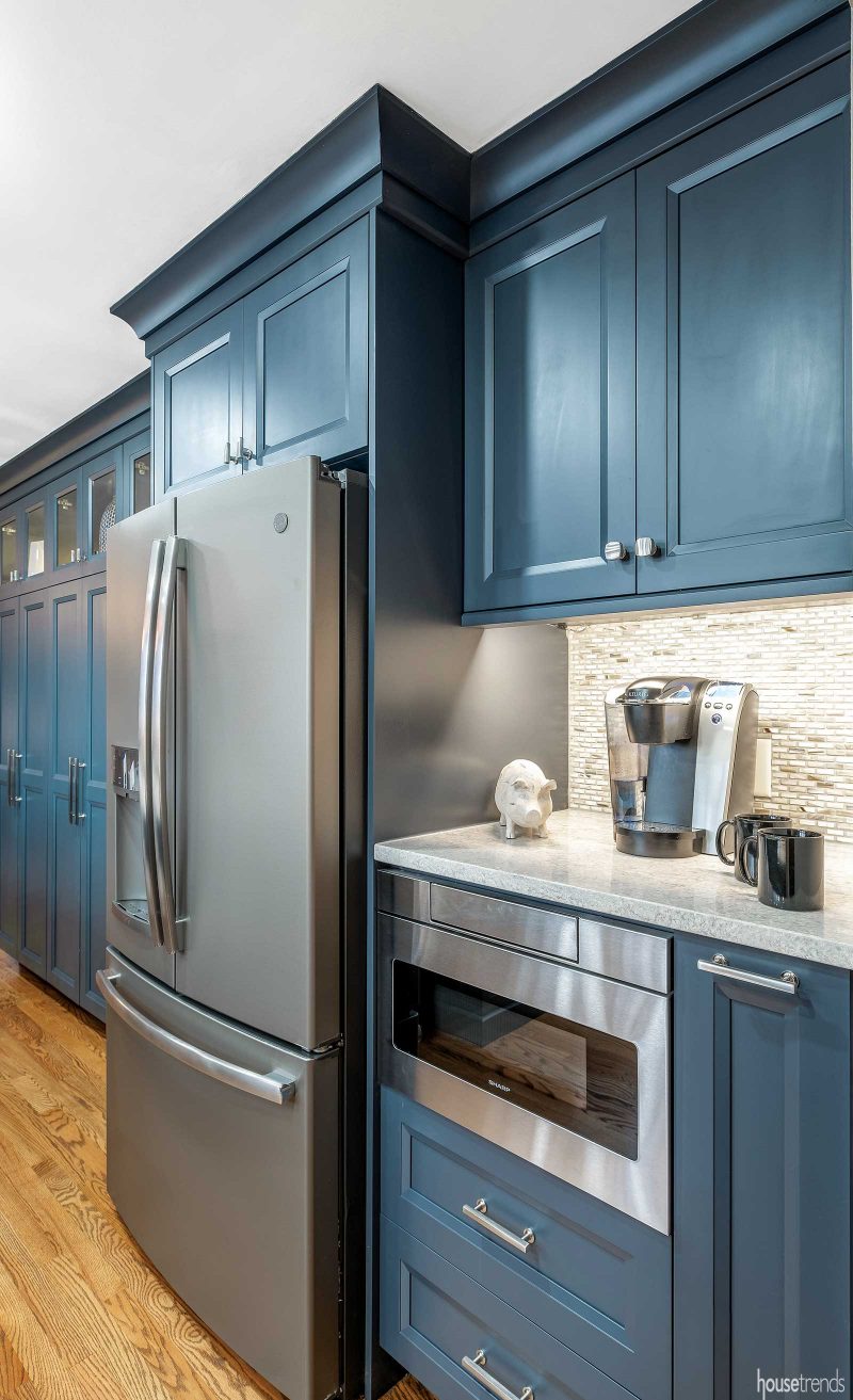
The renovation also allowed for a few additional elements, such as a coffee bar and microwave drawer tucked into the back of the kitchen, next to the refrigerator. Waker also installed a pullout to the right of the range to store pans and utensils, as well as a hands-free waste system behind a cabinet that opens by touching the unit with your knee.
“We also put glass above the pantry to highlight the decorative pieces and give it a neat ambiance in the space,” adds Waker. The interior lights in the pantry and in the bar cabinets, along with under cabinet lighting, lights over the island, recessed can lights and a window above the sink, provide many sources of illumination.
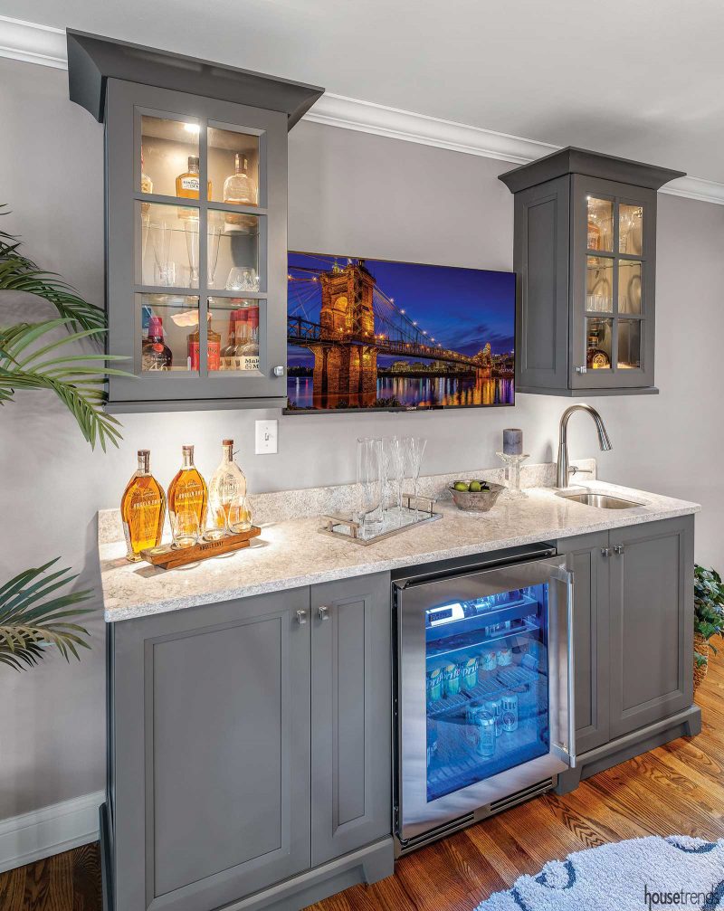
“We also created a bar at the end of the kitchen with gray cabinets, a wine refrigerator and a 43-inch television,” says Sam. The open cabinetry flanking the television stores glassware and bottles and provides a nice balance to the kitchen. Sam likes the contrast to the blue cabinetry, though the two colors are in harmony, due to the complementing tones shared by both.
Clean and simple design aesthetic
For the most part, the design was kept simple, with clean lines and unembellished hardware, but it still has many elements of a custom look. Waker says that the renovated kitchen pulls the look of the whole house together, especially since the kitchen is centrally located.
Although the home’s exterior is Colonial and most of the other rooms are decorated in a traditional style, Waker views the kitchen as more transitional. “We wanted to give him a timeless look, but not something that everyone has.”
RESOURCES Kitchen Designer Vicki Waker, Cabinet Creations Design Gallery; Cabinetry Cabinetry by Provines; Countertops Mont Quartz; Backsplash Louisville Tile; Interior design accents Bob Bishop
Article appeared in Housetrends Dayton – March/April 2019
To see another kitchen remodel with hints of dark blue check out Tasteful touches
