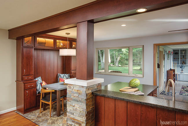
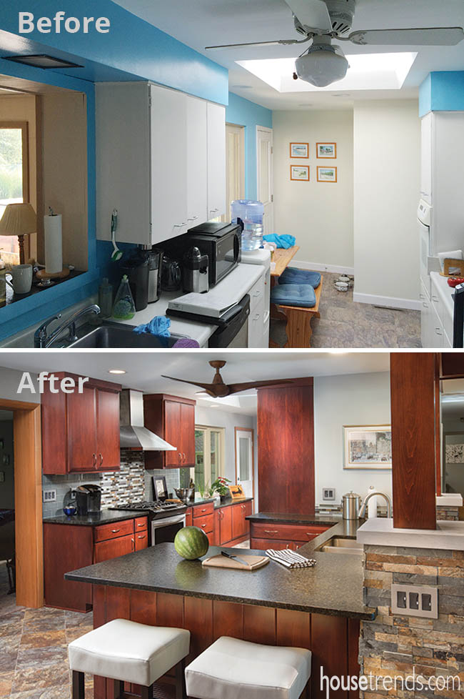
After growing up in the house, and later purchasing it from his parents, the owner of a 50s ranch was quite accustomed to its original compact kitchen. He lived with things just the way they were for years until deciding it was a horrible set up for entertaining.
“The kitchen had a very narrow galley style,” says Laura Watson, designer for The Cleary Company, the team that handled the renovation. “He was closed off from the adjoining rooms and couldn’t interact with guests while preparing food.”
Wanting an open floor plan and more seating space, the owner kicked over ideas with Watson and her team for a couple years. Together they decided to remove a cluster of walls between the kitchen and an adjacent pantry, dining room, family room, and closet.
The new space is more than double the size of the original with plenty of room to interact with company. Standing where a wall used to separate the owner from the family room, two stone-wrapped pillars give the room its signature look.
RESOURCES Designer Laura Watson, ASID, UDCP, The Cleary Company; Contractor George Cleary, CR, The Cleary Company; Cabinetry Yoder Custom Woodworking; Flooring America’s Floor Source; Countertops Verde Uba Tuba with leathered finish; Countertop fabricator Granite Direct; Backsplash Subway tile in rain and accent mosaic glass and stone, The Hamilton Parker Company; Faucet Moen, Range hood Zephyr, Frigidaire range Ferguson; Chandelier Possini Euro, Lamps Plus; Ceiling fan Minka Aire, Northern Lighting; Paint Benjamin Moore Winter Solstice on walls, Silvery Moon on ceiling


