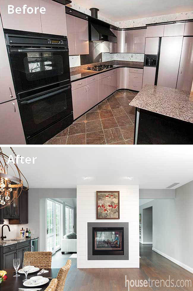
The overarching style that defines the renovation of this Indian Hill home is airy simplicity, but the project itself was remarkably gutsy. After all, the home was in foreclosure, and the restoration required gutting the residence, reworking the roofline, and flipping the layout—all while staying within the original footprint. Despite all the challenges, the homeowners told architect Richard Ernst to approach the renovation in a way that was “logical and easy.” He suggested tearing it down. They demurred. He suggested filling in the pool. They demurred again. So he went with plan C.
“We worked with Richard Ernst several times before and we have always liked the logic and simplicity of his plans,” explains Amy, the homeowner. “He gave us multiple plans, and when he presented the last one, we both said, ‘That’s it.’ It all really came from him. Working with Richard, and our contractor, Chip Glaser, made the entire experience delightful.”
A fresh re-start
Today, the home’s elegance is unmistakable, but one can also sense the casual cottage vibe. The blend of fresh, modern accents with vintage details only adds to its charm.
Amy and her husband Dan were soon-to-be empty nesters who were pondering the next stage of life but not yet officially house hunting. When they stumbled across this option, Dan had misgivings, citing the lot’s hilly terrain and amount of work the home needed.
Amy had lived in a nearby home in the past and was familiar with the neighborhood. While many of the area’s older homes have been rebuilt on a larger, grander scale, she knew that a smaller home such as this, one that jibes with mid-lifers, presented a golden opportunity. She also relished the view that the lot, sitting on a ridge could offer—especially from the new kitchen.
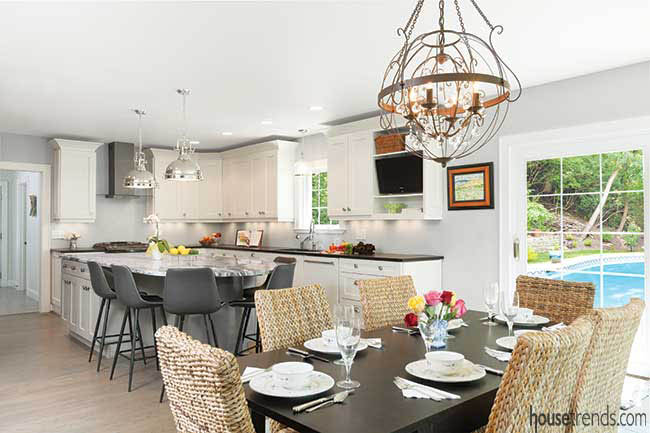
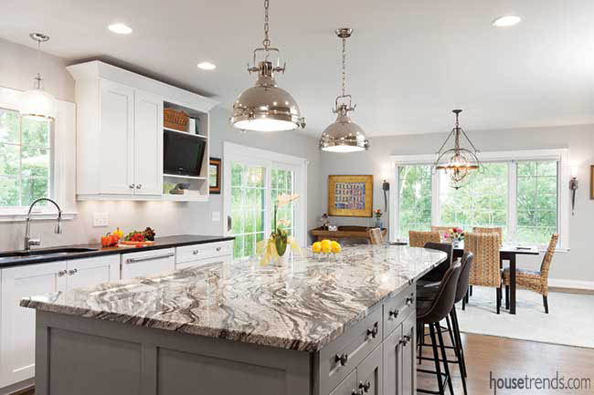
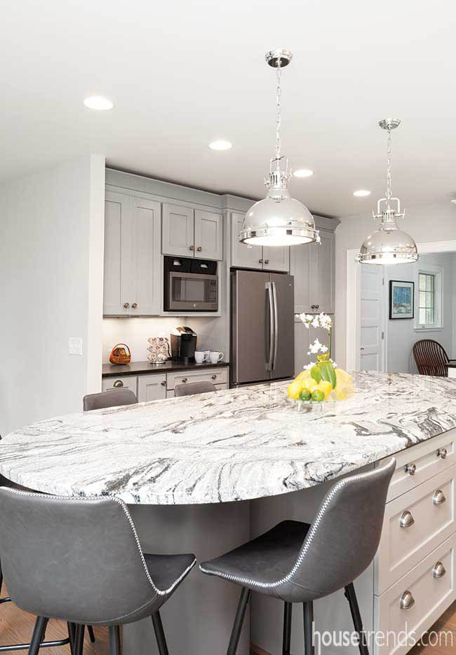
In fact, Amy calls the kitchen her favorite room in the house, and it was the rich slate gray of the appliances that inspired the remainder of the space. She loves that it’s versatile and smudge-proof, and that it meshes well with the serene white and gray cabinetry. Despite being new, the color scheme has an aged, old world look. As Amy explains, “The whole thing looks like it’s been there for a long time.” The kitchen’s coffee station area was washed in a touch of gray glaze to match the appliances and to add panache.
The honed countertops also mesh but at the same time provide just the right amount of contrast. “I wanted something a little different for the island,” says Amy. “I love this granite with all its movement and striking pattern.”
Amy had the brainchild of using a cement form tube with attached cross bracing for the island seating area. She then painted the tube to match the slate appliances. Five modern-style bar stools serve for seating, as well as the adjacent dining table and chairs. Everyone agrees this space nicely accommodates a good-sized crowd within a small house.
The delicate tableware – Old Luxenburg by Villeroy and Bach – is perfectly illuminated by the soft light of the room’s fixtures, including a rustic silver orb chandelier over the dining table.
Switching things up
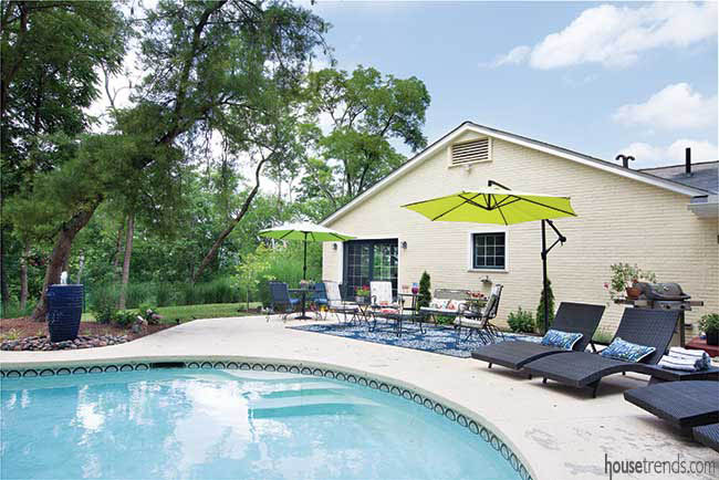
As for the aforementioned flipping of the home? The kitchen was previously on the opposite end of the house from the pool. Flipping it to the other side of the house now offers an easy flow to the pool and outdoor seating.
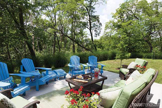
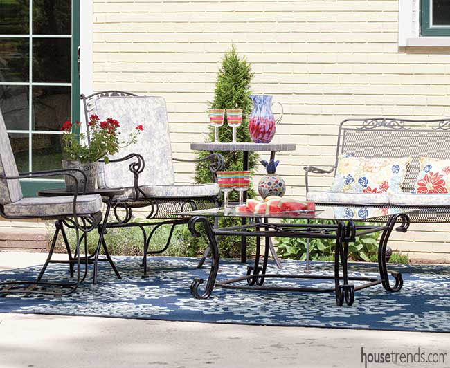
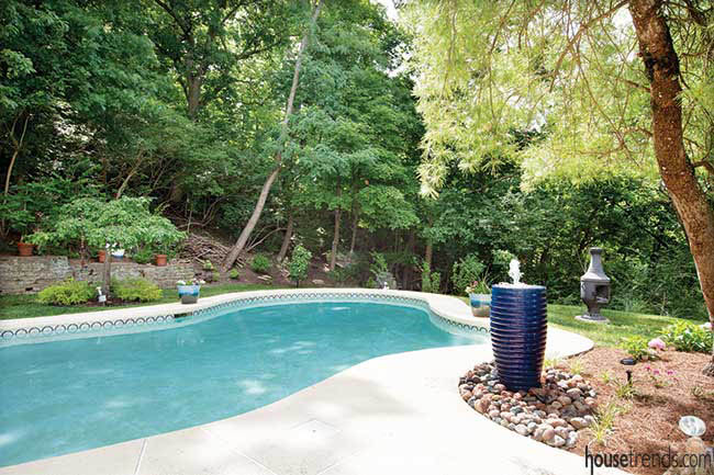
A cottage home typically blends into the surrounding landscape, and this home is no exception. The pool sits on the ridge surrounded by leafy shade trees. Comfy outdoor furniture in bright colors encourages lazy afternoons spent by the pool.
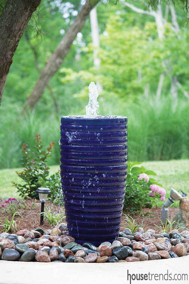
One of the other distinctive items in this lush little oasis is the calming, royal blue pool fountain, an item from the couple’s previous home that they brought over to the new space. “I worked hard to find the rocks that sit at the base of it,” Amy says. “They’re naturally colorful and fit beautifully in with the surrounding landscaping. They support the cottage-not-over-embellished-look. I now appreciate clean lines and little fuss.”
Another carryover from their previous home was the artwork over the front door, created by artist Edward Casagrande. “If you have something you love from your old house, take it with you,” says Amy.
“I am not an interior designer, but I have done lot of houses for myself,” she adds. “My recommendation for people is go with what you like. If you like it, it will be great. This is a wonderful spot to call home!”
Resources: Architect: Richard Ernst; Builder: Chip Glaser, Glaser Builder LLC; Kitchen designer: Tom Bove, Genesis Wholesale Kitchen and Bath; Cabinetry: Kith & Eudora from Genesis; Countertops: Zelaya Stone Works; Sink and faucet: Kraus; Hardware: Chrome and Black Nickel Vibe, Hickory Hardware; Appliances: Range, refrigerator, range hood all in Slate from GE, KitchenAid dishwasher and GE bar refrigerator; Mudroom tile: Louisville Tile, installed by AndreaTile, Inc.; Bar glass: Architectural Art Glass; Lighting: Dining room chandelier and sconces, island lights Lamps Plus; Pendant over sink Ballard Design; Paint: Agreeable Gray from Sherwin-Williams; Flooring: White oak; Window treatments: American Blinds; Windows: Sun Windows Inc.

