There’s a tenet that Kendra Larsen follows, whether she’s shopping online or budgeting for a massive remodel: “You’ve got to know where to splurge, and know where to save,” she says.
Kendra has been honing this skill since her childhood in California, where she often went garage sale hopping with her grandma on the weekends. Her love of the hunt and her eye for design has evolved since then, especially after she and her husband, Chris, extensively remodeled their previous home in Denver.
“It definitely gave me the remodeling bug,” she says.
So when the couple purchased their Anderson Township home, built in 1986, Kendra wasted no time launching a remodel of the kitchen and sunroom and began working with Neal’s Design Remodel and kitchen designer Christina Temple before they even moved into the home. The project began with the couple using Neal’s design and architectural services to open up the kitchen to the sunroom. The focus then grew to include a complete kitchen overhaul, which took nearly a year to design and build.
Keep what you can
The Larsens were eager to replace the home’s 1980s moments-—like the dropped ceiling in the sunroom—with a “midcentury French bistro” spirit.
“I like really modern stuff mixed with vintage so it tells more of a story,” says Kendra, who has a background in visual merchandising.
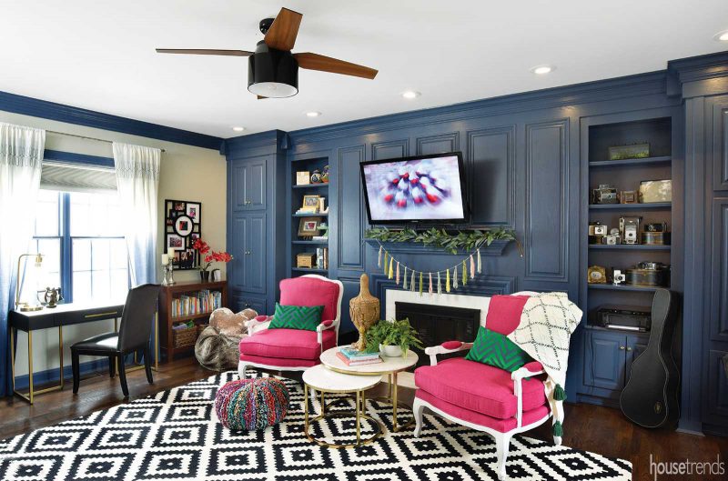
Before the kitchen remodel began, Kendra painted the oak-paneled walls in the living room a deep French blue. And in the dining room, the existing wainscoting and dentil crown molding dress up the French country style of a hutch, which actually is two separate finds from a Metrolina flea market in Charlotte, North Carolina. But it was a new Lacanche French range that inspired the overall style in the kitchen.
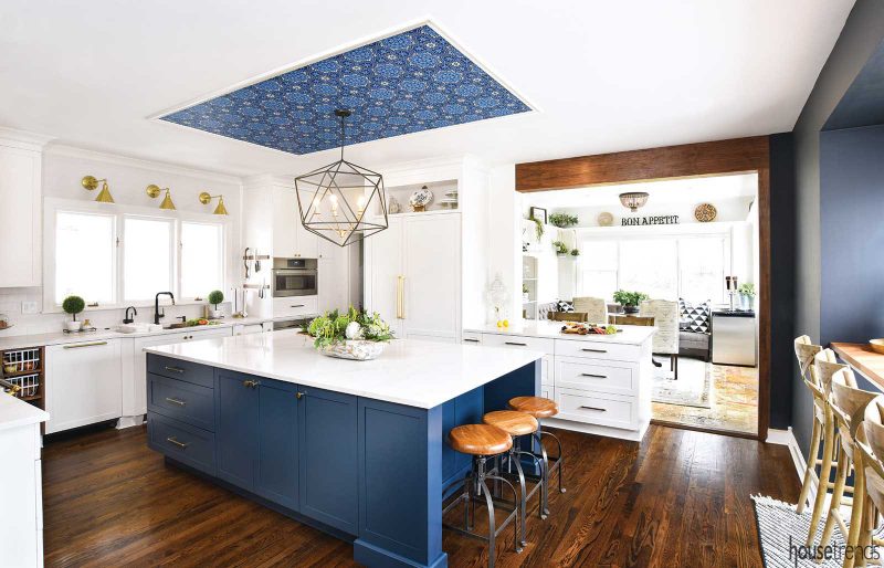
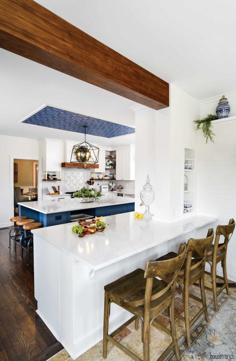
By working within the same footprint—simply lengthening the small square island into a 9×5-foot rectangle—the couple was able to keep the existing hardwood flooring, which runs throughout most of the first floor. And rather than completely removing the wall between the kitchen and sunroom (which now functions as a breakfast nook), the team converted it into a peninsula and framed the doorway with a walnut beam. This created a “bold separation” between the rooms and a more natural transition to the existing travertine tile.
Come up with creative solutions
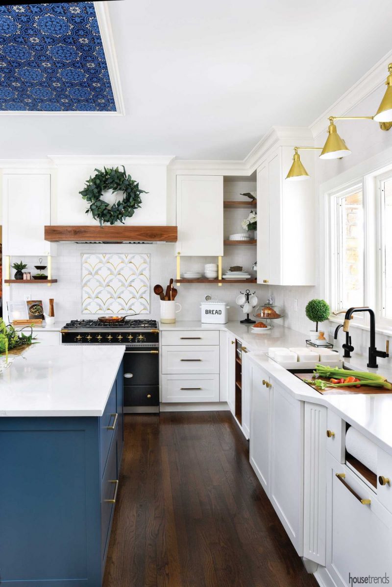
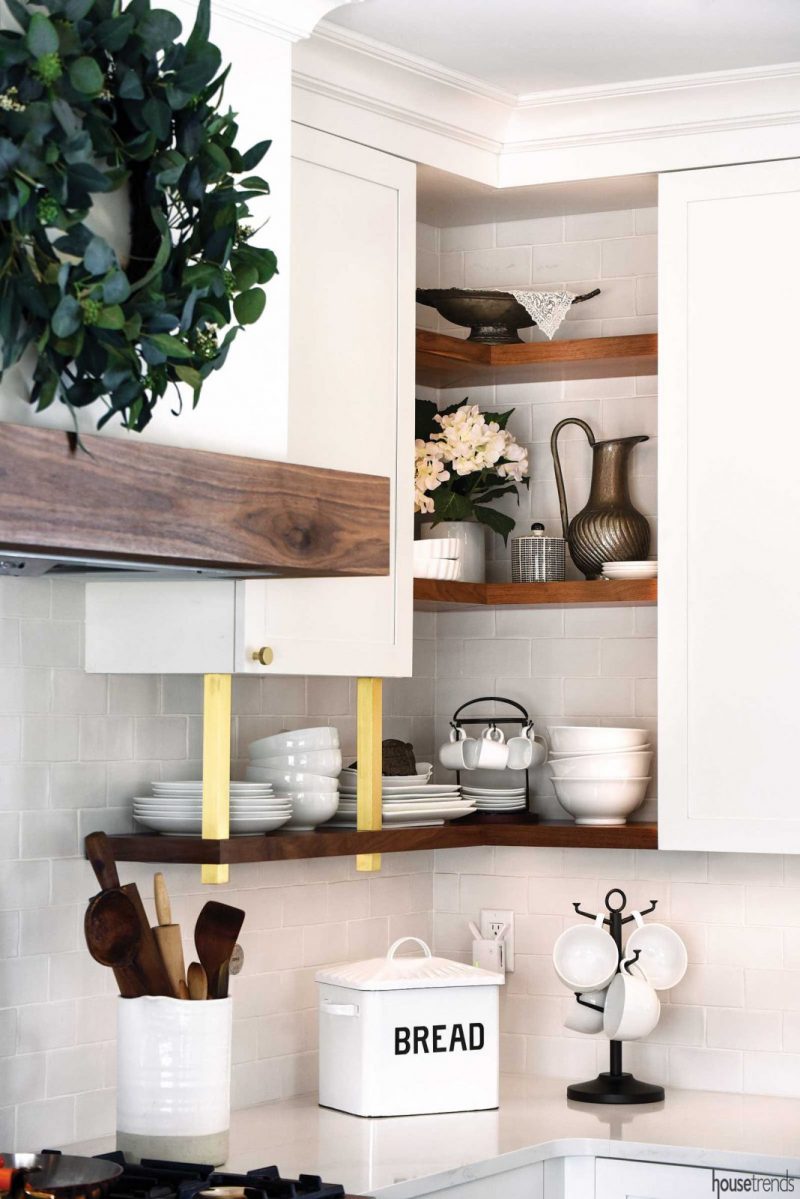
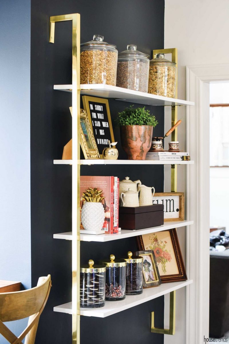
The sheer number of decisions required during a remodel can feel overwhelming, but Kendra resisted the urge to go on autopilot. By thinking about what she really wanted, and didn’t want, she was able to cut corners—quite literally. To Kendra, corner cabinets are a vortex where things go to be forgotten and die: So she removed them. Instead, open shelving with brass accents provides grab-and-go convenience for everyday plates and bowls.
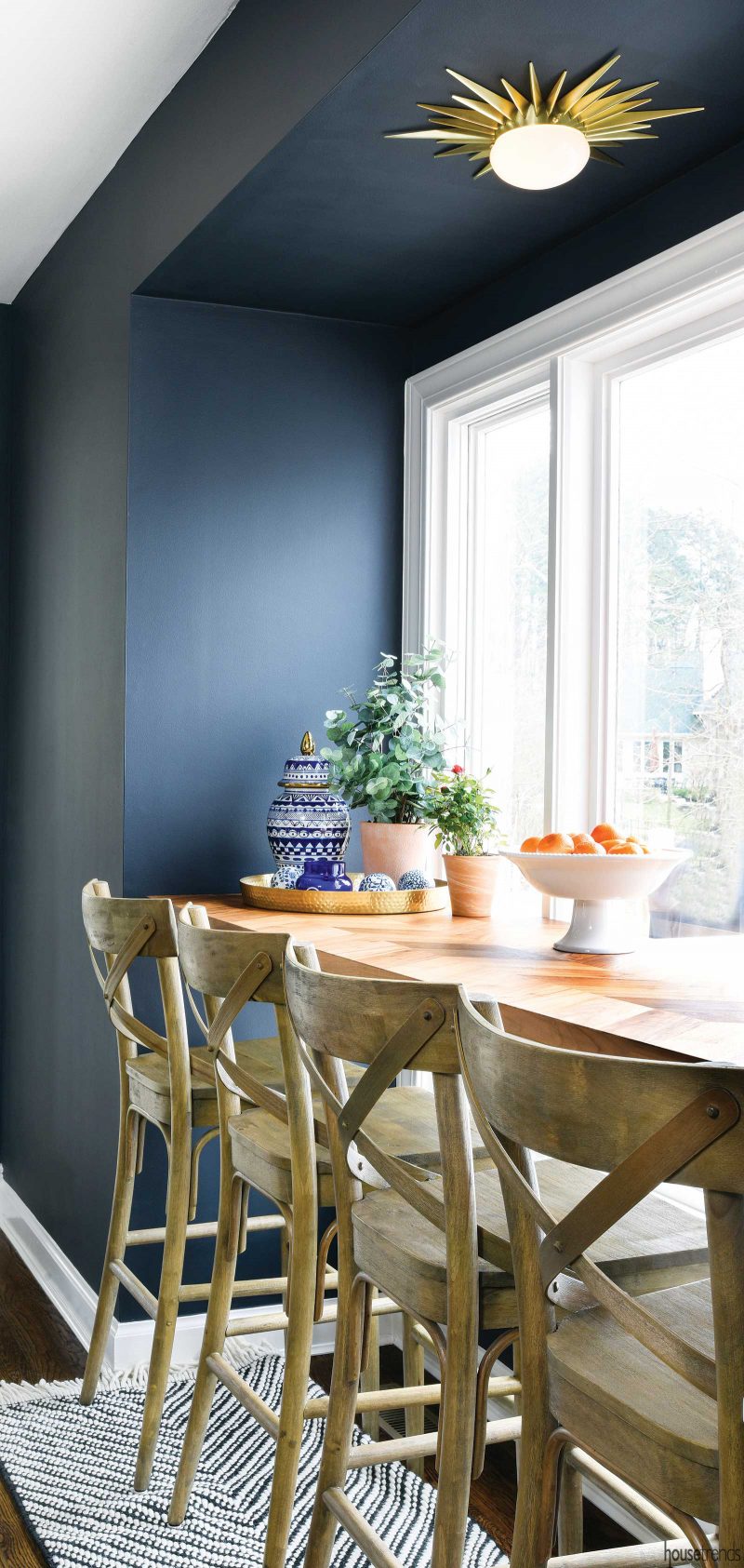
Questioning her options also helped Kendra keep an eye on her aesthetic vision in the breakfast room. Removing the space’s dropped paneling raised the ceiling by 17 inches. Instead of filling the exposed wall space with a double molding or brick to match the wall below, Kendra chose a simple white shelf that contributes to the space’s French bistro air.
A ceiling detail above the kitchen island elevated the space’s style. Graphic wallpaper framed with thin molding adds a modern element to the space. Paired with the blue custom paint on the cabinetry below, it solidifies the island “as a bold, standalone piece” set against the backdrop of white quartz countertops and perimeter cabinetry, Temple says.
Mix up the materials
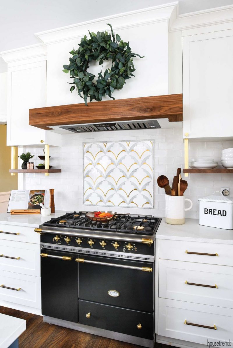
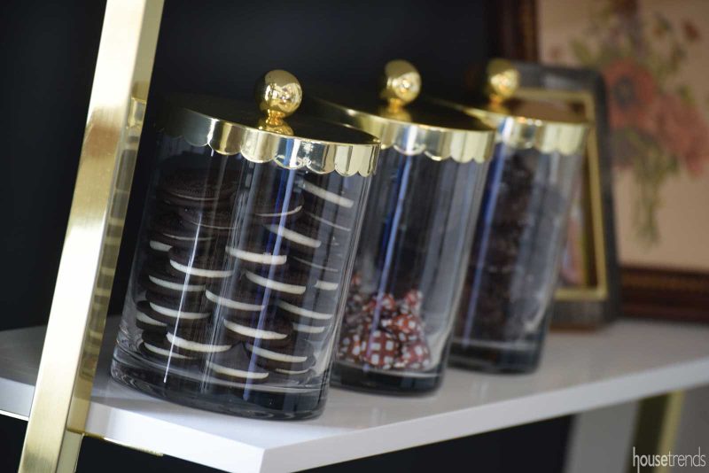
Although walnut, brass and black finishes create a cohesive custom look in the kitchen, Kendra and Temple used a discerning eye to select the individual elements from various resources. The selections began with the Lacanche range: Kendra mimicked its black finish in the Keidel sink fixtures, and repeated the brass accents throughout the kitchen. Supports for the open shelving flanking the stove are made of solid brass and were custom made by a local metal artist Nicholas Yust.
Troy Sexton, field supervisor for the project, and Stephen Chaney, the lead carpenter, went to great lengths to incorporate touches of walnut throughout the space.
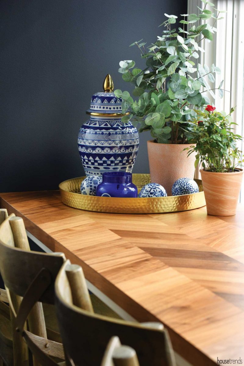
The custom range hood and built-in shelves were milled from the same walnut that separates the kitchen and breakfast nook, and scraps of the wood were even used to create shallow shelves for a hidden spice rack next to the refrigerator. But Kendra also turned to some big-box retailers to pick up the finish in other accents: A walnut-veneered bistro bar that overlooks the backyard is an Ikea find, and magnetic knife racks near the sink were from Amazon.
Make cabinetry work for you
For the Larsens, custom cabinetry was one splurge that paid off in looks and utility by making it easy to retrieve and stow essentials for their family, which includes a 4-year-old daughter and 2½-year-old son. After all, nothing erases the beauty of a freshly remodeled kitchen like cluttered countertops. Working with Temple, they chose from a menu of options.
“A lot of time went into considering how the space is used and planning where all of the kitchen items would be most convenient for daily life, as well as entertaining,” Temple says.
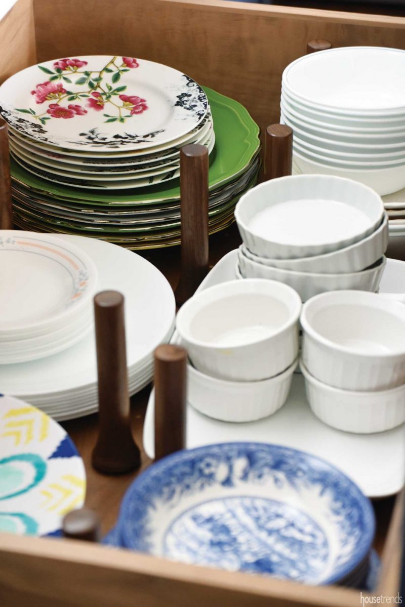
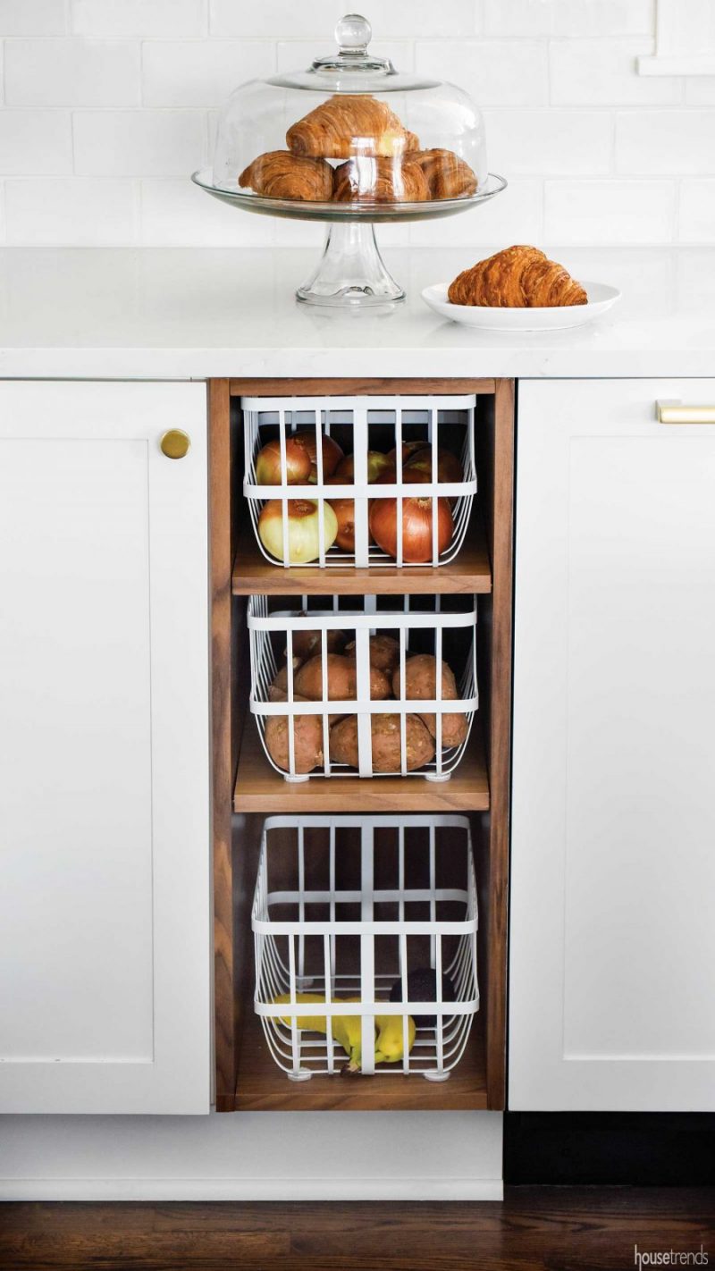
A pull-out base cabinet next to the refrigerator houses cereal in kid-friendly dispensers. In the heart of the work triangle, Kendra, who is an avid cook and former food blogger, can quickly access onions, potatoes and bananas from open baskets. And in the island, not a cubic inch of space is wasted—from nested drawers to a wired cabinet with a lift for the KitchenAid mixer. Even the spice rack is designed for maximum organization: The family’s meal-planning lists and calendar are displayed inside the door.

Balance function and design
Kendra’s remodeling journey has yielded a highly organized, highly personalized space that she says has greatly improved the way her family uses the kitchen.
“When you plan something for a year, you’re terrified it’s not going to be everything you want,” she says. “But it really is. It’s everything we wanted and more. It makes me happy when I walk into it.”
RESOURCES Contractor Neal’s Design Remodel; Project Consultant Steve Hendy; Kitchen designer Christina Temple, Neal’s Design Remodel; Stylist Kendra Larsen, Heathgate Home; Kitchen countertops Eternal Calacatta Gold quartz by Silestone; Kitchen backsplash Inset in Pegasus Bianco Carrara Thasson from Floor and Décor; Field tile in Adex from Hamilton Parker; Kitchen sink Stages by Kohler; Kitchen faucet Brizo, Keidel; Refrigerator, freezer columns, microwave drawer, steam oven, dishwasher Bosch from Custom Distributors; Range Lacanche Fourneau Volnay; Hardware West Slope Series by Rejuvenation; appliance hardware Emtek; Brass shelving supports Nicholas Yust; Paint Alabaster by Sherwin-Williams; Navy accent wall in Railings by Farrow and Ball; Ceiling wallpaper Cole and Sons; Florals Botanica
Article appeared in Housetrends Cincinnati – March/April 2019

