Josh and Christine Kommer bought their Indian Hill home two years ago, ready to leave behind their cramped life in Chicago. The home, built in 1964, had the expansive yard and sheer square footage they desperately missed in the city—especially with a growing family—but it wasn’t exactly taking advantage of these features.
The home hadn’t been updated since the ‘60s. Back then, the niceties of the era called for a separation of public and private spaces, leading to dark, closed-off rooms. But today, double doors no longer hide the kitchen from the front hall and family room. Through a full remodel, the couple created an open design that balances continuity with individuality.
“We wanted it to be classic, with a modern twist,” Christine explains.
An open, coordinated concept
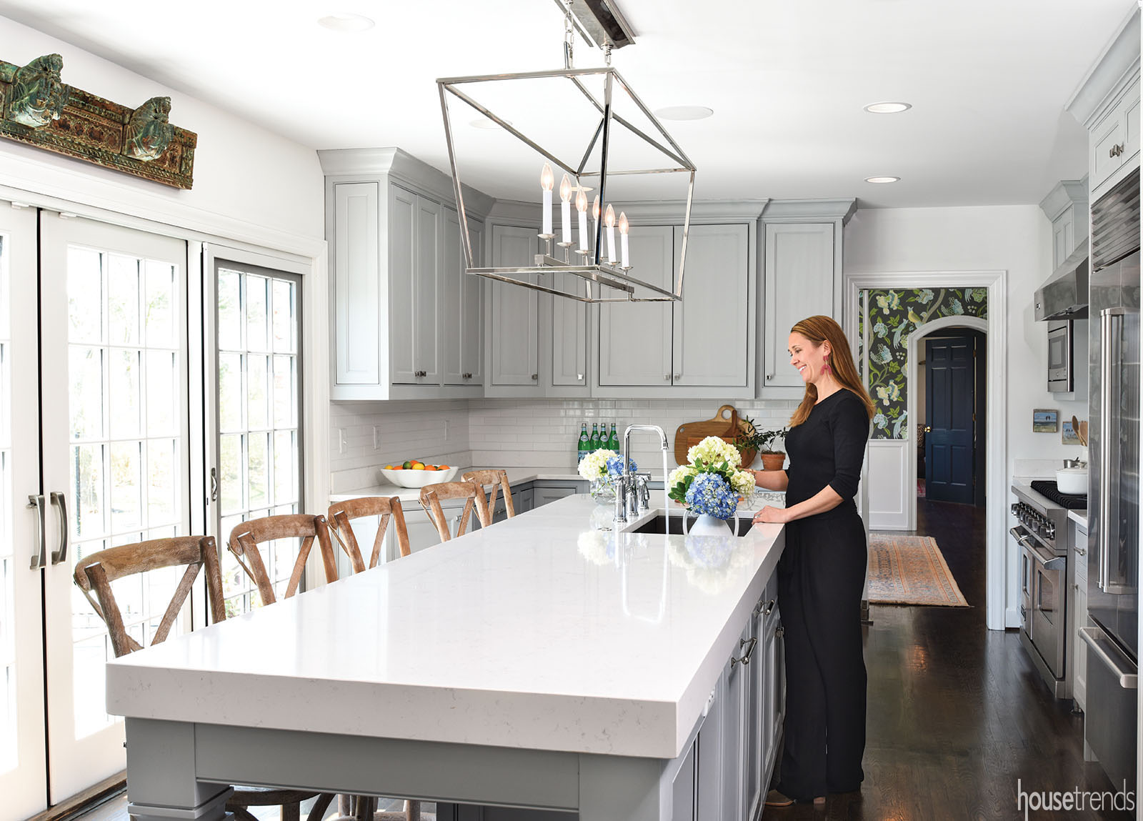
Before moving in, the couple worked with architect Richard Ernst Jr. to bring their ideas to light, quite literally. Adding sliding doors along the back wall of the family room and kitchen allowed sunlight to stream in and the family to peer out over their lush back yard and expanded stamped concrete patio. Doorways between the kitchen and family room, and the dining room and living room were widened, and heavy wall paneling in the family room was removed, along with a Mad Men-esque bar. Out went a mini-mudroom of sorts, which broke up the kitchen, as well as a “bizarre” maze-like hallway leading to the master suite
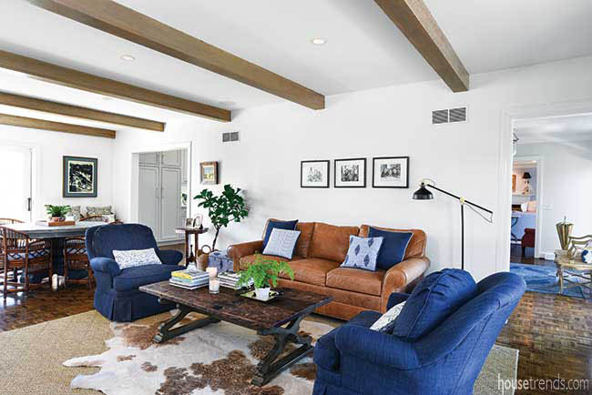
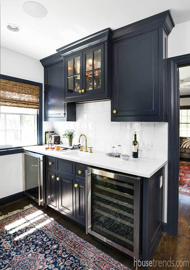
Given the newly opened floor plan, Christine worked with Ernst to carefully orchestrate the sight lines. The doorways were sized to favorably frame adjoining rooms, for example, and the sliding doors were placed to line up with windows at the front of the house. Because of that, the design of each room likewise needed to play off its neighbors. Now, from the mudroom you can see through the family room, to the kitchen, dining room, then bar and finally into Josh’s home office.
“I knew you were going to be able to see from one end (of the home) to the other, so it all needed to coordinate,” Christine says.
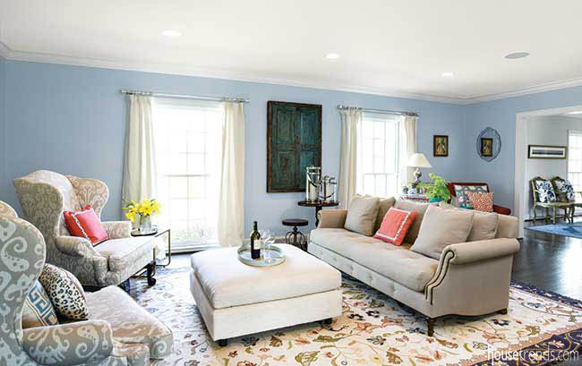
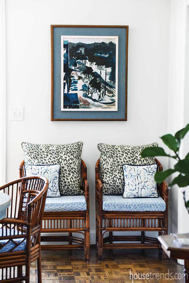
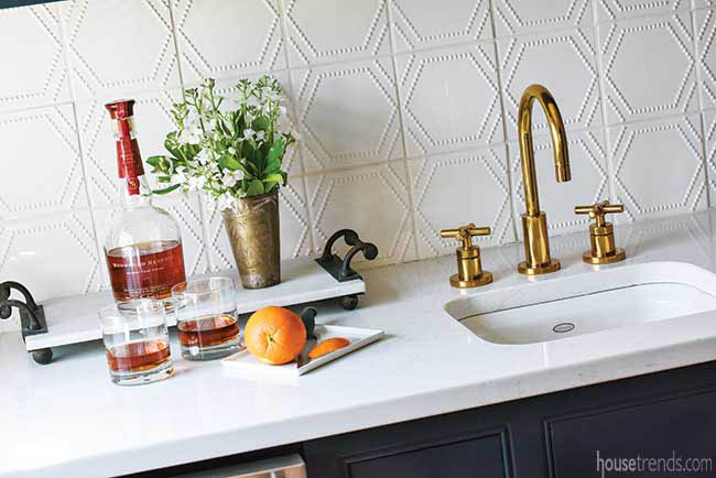
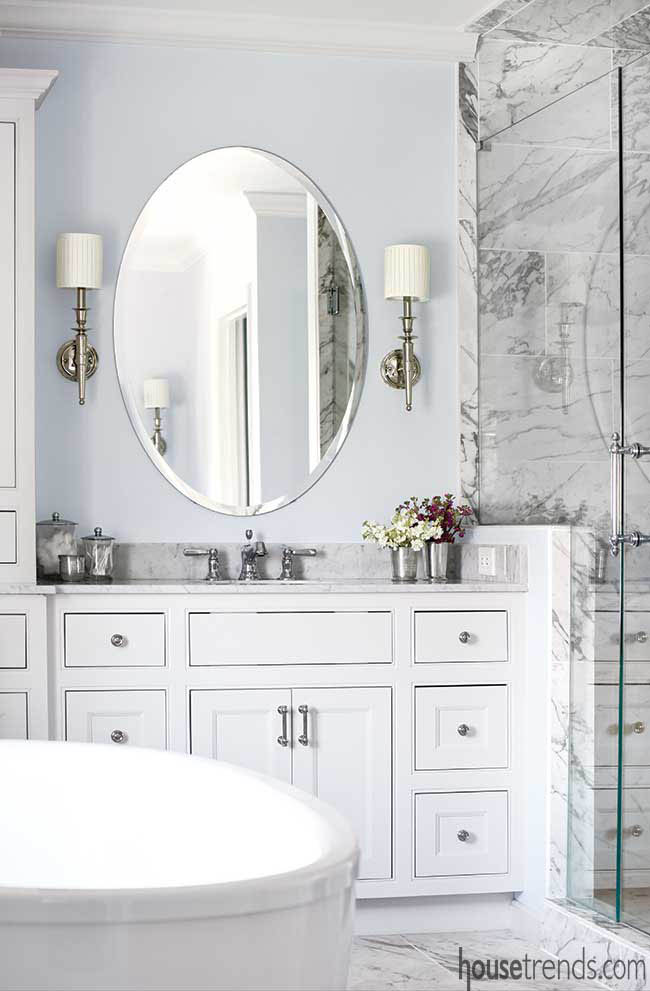
Maintaining the home’s overall traditional style was a key component of this coordinated approach. Shades of blue carry from room to room and polished nickel light fixtures and cabinet hardware continue from the kitchen to the baths.
Updating the classics
But the home’s traditional style is communicated in a very “2018” way. Original ceiling beams in the family room were maintained, but antiqued to resemble wormwood, and the parquet flooring was refinished in a fresh dark ebony stain that matches the hardwood flooring in the kitchen.
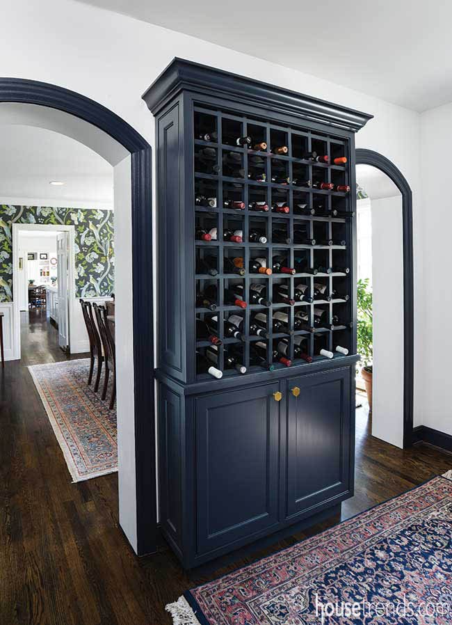
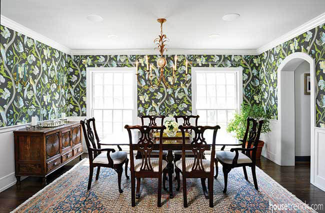
While blue is a unifying thread throughout the house, the color takes on its own personality in each room. Bluish-gray cabinetry in the kitchen feels downright demure next to whimsical bird-bedecked wallpaper in the dining room. In a bar adjoining the other side of the room, navy cabinetry and casing enforce a more masculine vibe.
Breaking from tradition
To enliven the home’s classic style and blue-hued color scheme, Christine created a few unexpected departures.
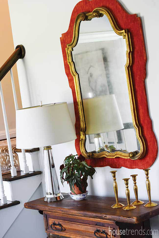
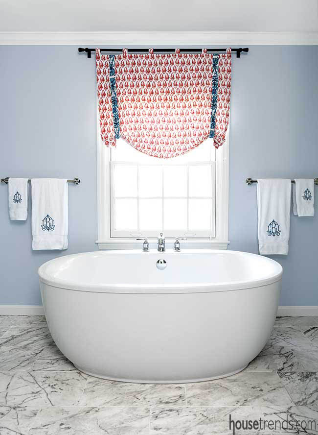
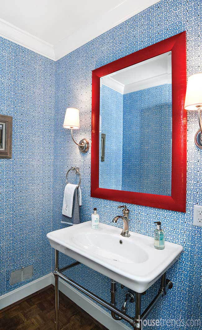
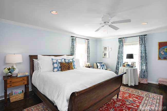
An attention-grabbing red-framed mirror in the powder room, for example, and orange-red window treatments in the master suite brighten these serene settings with bold pops of color. Unique accessories also play a role: An antiqued brass “bird light,” as Josh calls it, is an exuberant accomplice for the dining room wallpaper, while sconces made from animal horns relax the formality of the living room.
Then there are the ever-so-subtle edits that may not be immediately noticeable but make the home look “more fresh and modern,” Christine explains.
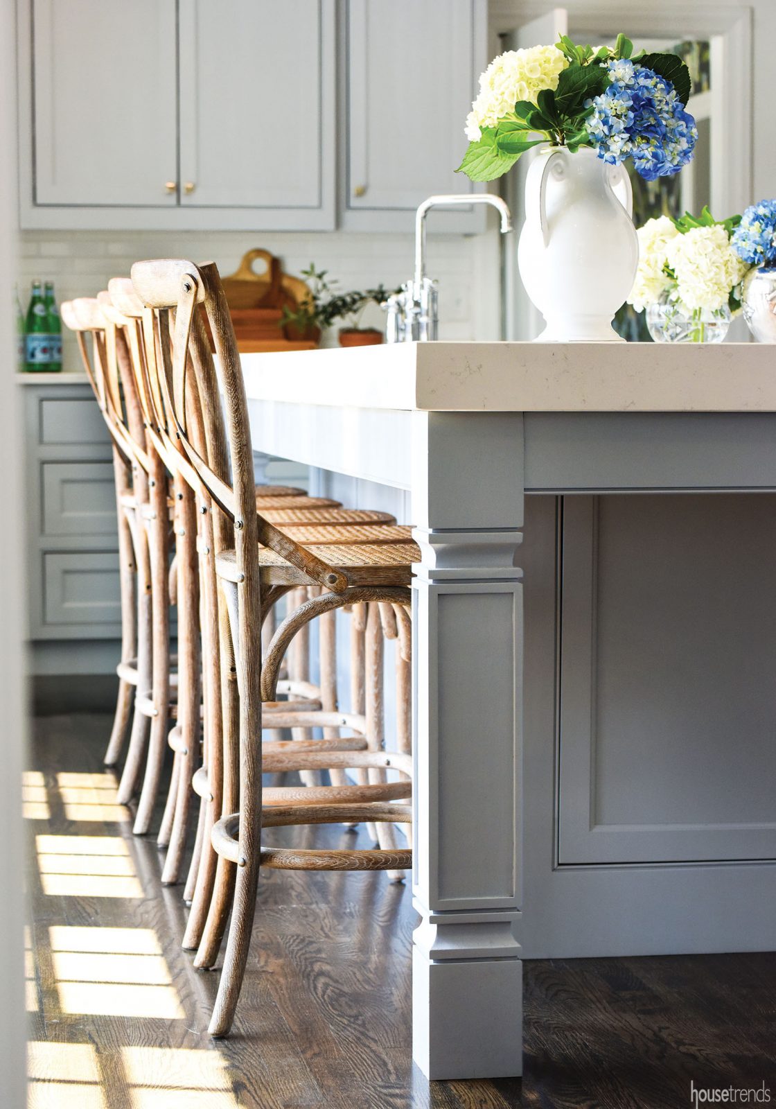
The crown molding and baseboards throughout the first floor are beefier than usual, as is the quartz countertop on the kitchen island. Here, the white subway tiles likewise are 2×8 inches, rather than the standard 3×6. The ceiling of the dining room is painted the faintest version of gray, while the living room ceiling bears a hint of pink. “It’s very subtle but changes the whole feel of the room,” Christine says.
And while those polished nickel cabinet pulls are traditional, they’re also slightly mismatched, “so it doesn’t feel so sterile,” she says.
That’s important, because this kitchen is no longer meant for the cook’s eyes only. Today, ample seating at the island and plenty of mingling room make the space a favorite gathering spot for the family of six and their friends and family.
Resources: Architect: Richard T. Ernst Jr.; Contractor: Jack Dean Construction, Inc.; Interior, kitchen and bath design: Surround Design, LLC.; Landscape design: Dan Druffel, Inc.; Lighting: Visual Comfort, Keidel; Paint colors: Benjamin Moore Decorator’s White on kitchen walls, Whitestone on cabinets, Lake Placid on living room walls, Opal on ceiling; Sherwin-Williams Charcoal Blue on bar cabinets; Wall treatments: Thibaut Janta Bazaar in dining room; Quadrille in powder room; Window treatments in master bedroom and custom pillows throughout home: Kathleen Toepker-Akaka, Karezza Design Company; Window treatments in family room: Lacefield Designs; Window treatments in living room: Restoration Hardware; Window shades: Blindster; Windows: Pella; KITCHEN: Cabinetry: Custom by Adrian Jenkins; Countertops: Quartz, Mont Granite, fabricated by Anything Granite; Backsplash: Daltile Modern Dimensions in Arctic White, from JP Flooring; Sink: Kohler, Keidel; Faucets: Brizo, Keidel; Appliances: Viking range, Sub-Zero refrigerators and Bosch dishwashers, all from Keidel; Architectural salvage piece: French Country Road; BATHROOM: Cabinetry: Custom by Adrian Jenkins; Countertop: Carrara Bianco, fabricated by Anything Granite; Tub, sink and faucets: Kohler, from Keidel; Shower tile: Atlas Concorde Marvel Statuario, from JP Flooring


