“Remodeled” feels like too mild of a word to describe some projects, particularly when the transformation is a bookend for a decade-long drama of building, renovating, relocating and repeating. The owners of this Mason home—self-proclaimed “nesters”—have been trying to create their forever home ever since they downsized from Santa Barbara, California, to a home in Arizona, which they completely remodeled. Five years in, they decided to drop roots—but in a slightly larger home. So the owner devoted her full attention, and more than two years, to designing and building their dream on a two-acre Scottsdale property. “We put our heart into it,” she says. Which made it all the more crushing when, after living in the home for just six months, her husband received a call: He was being relocated to Ohio. “It was painful to leave,” she says.
So when they began searching for a home in the Mason area, they didn’t think they had the emotional bandwidth to launch into yet another project—building or remodeling. But when their exhaustive search failed to find a home with the contemporary appeal they were seeking, “we realized anything we got was going to be a project, so we just went for it,” she says.
After finding a home in a location they were targeting, the couple’s realtor introduced them to architect Kenneth R. Bowerman, who then suggested the team at deStefano Homes and Remodeling. Through an unflinching overhaul, the couple went all-out to create a minimalist, modern home where they can finally feel settled.
“We’ve moved a lot over the last 10 years, and we’ve realized less is more,” the owner says of their aesthetic. “Clean and simple feels better.”
Maximum utility
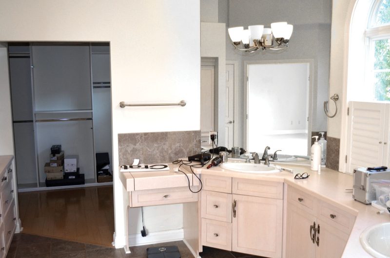
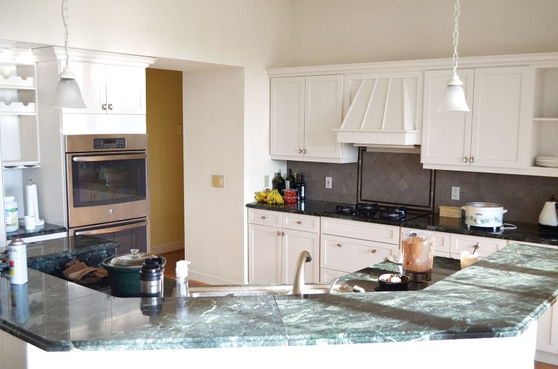
On the surface, renovations to the home, built in 1996, focused on stripping away outdated trends. Out went the honey-toned oak flooring and Palladian windows. Gone are the pale-pink laminate countertops in the master bath and, most notably, the colonnades encircling the dining room and living room.
“The three of us roundtabled,” says project manager Rocky deStefano. “The homeowner, Ken and I walked through the house and discussed what needed to be done—taking down the columns, opening up the space. The home has a traditional craftsman exterior and our task was to create an interior that was as contemporary as possible. There were a lot of niches, trim work and angles that we wanted to remove. Our philosophy was less is more.”
Yet, look deeper and you see the most extensive changes—executed by deStefano and his team—are all about maximizing the home’s utility. As empty nesters, the couple was ready for the main floor to revolve around their needs, so they made compromises like giving up a full bath in the hallway in favor of an expanded office. Closing off part of the stairwell to the lower level extended the main floors usable space and created an easier flow from the great room to the breakfast nook and kitchen.
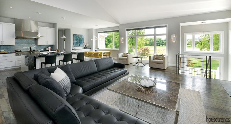
The original kitchen ceiling was vaulted. “We brought it down to 10 feet to make the space much more inviting,” says deStefano.
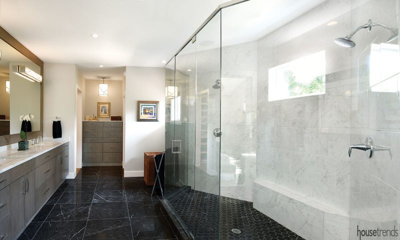
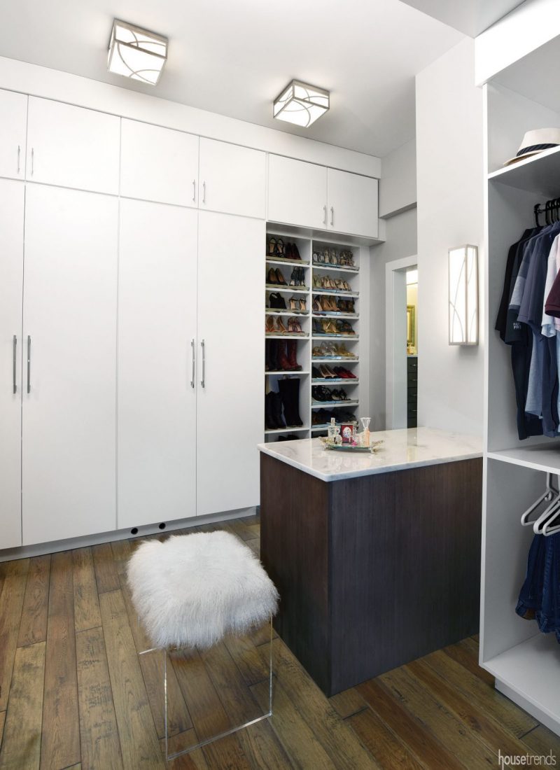
Renovations to the master bath, which is situated behind the kitchen, scored more points for easy living. By reconfiguring the existing footprint, flipping the placement of the sinks and shower and removing extraneous cabinetry, the couple got a spacious shower and a direct connection from the closet to the laundry room—all without sacrificing the deluxe walk-through closet.
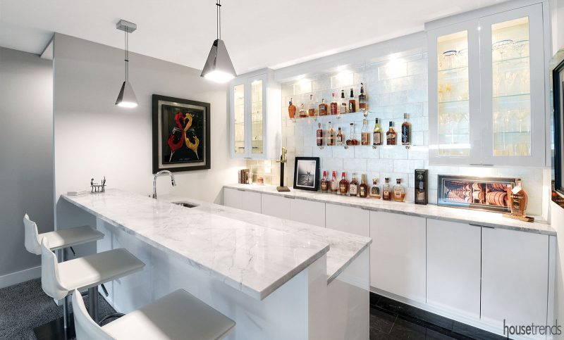
While the amenities of the first floor afford the couple the option of never venturing downstairs, the fully remodeled lower level isn’t reserved for guests. They fully utilize features including an exercise room, steam shower, full bar and a flex room—which is outfitted with a Natuzzi sleeper sofa for guests but mostly functions as an office. Amply lit by well windows, the lower level living room feels so much like an apartment unto itself that it’s where the couple heads for movie night.
“If we’re going to sit down and watch something, we come down here,” she says.
A “minimal” makeover
To truly feel comfortable, the couple knew the home’s décor needed to shift from ‘90s traditional to minimal and modern. The clean aesthetic starts with a simple backdrop: white slab-style cabinetry, just one wall color and a palette of charcoal, cream and taupe shades.
With that canvas in place, they injected interest and personality through high-impact furnishings and finishes.
“Because we have such a simple style, every piece had to stand on its own,” she says.
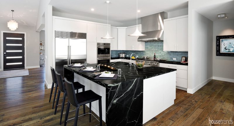
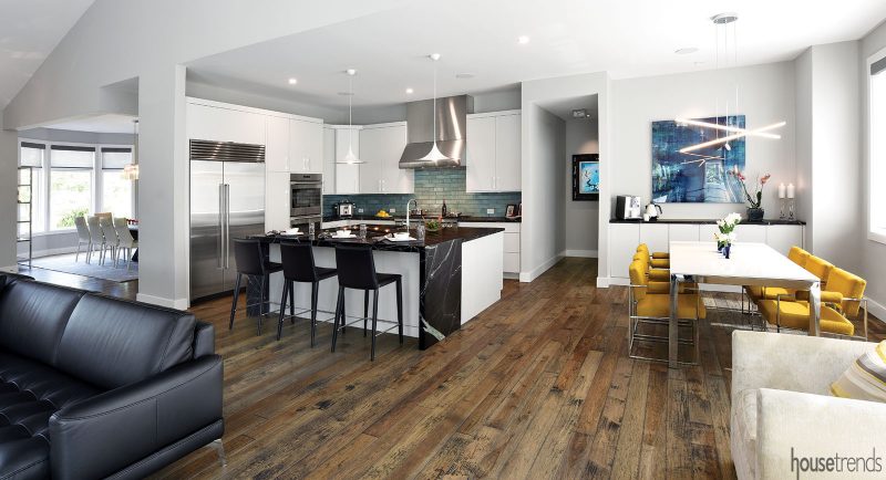
White veining strikes through the deep black of the Brazilian soapstone kitchen countertops, while the smoothness of this surface and others is countered by textured elements. Clean-lined elements like the leather seating are punctuated by eye-catching details—tufted seats, exposed metal frames and tidy tailoring. There’s the quartzite tile that ascends from floor-to-ceiling on the fireplace wall, and the five-inch hand-scraped hickory flooring that runs throughout the main floor.
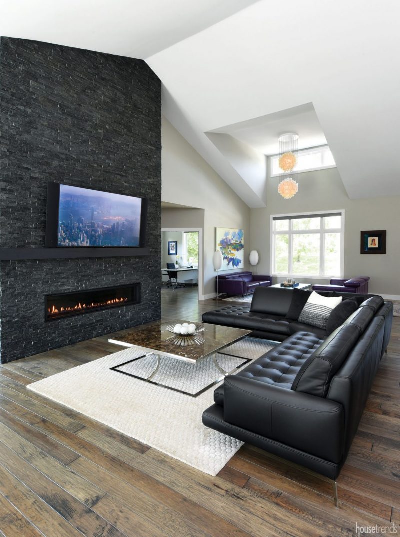
Coming from the West Coast, where tile flooring is the default for open living spaces, the homeowner originally wanted tile throughout the first-floor common areas. But, deStefano convinced her otherwise, mainly due to the fact that two full-grown German Shepherds live in the home as well.
“I thought it made sense to install a floor that could hold up to those active dogs,” deStefano says. He suggested a wood five-inch wide distressed hickory plank that could take a bit of abuse. The flooring was finished with an Aged Whiskey Barrel stain to bring in shades of gray for a more contemporary look.
“It’s now one of my favorite features,” the homeowner says.
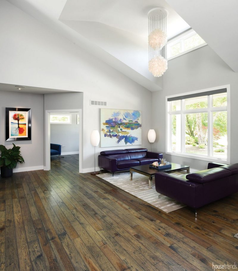
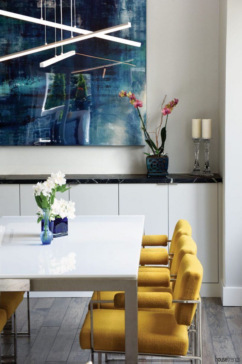
Meanwhile, the statement-making lighting does much more than stand-alone: It elevates everything around it. Cascades of mother-of-pearl shells accentuate the vaulted ceiling in the living room and foyer, for example, while three LED bars suspended in the breakfast nook play up the contemporary sheen of the table below.
Coming home
The owners acknowledge that the extent of the home’s overhaul begs the question: Why buy this house, if you planned to completely gut it? Accustomed to fielding this inquiry, she says the home had three major selling points:
1 It provides a short commute for her husband.
2 It’s in the Heritage Club golf community. This was a priority, given that they were new to town, are empty nesters and that her husband travels frequently for work. “It’s a great way to meet people,” she says.
3 Most importantly, something about these sun-filled rooms spoke to her. “This feels more like home to me, coming from the West Coast,” she says.
Now that the yearlong interior remodel is complete, the couple has some massive outdoor projects in mind for the future. But for now, they’re taking a pause and enjoying feeling settled at last.
Article by Amy Howell Hirt/Photos by Daniel Feldkamp
RESOURCES
Builder deStefano Homes & Remodeling
Architect Kenneth R. Bowerman Architect, Inc.
Custom stair railing 1st in Design
Plumbing fixtures Kohler, Ferguson
Tile Louisville Tile
Countertop fabricator Take It For Granite
Whole home av Custom Electronics Group
Closets TopShelf Exquisite Closets
Windows and doors Jeld-wen, McCabe Lumber
Paint Sherwin-Williams, Repose Gray, S&P Painting
LIGHTING Verner Panton Fun in living room and foyer; George Nelson, Cigar Lotus floor lamps in living room; Sonneman in breakfast and family room; Roost, Lotus Flower in master; Gubi, Semi-Pendant in kitchen
FURNITURE Cattelan Italia Isabel High Back dining chairs, Domicil Aero living room sofas, Bracci family room sectional, Lazar, Flamingo master sitting chair, all from Bova
Kitchen bar stools Bottega, Design Within Reach
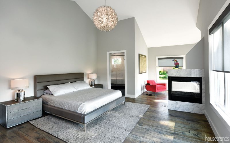
Master bed Italia Panel Horizontal, Restoration Hardware
Master nightstands & dresser Saunderson Shagreen, Restoration Hardware
FLOORING Hand-scraped Hickory, West Chester Flooring
Rugs Esker master rug, Design Within Reach; Amelia foyer rug, Dash living room rug, Poiret family room rug, all from Mitchell Gold + Bob Williams
Window treatments Qmotion Shades
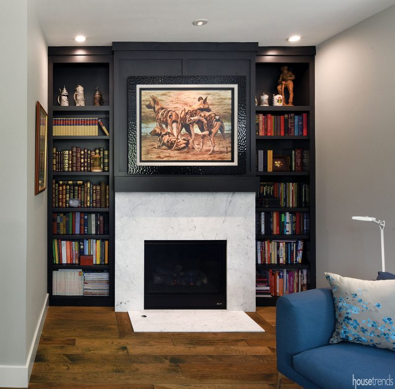
Fireplaces Heatilator in family room and master, Reading Rock; Superior in office, Brick Tec
Family room surround Realstone Shadowstone Midnight Sky
Master and office fireplace surrounds Carrara marble, Take It For Granite
Office bookcases and both mantels C&W Woodworking
KITCHEN
Cabinetry Kemp Cabinetry, Sims-Lohman
Countertops Brazilian Soapstone, Mont Granite
Backsplash Realstone, Sea Foam Glaze
Appliances Asko dishwasher, Wolf 48” Rangetop w/double griddle, Wolf oven, Sub-Zero refrigerator, all from Custom Distributors
MASTER BATHROOM
Countertop Shadow Storm marble, Daltile
Sink Ladena
Faucets Alteo
Shower Atlas Concorde Eon Carrara
Floor Luxury, Nero Marquina
Shower Surround Russ’s Glass
LOWER LEVEL
Appliances Sub-Zero wine refrigerator, Scotsman ice machine, True Undercounter Refrigerator Drawers, all from Custom Distributors
Bar Super White marble, Daltile
Stools Bottega, Design Within Reach
Backsplash Lucian Metallic, Ann Sacks
Sectional Lazar, Alba, Bova
Fireplace Brick Tec
Surround Luxury, Nero Marquina
Pool table A.E. Schmidt, Lexington Billiards & Spas
Pool table and bar lighting Blackjack Lighting
Carpet Karastan, Pleasant Tones
Window treatments Hunter Douglas, Stampers
Article appeared in Housetrends Cincinnati – October/November 2019

