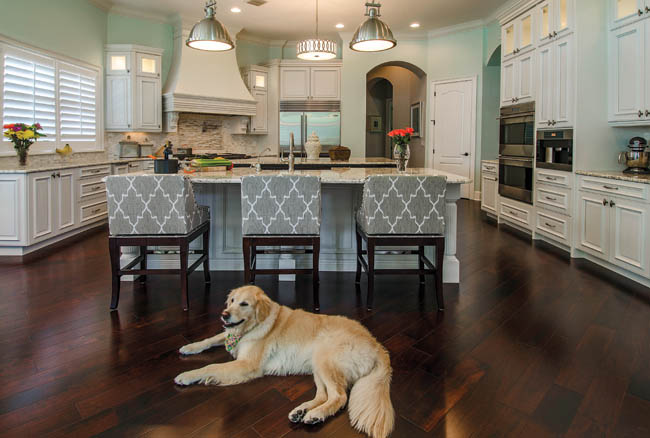
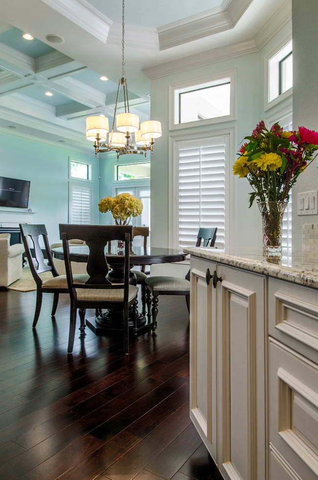
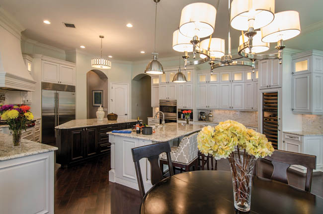
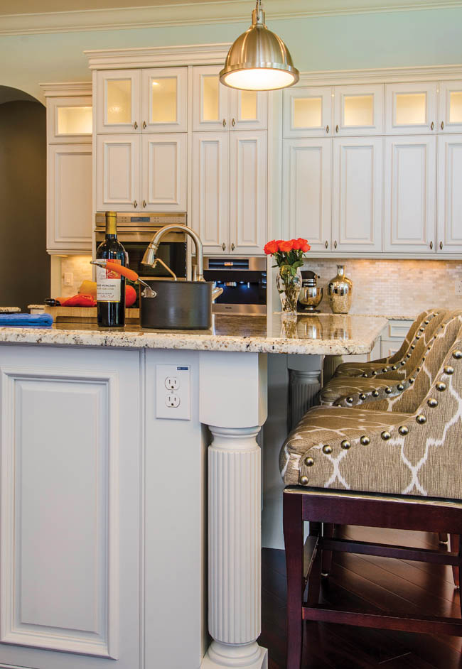
In the mornings, an Odessa stay-at-home mother brews a mug of freshly ground coffee and fixes her 2-year-old daughter breakfast. The kitchen luxury that greets the duo upon rising is a coveted kind—pearl and bluish-gray tones, maple cabinetry and a bevy of custom amenities. “We wanted a light, fresh look,” the homeowner says.
With help from a skilled team, including Anita Taylor of Custom Designs Cabinetry in Tampa, they got it. “The homeowners were looking for something you’d consider just a simple elegance, and based on that, we created the design,” Taylor says. “It was a total collaboration.”
For the wall color, they chose Topsail by Sherwin-Williams—an airy, water-like choice that would provide a calming backdrop.
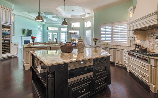
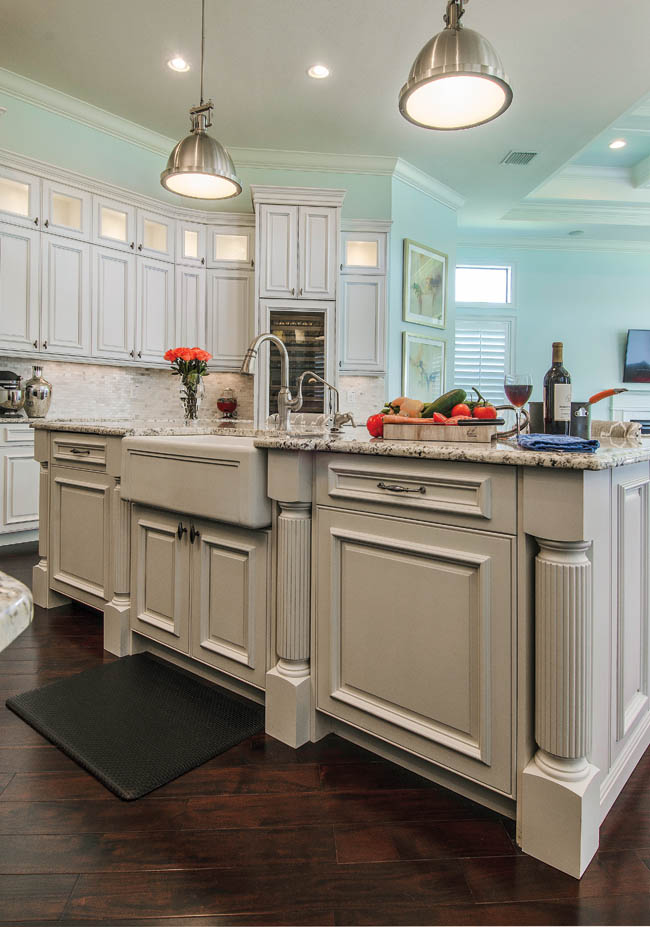
They opted for maple cabinetry and two large islands, too. “Anita had some great ideas about design. And this was the first time I did something like this, so I shared with her a lot of features I really liked,” the homeowner says. “I enjoyed the whole process from start to finish.”
White-painted cabinets were a must, and the color was tailored to the homeowners’ preferences. In fact, the current hue was tweaked so specifically that it cannot be duplicated or found in stores.
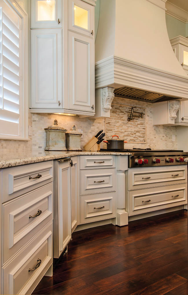
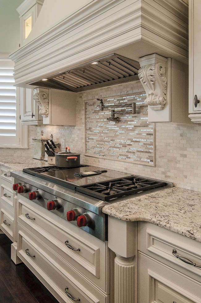
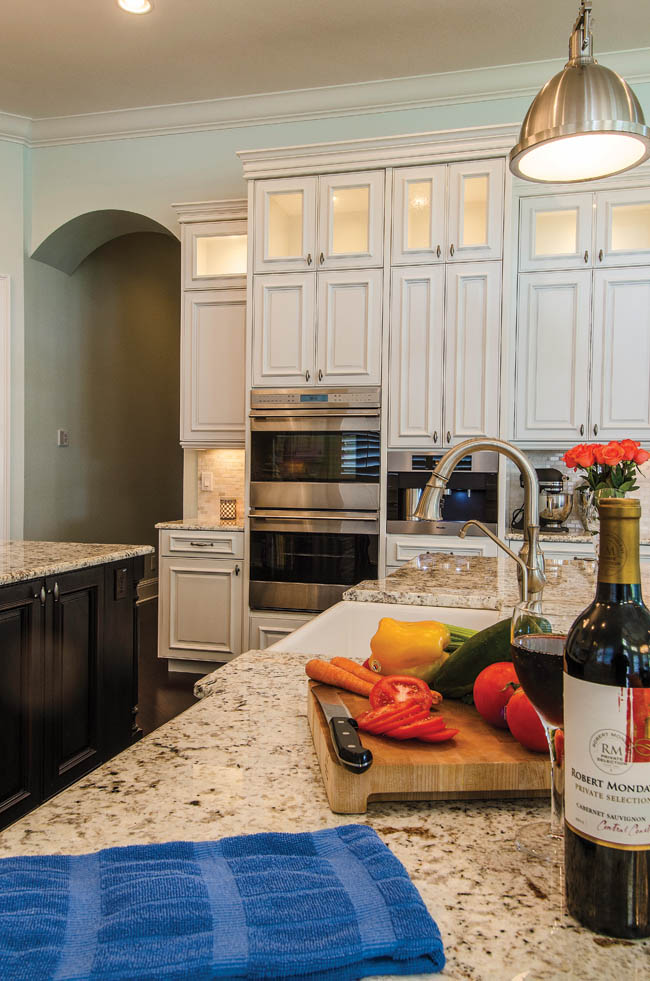
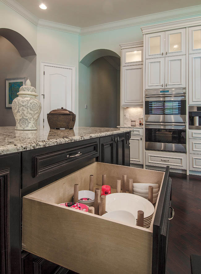
The homeowners wanted a range with a central griddle and four burners, as well as a pullout microwave drawer to preserve space. The large wine fridge and the built-in coffee maker have become two of the homeowners’ most beloved conveniences.
Because of their Italian backgrounds, the homeowners knew that a pot filler behind the stove would be imperative for cooking large quantities of pasta at parties.
When guests visit, they congregate around the islands and delight in European cuisine and vino. “The homeowners have a large extended family and their home has become the gathering place,” Taylor says. “We knew they’d be entertaining family-style in the kitchen a lot. One large island doesn’t handle enough platters for an Italian family.”
Guests at the soirees tend to comment on the diverse elements in the kitchen that they may not have seen elsewhere. Whether it is the mini subway tile backsplash, the beige-and-white upholstered chairs at the bar counter, the industrial lighting fixtures, or the White Galaxy granite, each feature fits together seamlessly in this so-called “transitional” space.
“The cabinetry is very traditional, so we wanted to mix some modern elements in there to make it more of a transitional style,” the homeowner says. “I didn’t want it to be totally traditional.”
Taylor, designer Fred Johnson and the homeowners worked in concert to achieve this look. “They have 12-foot ceilings so we suggested the backlit, glass door cabinets to take advantage of the height and we knew we wanted to feature the chimney standalone hood,” Taylor says.
“Then, rather than just put up standard 42-inch cabinets, we decided to go up to 54-inches, and the beauty of custom is that we can make it any size,” says Taylor. “We’ve increased the depth of our uppers to 13 to 14 inches because plates are just getting larger today.”
“People are looking for that clean look,” Taylor says. “Although the cabinetry is a little transitional, the lighting brings that kitchen back down into an age range for 30-year-olds. It’s pretty hip.”

