Ezra and Skipper Singer’s beachfront condo in St. Petersburg overlooking Tampa Bay was a dark contrast to the bright seascape just outside the window. If the condo was a weather forecast, the interior was overcast, while outside it was sunny with a chance of more sun. Skipper describes the former décor as having a heavy feeling, with dark faux paint in the foyer, brown doors and thick drapery. “Our whole goal was to lighten and lift and have something beautiful, but with a pop of color,” she says. Another goal was to maximize the natural light that streamed in every day from the windows that surround most of the condo. And, as the elevator doors open directly into her foyer, she wanted there to be a “wow factor” upon entry.
A bright vision
Skipper and Ezra worked with interior designer Pamela Harvey, owner of Pamela Harvey Interiors in St. Petersburg and Virginia, to brighten up the space and to make it clean and fresh. “She was right in sync with what our vision was,” Skipper says.
“The old space was much darker and felt dated. Just walking in, you can tell when the building was built and could put a time stamp to everything,” says Harvey.
Few things are brighter than white, which was incorporated in abundance throughout the 3,000 square-foot, three-bedroom condo, along with pops of coral and blue to reflect the beach setting and to add a dose of what Harvey calls “coastal elegance.” She also wanted to create a soothing environment but with a fresh and up-to-date look.
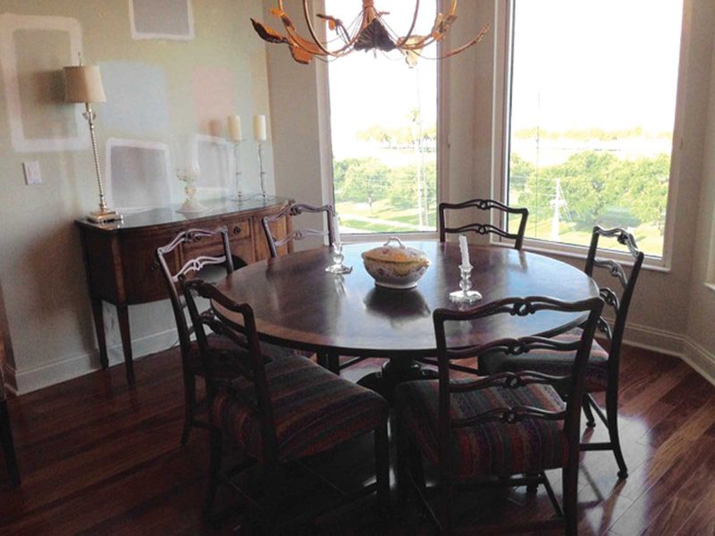
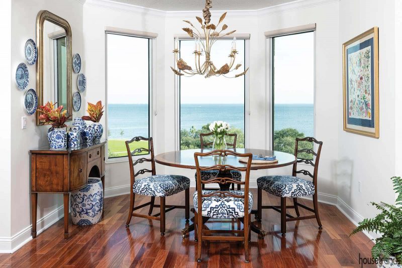
Skipper did not replace all of the furniture that she and her husband brought with them when they moved to St. Pete from Columbus, Ohio several years ago. For example, the existing dining room table and chairs were given new life, as updated accessories now surround them, such as the mirror that reflects the bay.
Perhaps the room that underwent the most drastic renovation was the kitchen. Originally, the space featured a bar-height countertop and a pantry that jutted out in the middle of the room. Harvey eliminated the back of the original bump bar and made it one level, taking it to counter height, which made the kitchen feel more open. She also took out a hodgepodge of cabinets in the left corner and converted them to one big pantry, allowing for much more storage space.
The former cabinets were all glass but closing off two of them also gave her more storage space and made that area more functional. The brown cabinets were spray lacquered white, and black appliances were replaced with stainless steel. To warm up the space, Harvey added copper accents and placed handcrafted paper in the backs of the open cabinets in a coral color and installed uplighting. She also removed the black marble backsplash, replacing it with white subway tile.
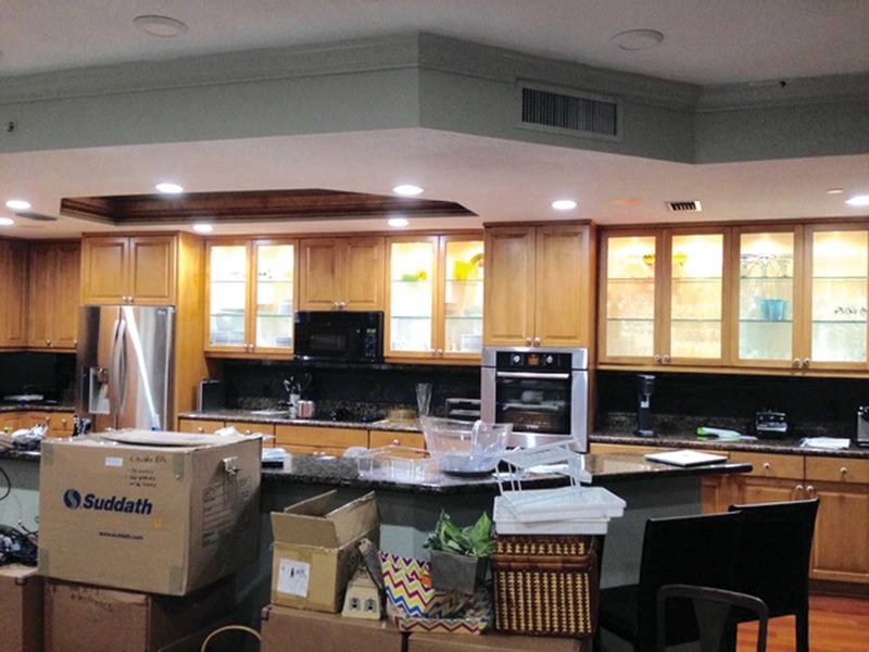
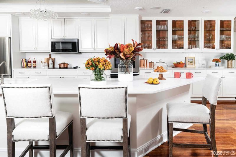
Skipper also points to her one-bowl sink and coffee station as additional details that she enjoys. “We love the kitchen now. It’s light and bright and up-to-date and very functional. We’re thrilled,” she adds.
A timeless and cheerful design
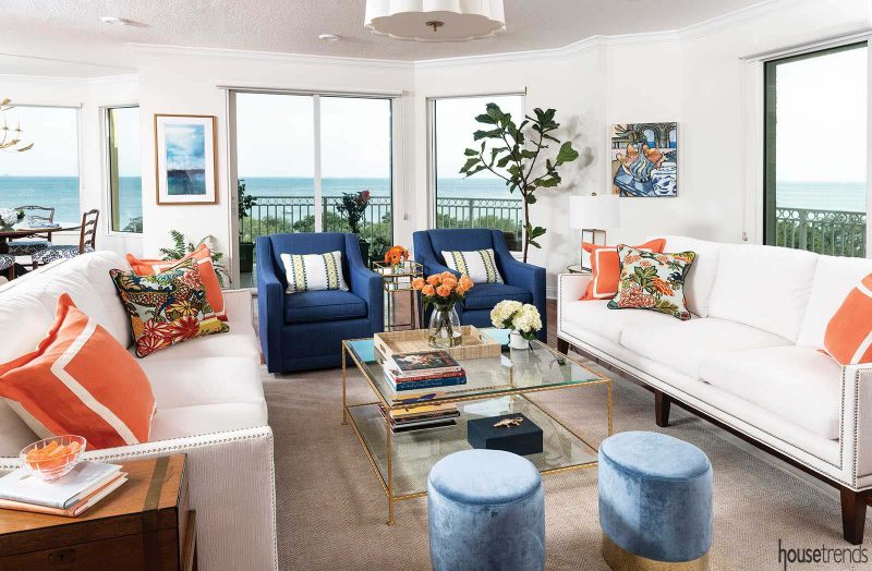
Skipper incorporated a white, blue and coral color scheme in her favorite room—the living room—with white sofas and coral accent pillows, navy blue swivel chairs and powder blue stools. The white walls are decorated with several paintings that pull the blues from the furniture and from the waters of Tampa Bay.
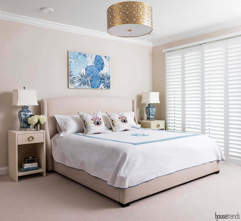
The colors in the master bedroom are neutral, with timeless tan walls and blue accents such as lamps and a painting hung over the bed. The gold light fixture plays off the gold accents elsewhere in the room. Beyond the plantation shutters is a balcony and another stellar view of the bay. The blue accents are reflected in the adjacent master bathroom.
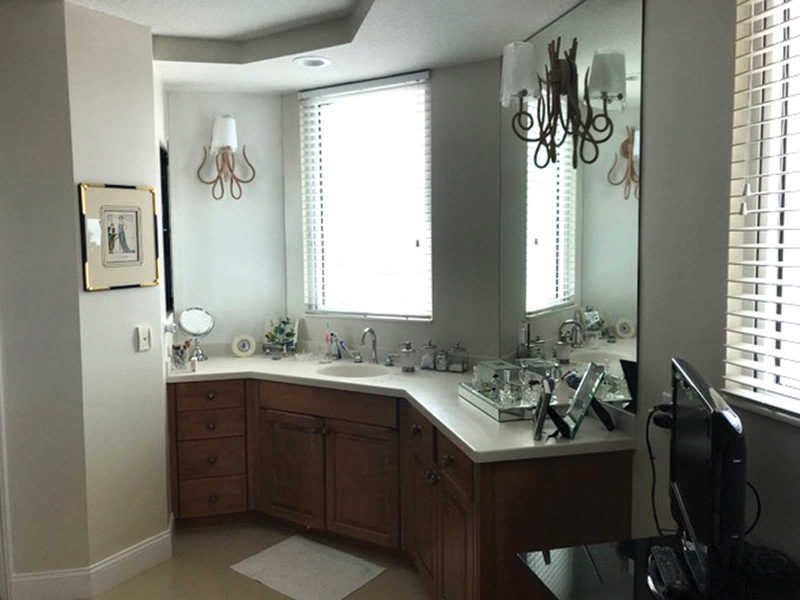
It may look like a full renovation was done to the master bathroom, but in reality, there was not much disturbance to the space. In keeping with the home’s color scheme, dark cabinets were painted white and the walls painted periwinkle blue. She kept the existing countertop but removed the builder’s grade mirrors and installed custom ones with ivory edging, and she switched out the silver accents for gold. The room was large, but Skipper had no place to sit down to apply make up. Harvey added a freestanding white vanity with a decorative quatrefoil-backed chair, which also served to fill an empty space.
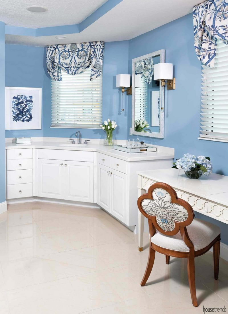
There are two other bedrooms in the condo, which Skipper converted into offices for her and her husband, keeping a pullout couch in one of them for use as a guest room.
Harmony in color
Another room that underwent an overhaul was the powder room, which Skipper says she loves. The blue paisley wallpaper replaced the yellowish-brown faux paint and a white pedestal sink looks regal resting on top of 12×24-inch white matte tile that is laid in a herringbone pattern.
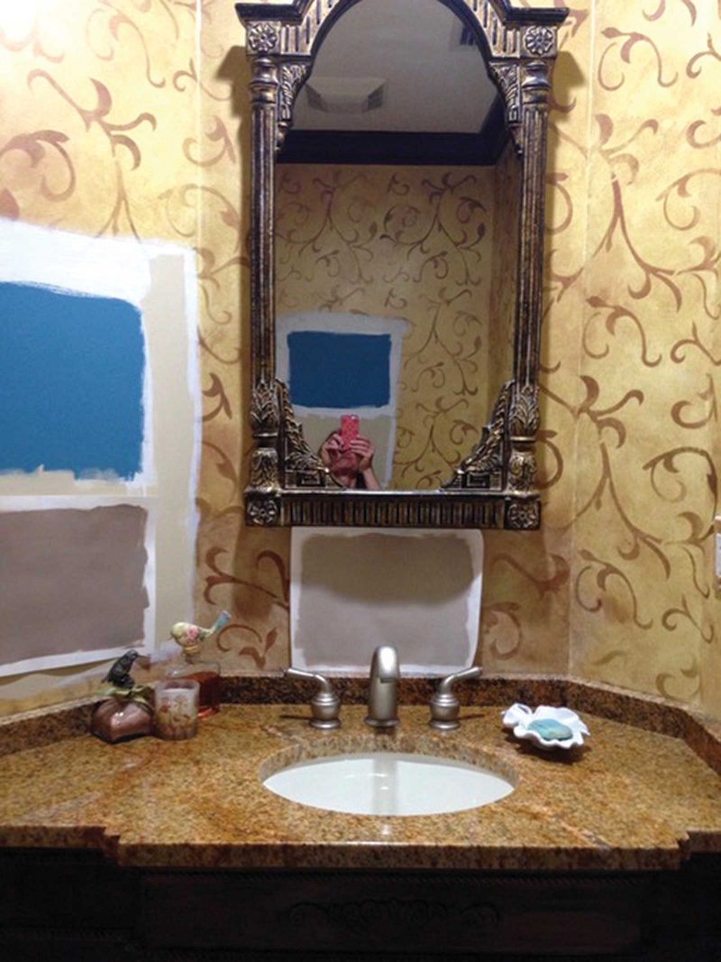
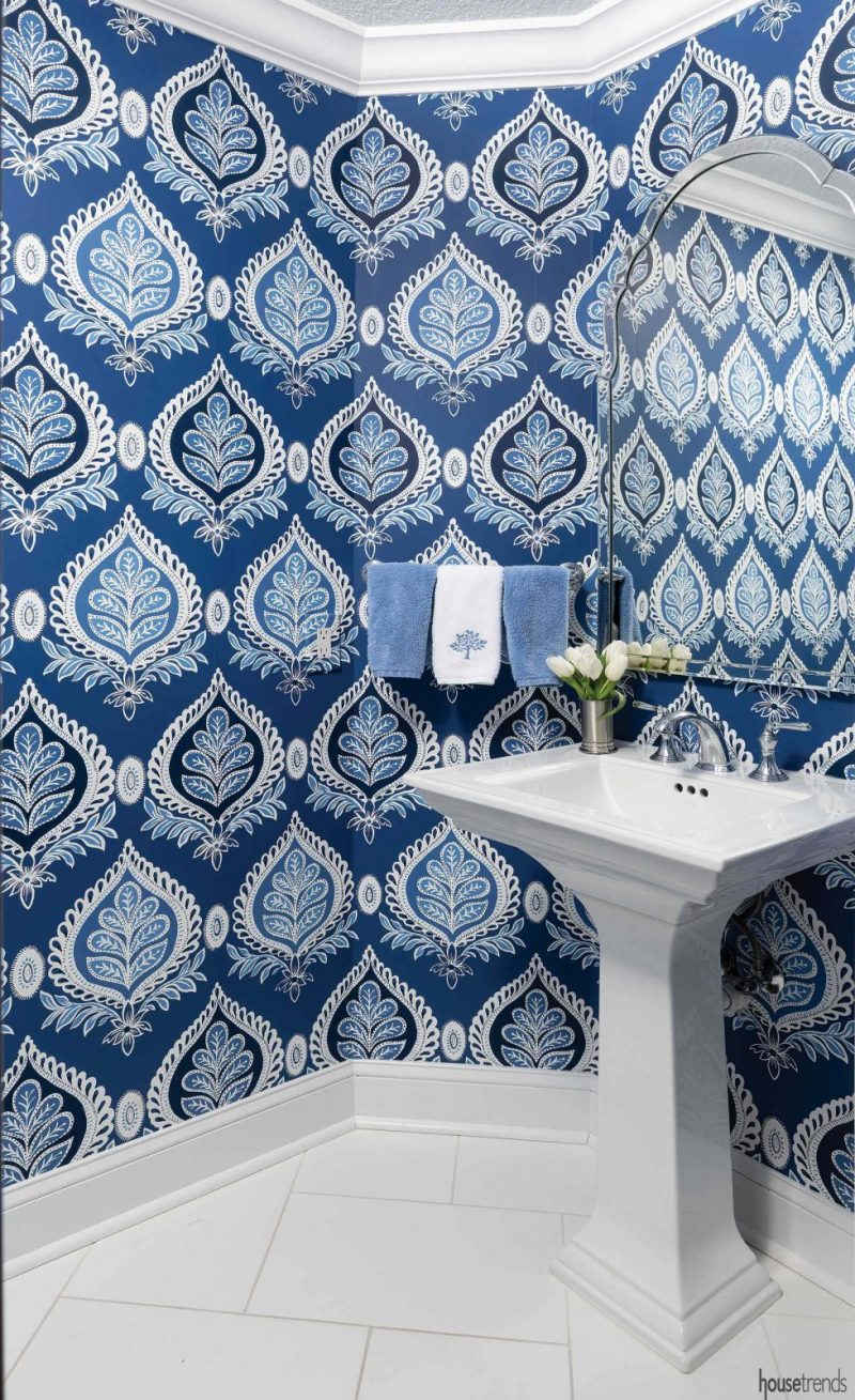
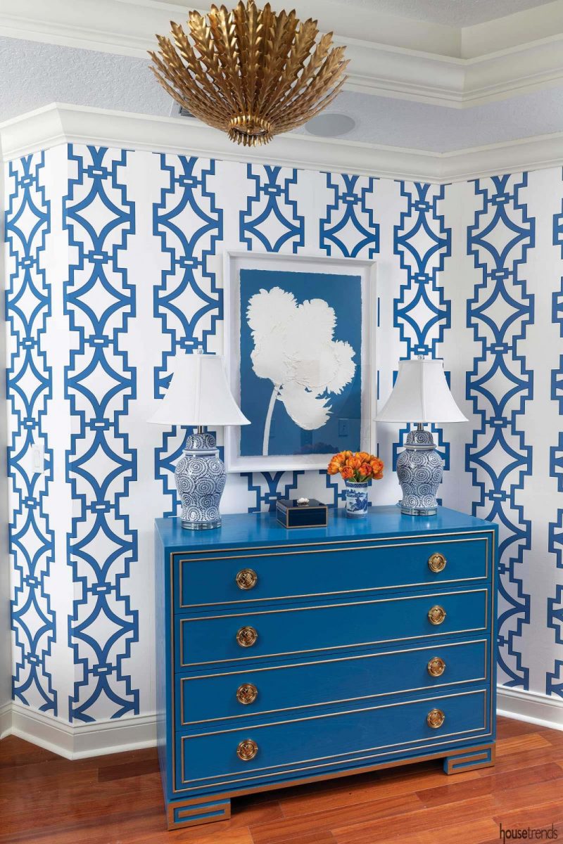
The formerly drab foyer, which had been painted to resemble brown wood, was updated with a bright blue cabinet, patterned blue wallpaper and other blue accents, is now welcoming and bright. “My favorite area is right off the elevator. It is nice to have that feeling as soon as you walk in the door; it gives you the sense of how the entire condo should feel,” says Harvey. “The new space has a better connection to the water view. The colors seem to work better with Mother Nature. It’s more harmonious and doesn’t have the contrast it used to have.”
Skipper is thrilled with the renovation. “I love standing at my kitchen sink and looking out into my living room to see the view of Tampa Bay.”
RESOURCES Interior designer Pamela Harvey Interiors; Lighting Circa, Barbara Barry; Upholstery Thibaut; Schumacher; Kitchen cabinetry finish Benjamin Moore White Dove Lacquer; Kitchen countertops Cambria; Kitchen backsplash Tile Shop; Master bedroom paint Benjamin Moore Edgecomb Grey
Article by Hilary Daninhirsch/Photos by Joe Traina
Article appeared in Housetrends Tampa Bay – July/August 2019
To see another home with elegant blue details, search: Brass and blue details

