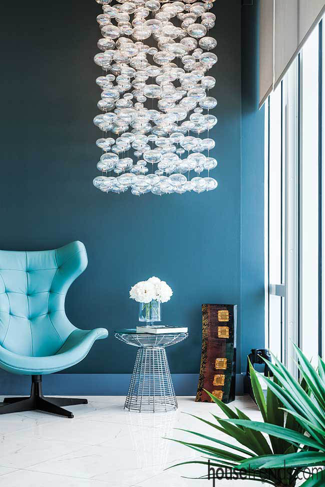
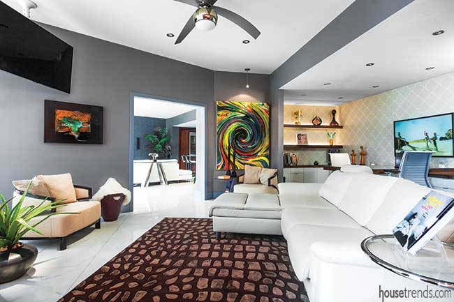
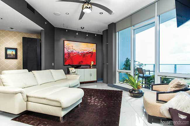
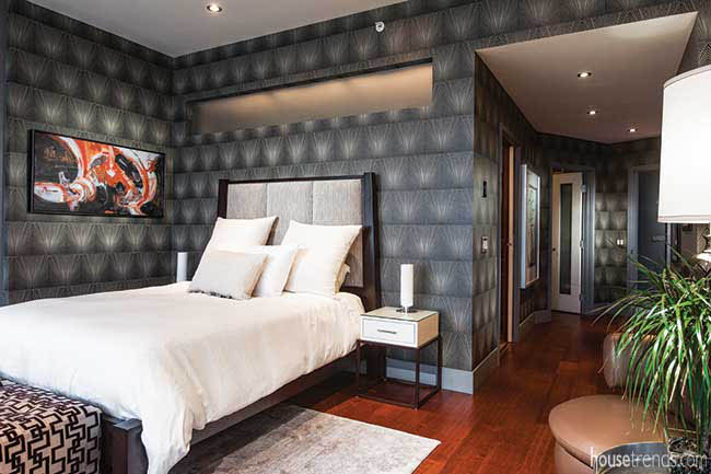
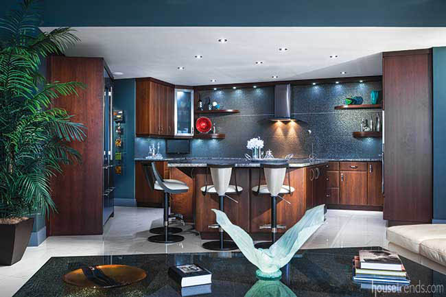
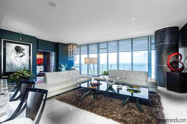
Modern and “Manhattan chic,” best describes this remodeled condo in downtown St. Petersburg that has an art gallery feel with sophisticated livability. The 2,350-square-foot, two-bedroom, three-bathroom residence located right in the core of the city, boasts a stellar, shimmering view of Tampa Bay, and accommodates the semi-retirement lifestyle of its owner, Kenneth.
“I still entertain customers at my condo and I entertain my family too. Everybody loves to come to Florida, so they come visit me from St. Louis, Detroit and Texas,” Kenneth says. “I have a den where my audio and stereo equipment are, and it’s a good gathering place for everyone.”
Accentuating the positive
Kenneth had already lived in the building, but wanted to relocate to a larger suite. He purchased the unit and then enlisted the help of close friend and interior designer Rita Bateman. “It all started when I first gave Rita a call and she had some really good design ideas for me,” Kenneth says. “The lighting plan was what excited me the most about the renovation; it completely opened up the place. Accent lights over the paintings really helped the look. Rita dropped the ceiling about three inches and added more LED lights. Those two items really helped, in my opinion, to enhance the place.”
Guests typically comment on the ample art throughout the condo. “Rita helped me pick out some paintings, and some prints, at the Salvador Dali Museum nearby. Also, two local painters from St. Pete did some of the artwork in my place,” Kenneth says. “I really gave Rita free rein in terms of design. I was excited because Rita is a contemporary designer, and I knew she’d do something incredible and modern with the space. Everyone who comes over loves it. It’s nice and comfortable, and everybody seems to be very excited about it.”
The transformation was undoubtedly dramatic. When Bateman initially approached the project, the interior of the condo was outdated and dull. “The guy who owned the condo before me leased it out to a couple for a while, and it was in pretty bad shape. It was only two or three years old when I bought it. It just didn’t have the pop then that it has now,” Kenneth says. “It had wood floors and it was bland overall. Rita had some really good connections for artwork and décor, so she was able to decorate the space nicely with unique items.”
Invigorating spaces
Reconfiguring the layout and optimizing space utilization were some of Bateman’s challenges. “The original kitchen was very awkwardly done. The appliances weren’t evenly placed around the kitchen and it was lopsided. The cabinetry wasn’t the highest quality either,” Bateman says. “The floors were a combination of wood and carpet, which were both pretty dated. The bathrooms were nothing spectacular but I could tell they had a lot of potential.”
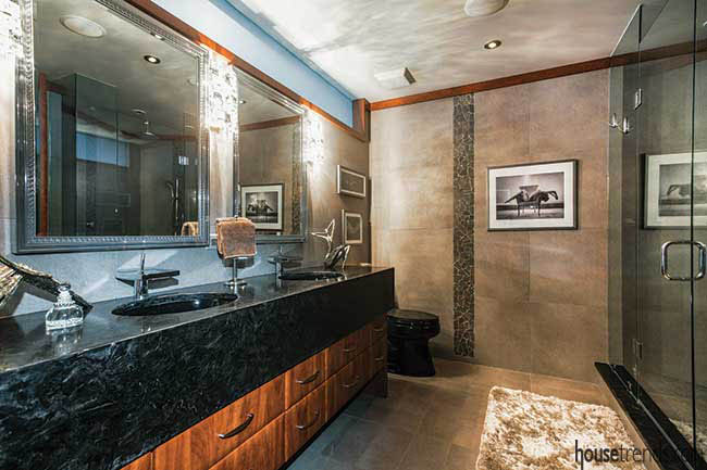
So Kenneth and Bateman brainstormed. “We came up with a couple of designs and picked out one that was a bit sultry,” Bateman says. “The master bathroom has a bit of a romantic feel to it. We even increased the size of the shower—it’s a very functional space.”
For the lighting concept, the condo had concrete ceilings, so the lighting was restricted to a few electrical outlets. They ultimately added a drop, false ceiling in order to extend the amount of light in the unit.
The living room went from having one outlet to nine LED dimmable ceiling lights. “We also added some art lights to highlight some of Kenneth’s really nice pieces scattered throughout the space,” Bateman says. “I’m very connected to local artists in the St. Pete area. I have representatives who are always sending me options. I always encourage my clients to utilize local artists’ paintings, sculptures and glasswork, because it supports the local community.”
Capturing the view
Bateman also selects one-of-a-kind pieces from upscale furnishing stores such as Scan Design and Clive Daniel Home. “I was going for what I call ‘Manhattan chic’ for this condo. One entire side of the condo, from the den to the living room, is all pretty much glass, so you’re looking directly out over the bay. During the evening, you can see the twinkling of the city lights,” Bateman says. “I wanted to do something that was complementary to the bay views. The shades of gray really worked well with the blue bay water and blue skies. I was very pleased with how everything turned out. It’s upscale but it’s not overly complicated or fussy. It’s sophisticated and beautiful.”
Resources: Contractor: Mike Franzek, Avid Construction Service; Interior designer: Rita Bateman, Your Design Envy; Lighting: WAC Lighting, Electric Lighting; Paint: Benjamin Moore; Painter: Terry Dupree, Dupree Painting, LLC; Wall treatments: Candice Olson, DiMarco Enterprises; Furniture: Scan Design; Home Resource; Doma Home Furnishings; Cantoni; Custom furniture: T2TheS Design/Build; The Sarasota Collection Home Store; Flooring: Yeager Flooring; Tons of Tile; Window treatments: Lutron, Douglas H. Kresge, LLC; Window treatment installation: Mike Bertoniere; Cabinetry: R&J Custom Cabinets; White’s Custom Cabinetry; Countertops: Mont Krest Granite & Stone; Countertop installation: Five Star Stone, Inc.; Kitchen backsplash: Del Conca, Tons of Tile; Sinks and faucets: Kohler, Ferguson; Plumbing installation: Clearwater Plumbing; Custom glass and mirrors: Coastal Glass; Artwork: Laura James; Patton Hunter; Claudia Strano; Marc Levasseur

