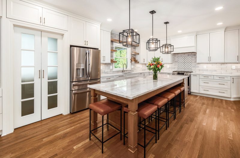
It’s easy to imagine there would be no angst about what to make for dinner in a kitchen setting so serene. A vibrant bouquet provides a pop of color in a mostly monochromatic—but never dull—color scheme. In fact, the predominance of white hues injects a freshness and sense of vibrancy to this tranquil space.


Decades in the making
Twenty years ago, Tom and Lori Alas moved from Florida into their current home in New Albany, which they loved. Fast forward some 18 years and, as so often happens, their kitchen had become dated. Dark and cramped, the space cried out for a renovation. The goal? Lighten, brighten and expand. “If we hadn’t, I hated the kitchen so much that we would have had to move,” Lori says with a laugh.
The couple engaged the team at Kitchen Kraft and the shift began with what Justin Owens, production manager, deems the “discovery phase.” Before tackling aesthetics, the team analyzed how the proposed renovation would work relative to structural changes, the potential for moving load-bearing walls, and any mechanical challenges.
Justin confirms that there weren’t any out-of-the ordinary challenges, thanks to this discovery phase and prep work done ahead of time. “Nothing was particularly problematic because we mapped it out in advance,” he says.


Reallocating space
In this case, Kitchen Kraft converted a mostly unused formal living room into a dining room that not only compliments the kitchen but also achieves continuity between the two areas. After removing an entire wall (thankfully not load bearing) and a set of ornate columns that didn’t mesh with the rest of the surroundings, doorways were also widened. Now, the first floor is a large open space where flow, positioning and space prioritization intersect, making it perfect for entertaining.
“We entertain almost every Sunday for sports, so we wanted people to be able to spread out,” explains Tom.
Spreading out meant the location of kitchen itself shifted, as did the roomy walk-in pantry. The natural light streaming in from the window above the newly placed undermount sink bathes the room in sunlight, while the trio of eclectic light fixtures adds additional light and style.


Center stage
But it’s the island that occupies pride of place. As is typical in many kitchens, everyone congregates around this centerpiece. Just as the overall space was expanded, lightened and brightened, so too was the island. Lori knew she wanted light wood cabinetry here to contrast with the creamy white of the perimeter cabinetry, and it was a stroke of luck that she found the accompanying quartz countertop.
“It is my absolute favorite,” she says. “We found it as we happened to be walking out of the showroom. There was the Taj Mahal right there!”

The classic white of Taj Mahal is layered with delicate gold and gray veins. The Ethereal Glow quartz that lines the room’s periphery also has a soft white base with subtle patterns underlaid throughout. Together, and in tandem with cabinetry including the glass-fronted portions and exquisite trim details, and the white and soft gray tile backsplash which resembles historic brick—they create visual interest.

Modern conveniences
A suite of new appliances offers countless conveniences. The Fisher & Paykel dual dishwasher has two drawers, allowing two loads to run—quietly, of course—either separately or at once. A GE cooktop and refrigerator, along with a Sharp microwave drawer in the island, round out the package. In a move toward efficiency, the kitchen houses a pull-out spice drawer and other custom organizational compartments.
A walk-in pantry is accessed through double glass-paneled doors and has a window of its own, allowing in plenty of natural light. In here, a coffee station features a Keurig, with its own pot filler faucet, and a drawer designed for storing coffee pods just below. The bar area in the main kitchen features a built-in single tap Marvel kegerator, a beverage fridge and a Bartesian cocktail maker, all ensuring that no guest will go thirsty or be without a plethora of drink options.

Ultimately, Tom says, the quality of everything in the new kitchen is a terrific value-add and is “just superb.”
At once sophisticated yet welcoming, the space has a timelessness that ensures no move will be necessary for many years to come.

RESOURCES Design and construction Kitchen Kraft Inc. Cabinetry Bridgewood from Kitchen Kraft Backsplash tile Bricklane Countertops Quartz, Konkus Marble & Granite Sink Create Good Sinks Faucet Kohler Appliances Fisher & Paykel dishwasher; GE cooktop and refrigerator; Sharp microwave; all from Jack’s Appliance Kegerator Marvel Single Tap Pantry window Pella
Article by Lee Rhodes | Photos by Columbus Pics
Article originally appeared in March 2023

