Serene and spa-like best describe the remodeled master bathroom in Stephanie Triko and Rob Schuler’s downtown St. Petersburg condo. Set on Beach Drive in the core of the city, the condo was built in 2007 and boasts Tampa Bay views from all angles. The three-bedroom, three-and-a-half bathroom unit was redone in 2013 by the previous owners, and Stephanie and Rob purchased it in July 2017. They fell in love with the views but knew they would have to renovate the master bathroom to suit their needs.
The bathroom revamping, which began that October, was a collaboration between the condo owners, interior designers Bruce Laughridge and Ron Haynes of Urban Innovations, Inc., contractor Mark Zdrojewski of Strobel Design Build, and cabinet maker Michael Bright of Bright Wood Works.
A beautiful blank canvas
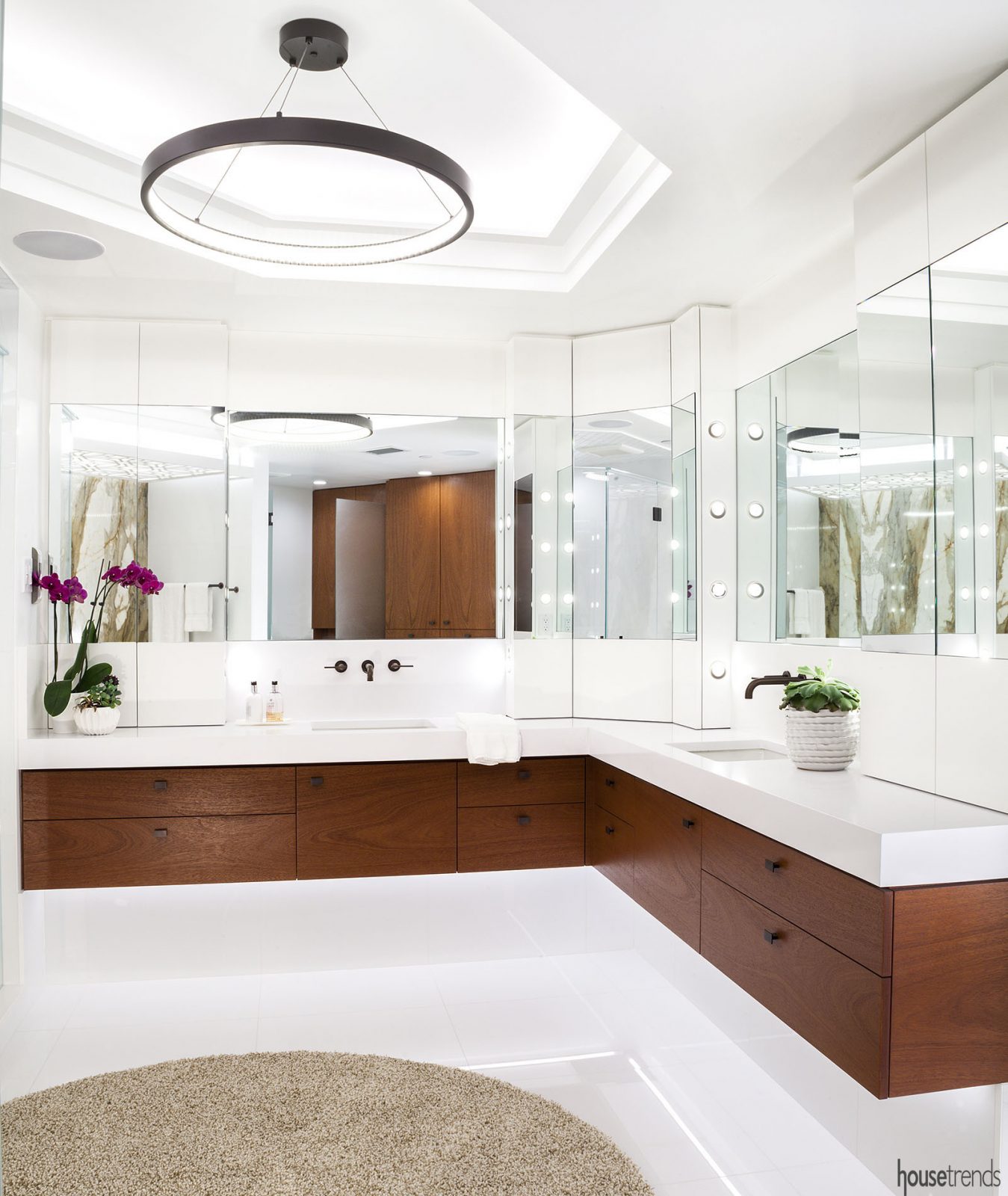
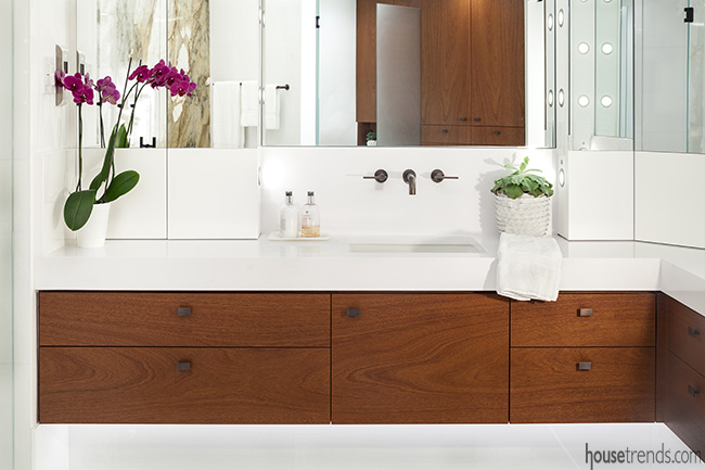
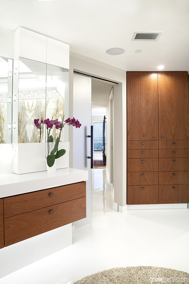
The space now features a sleek white aesthetic, floating vanities, undercabinet and overhead lighting, and marble focal walls. “At first, the biggest problem with the bathroom was that it was so closed off from the rest of the master suite. When you’re standing in the bathroom, you have a view of the hallway right out to the bay,” Laughridge and Haynes say. “The homeowners did want it to open up more and take advantage of that view. They also wanted to do something modern.”
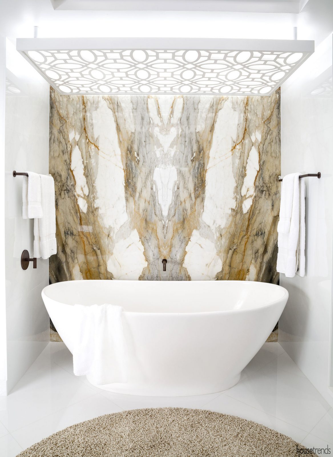
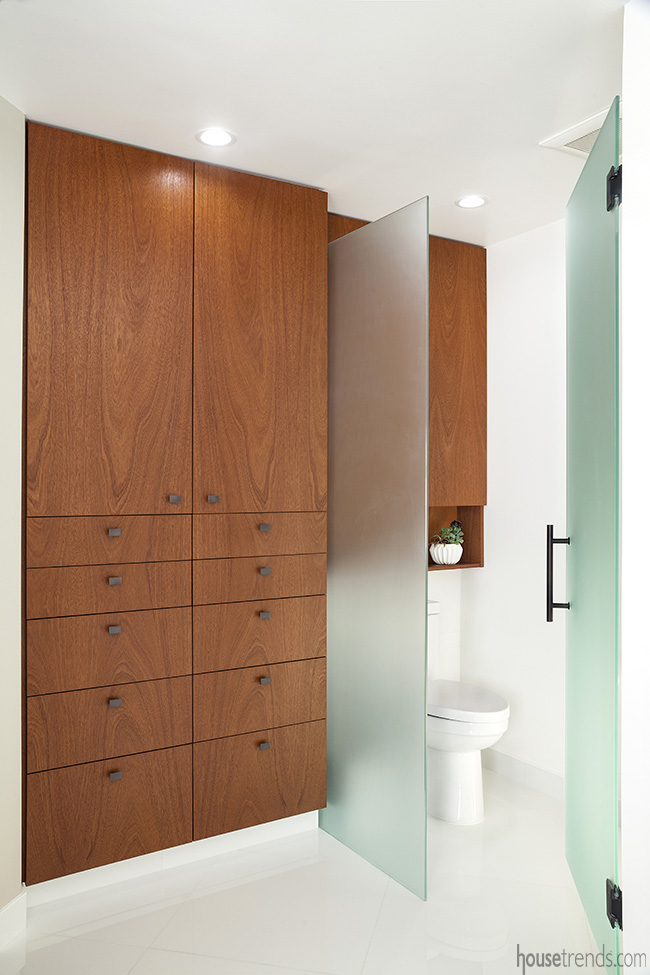
Laughridge and Haynes started with a blank canvas with large-format white porcelain tile floors and crisp white walls. “We went for everything white, but we did the wall-mounted base cabinets and linen cabinet in darker wood for contrast. Stephanie and Rob also had a preference for dark bronze plumbing fixtures,” the designers say. “We tried to keep the space as light as possible. We chose a stone that was the feature wall behind the tub and let the color be dictated by the stone.”
The stone chosen was polished Calacatta Macchia Vecchia from Custom Marble Works—a particularly stunning slab featuring rich gold and taupe veining that wowed the designers and homeowners at first glance. “Our most unique features center around the stonework,” Stephanie says. “The marble is book-matched and turned out fabulous.”
A bright and welcoming design
So did the lighting concept and space utilization. “It’s now unified in the way it opens into the master bedroom and how the light streams in,” Laughridge and Haynes say. “We did false skylights with a wooden screen fabricated to go over the top of the bathtub. It’s actually a lighted ceiling, so it’s never dark even though it’s an interior room.”
The water closet, which began as a typical separate room with a door, was eliminated, making room for larger cabinets. A frosted glass door now hides the water closet area.
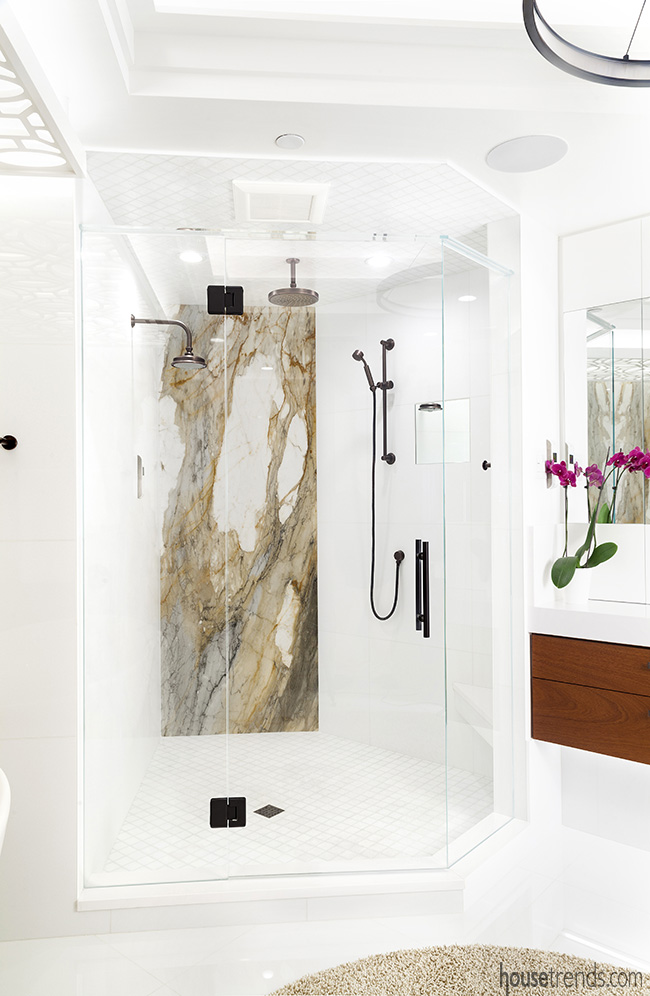
For the shower, the designers went with more glass and a frameless enclosure to make the area even more open. “We used as much usable space as we could, especially in a bathroom, where it’s tight to begin with. We just eliminated the wall separating the tub and toilet,” Laughridge and Haynes say. “It feels much larger.”
Bright selected the mahogany that was used in the cabinets. The material, he says, is recognized as a coastline wood because it is used in boat interiors. “I think some of the specialty features of this bathroom are the floating appearance of the base cabinets, the integrated lighting and the light bridge above the tub,” Bright says. “It’s always fun to collaborate with a design team like Urban Innovations. They create an original design for every project.”
An accommodating space
The completed bathroom also perfectly accommodates the needs of the owners, who both work from home and spend much of their time at the condo. A full-time residence, the condo was initially appealing because of its layout, though the original bathroom gave the homeowners “serious reservations.”
“While the unit had undergone a stunning renovation, the bathroom was original and developer-grade,” Stephanie says. “The new master bathroom design draws the exterior light and view in through the widened sliding glass entry door.”
That sliding glass pocket door was an impressive feat of construction. “To achieve a clean look for the door, the drywall had to be finished and painted inside the pocketing of the glass entry door to the bathroom,” says Zdrojewski. “The final result was certainly worth the extra effort. It was exciting to see the whole vision come together.”
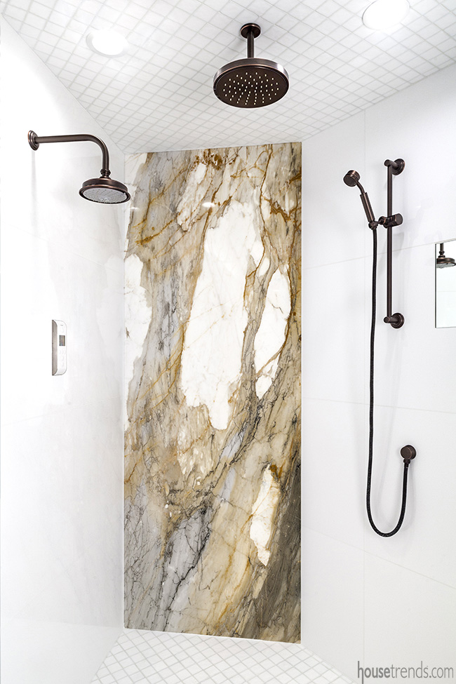
Bright’s new custom cabinets provide ample space for all of the homeowners’ necessities. The state-of-the-art electronic Kohler DTV system allows them to turn all three showerheads on and off with the touch of a button. The large vessel tub accommodates two people comfortably. “The bathroom is not overly large, but the use of clean lines and glass gives the feeling of openness and complete functionality,” says Zdrojewski.
“Giving up the natural lighting from our old unit was going to be hard. Fortunately, the designers came up with a great design that is attractive, functional and maximizes the potential of the space. Every day is a delight.” Stephanie says.
Not only does the current design dazzle the homeowners, it also regularly inspires awe from guests. “My friends and neighbors always compliment the quality craftsmanship, the marble and the cabinets, and they almost always ask for the number of the contractors,” Stephanie says. “We were so blessed to have worked with such spectacular artisans.”
Resources: Designers: Ron Haynes and Bruce Laughridge, Urban Innovations, Inc.; Contractor: Strobel Design Build; Cabinetry: Bright Wood Works; Custom area rug: Addison/Dicus & Bailey; Quartz countertops and marble slabs: Custom Marble Works; Tile installation: Artisan Tile & Stone; Plumbing fixtures: Ferguson


