Daniel and Kelly Pedersen used to live in a neighborhood where all the houses looked the same, so when they bought a ranch in Brandon in an older neighborhood where all the homes had their own distinct character, the couple decided to gut the house entirely to make it their own.
Reconfiguring the layout
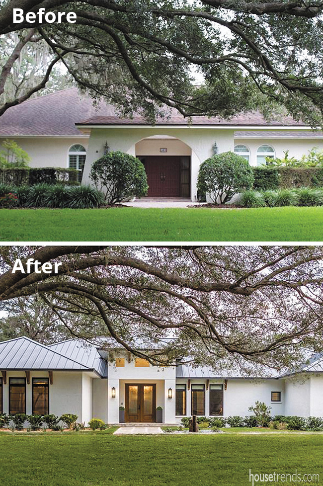
The 4,000 square-foot house, originally built in 1984, had a Mediterranean look, with arched windows, as well as a detached arch overhang at the front entrance. The extensive project took about a year, with Kelly, an interior designer herself, working alongside in-house designer Maru Martin-Moreno at Nelson Construction & Renovations in Clearwater, to create a space that was unique, reflected their personalities, and suited the family’s needs.
“We squared everything off and put on a metal roof to make it more contemporary,” says Kelly. They also removed a massive koi pond out front, painted the exterior, bought new front doors and installed a modern walkway, all of which completely changed up the exterior.
As it is compatible with contemporary styles, the couple wanted an open floor plan, which meant that the layout had to be reconfigured, something that was quite an undertaking, with old walls being knocked out and new walls being put in.
The original kitchen was moved from one side of the house to the other, while the five original bedrooms were shuffled around, several of which were transformed into other rooms. “We still have five bedrooms, but now we have an office and a playroom; these were extra spaces we didn’t have before,” Kelly says.
Another thing they did was convert the old master bedroom into a guest room with an ensuite bathroom, and create a new master bedroom, a project that added about 400 square feet to the existing footprint.
Clean and comfortable
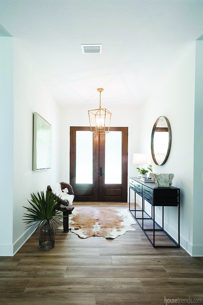
Style-wise, Kelly says she wanted a contemporary design that was nevertheless comfortable and warm. “I like bright, white, warm wood tones, but I also like to do some fun accents,” she adds. The white walls brighten up the entire home, along with the abundance of natural light filtering through the windows.
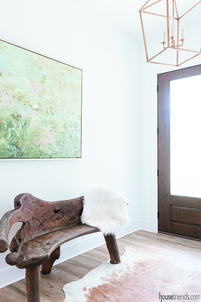
The welcoming foyer features a beloved wooden bench, which Kelly says has been with her for years, having bought it from someone selling it on the side of the road. “It has been the piece that everybody loves,” she says. She also installed wooden front doors, which is unusual in Florida because of the humidity as it can result in the wood swelling, but she has no regrets.
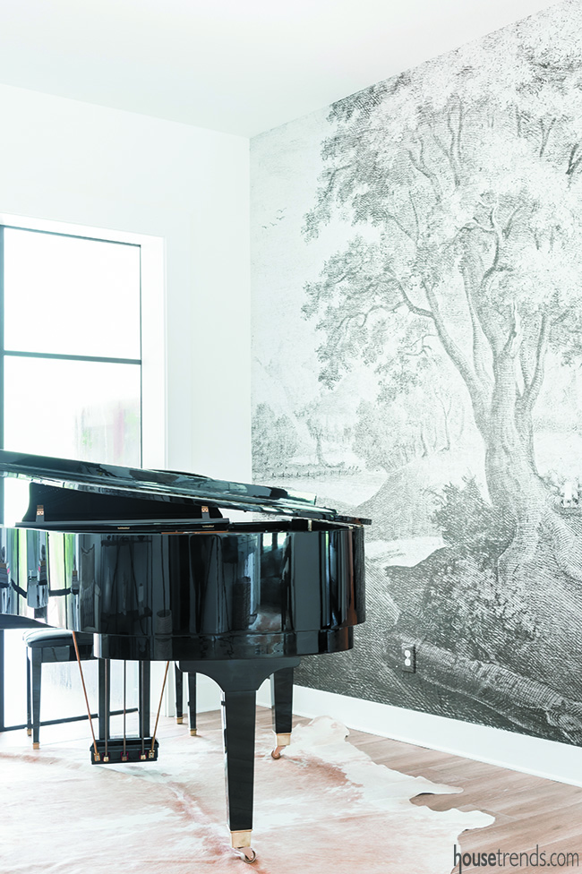
Upon walking through the front door, the grand piano is the first thing a visitor sees. A handmade mural, bought from an artist in Poland, hangs next to the piano.
Though it closely resembles hardwood, the Pedersens installed tile flooring throughout the main living areas, as the material is more suited to their family’s lifestyle, with three small children and two older dogs.
A nod to Tampa’s history
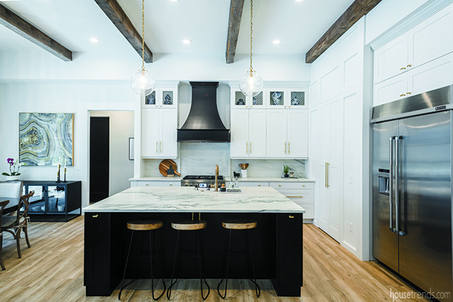
The predominantly white kitchen features a marble island with dark, gray veining throughout, which Kelly says looks like a piece of art. Another matching slab of marble was used for her perimeter countertops and backsplash. She also likes the microwave installed in the island, as well as the storage all the way around the perimeter. A hidden pantry looks like a paneled wall, and brass fixtures add a touch of warmth to the white cabinetry.
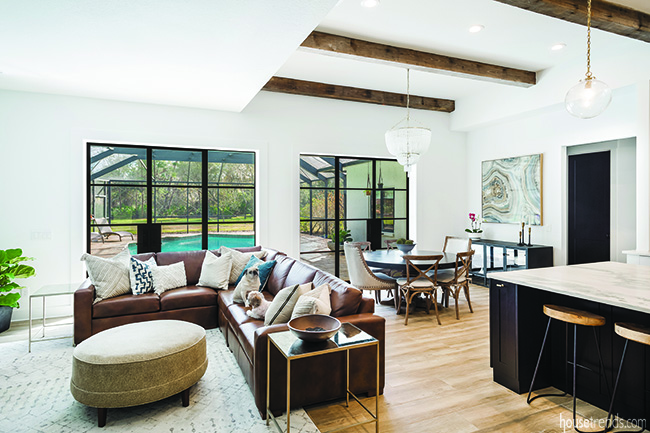
Like many modern homes, this one has an eat-in kitchen rather than a formal dining room, which works with the Pedersen family lifestyle. The casual table sits underneath a frosted beaded chandelier for an elegant touch.
But perhaps the pièce de résistance in the kitchen is the wooden beams on the ceiling, which came from the historic Biltmore Hotel near Clearwater, which contractor Greg Nelson says was the oldest wood structure in Florida, demolished several years ago. Kelly was able to hand pick the beams that she wanted and store them in her garage until they were ready to be installed. “I have a little piece of Tampa history in my home, which I love,” she says.
Installing those beams, made from extremely dense reclaimed heart pine, proved to be quite a challenge. “The hurdle was getting them installed and making sure they were safe; the beams weighed hundreds of pounds,” Nelson says, adding that it required getting some additional engineering done to support them. But it was worth the effort, Nelson says, as it’s pretty unique to have a portion of a 100-year-old building given new life in a new home.
A laundry room off the kitchen features cork flooring and also serves as a book bag station. Custom dog crates were installed underneath the counters.
Elegant features add interest
The center of the home is the living room featuring a leather sectional sofa and large framed picture windows that overlook the pool out back.
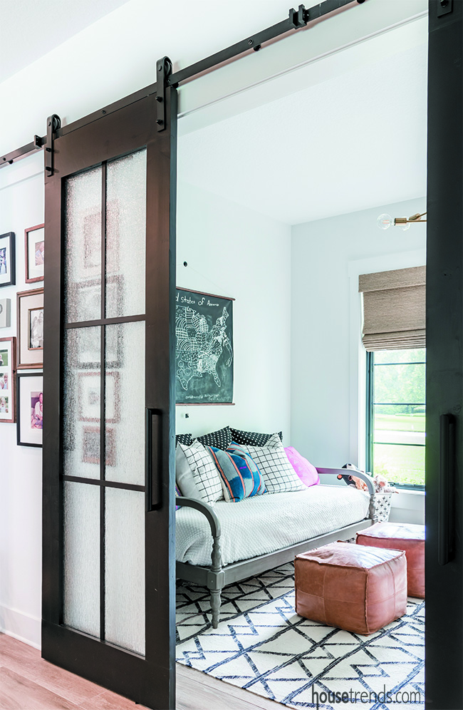
Another custom feature in the home is the barn doors that lead to the playroom, complete with a chalkboard wall and a patterned carpet. A nice bonus is that the doors can be closed when the playroom is in disarray, laughs Kelly.
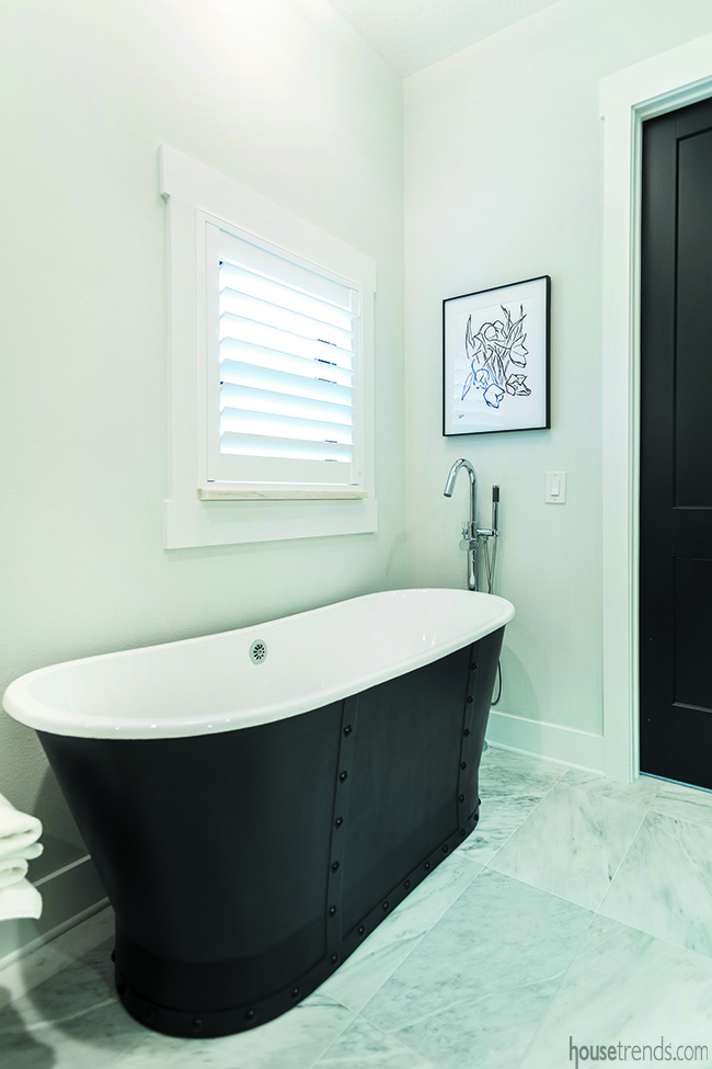
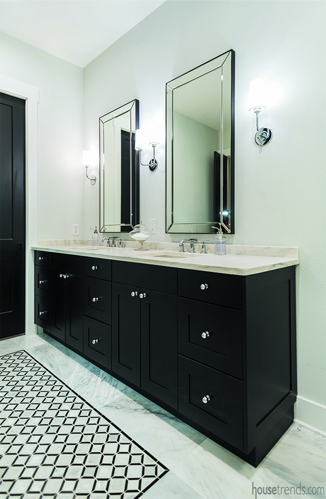
The owners also opted for black cabinets and a stand-alone black bathtub in their master bath, choosing honed marble countertops with bright, chrome fixtures to offset the darker tones.
The diamond pattern on the marble floors also adds a bit of oomph.
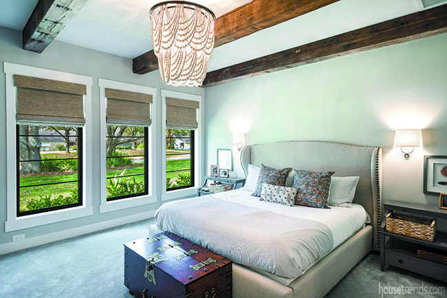
The master bedroom is bright and airy and overlooks the front yard. “I love all the natural light that comes in from those windows,” she says. Like the kitchen, the wooden beams on the ceiling are remnants of the hotel. The trunk at the base of the bed was a wedding gift from her husband when he was stationed in South Korea. A sparkly beaded chandelier over the bed is reminiscent of the chandelier over the kitchen table.
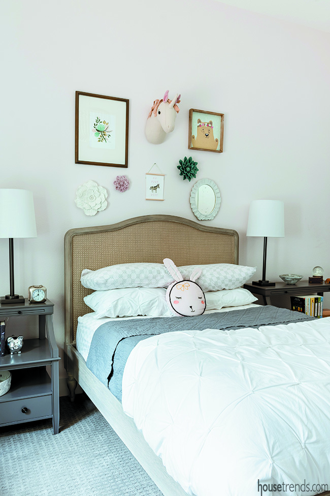
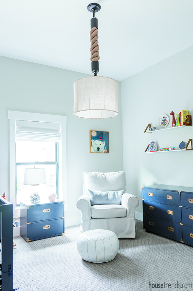
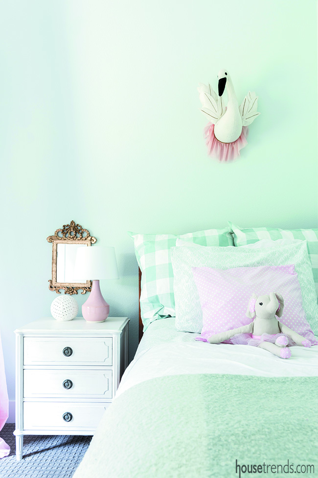
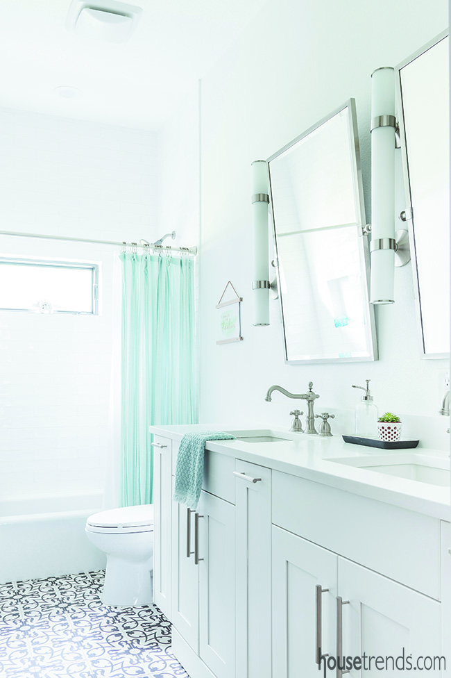
In the children’s rooms, Kelly played with color a bit, incorporating pastels and wall-to-wall carpeting to keep them cozy and warm, though she went with white for the kids’ bathroom along with cement tile in a black and white pattern.
Although the large-scale project was long and involved, Kelly says that in the end, it was a lot of fun and well worth it. “The team was great; I got along well with my foreman, which was everything. Communication is key in a project like this. You have to be on the same page and work with each other. We definitely achieved that.”
Resources: Contractor: Nelson Construction & Renovations, Inc.; Kitchen and bathroom design: Maru Martin-Moreno, Nelson Construction & Renovations, Inc.; Elements Design Co.; Interior design: 7th House Interiors; Landscape design: Meri Lawn Care & Landscaping, LLC; Lighting: Visual Comfort; Restoration Hardware; Paint: Benjamin Moore Decorator’s White; Sherwin-Williams Tricorn Black; Flooring: Cement Tile Shop; Window treatments: Budget Blinds; Windows: Pella; Doors: FireRock; Cabinetry: Bellmont Cabinet Co., supplied by Elements Design Co.; Countertops and backsplash: Montclair Danby honed marble; Sinks: Blanco; Rohl; Faucets: Delta; Kohler; Appliances: Jenn-Air; Bathtub: Signature Hardware; Hardscapes: Outdoor Impressions

