Serendipity. It’s a word for a happy accident. But what do you call a happy accident that is predicated ahead of time? Perhaps it simply comes down to fate.
Fate played a tremendous role in the journey that brought a couple to the luxurious home that commands a double lot in Upper Arlington. For years, the wife said she felt it was “supposed” to be her home, the one she would grow old in. She kept her eye on it and even knew some of the previous owners, but years passed and the home never went on the market. “I finally called our realtor with the anticipation of doing a renovation on our other house,” she explains. “He mentioned he had a double lot about to come on the market, and I just knew.”
Once the deal closed, the homeowner was not going to leave anything to chance. She was well aware that the home, built in 1930, needed a major overhaul, so she took her time, honing and sketching her vision of what the home could be, paying special attention to symmetry and balance. She pulled in Charlie Griffey from Griffey Remodeling to assist.
A sensitive shift
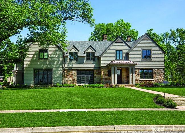
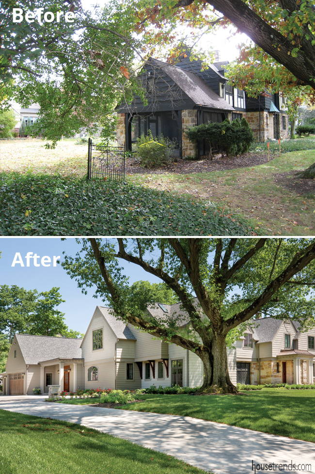
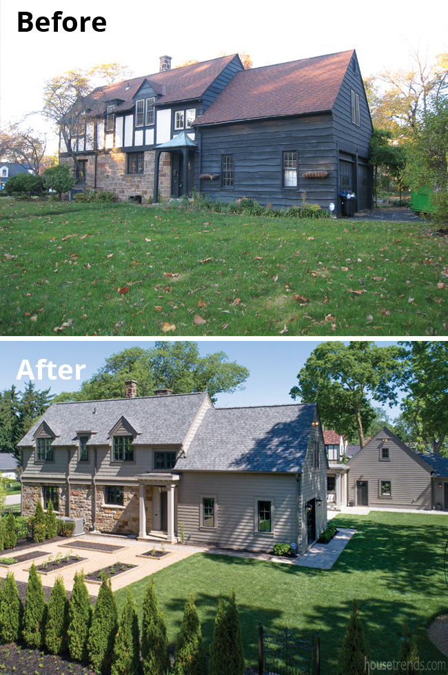
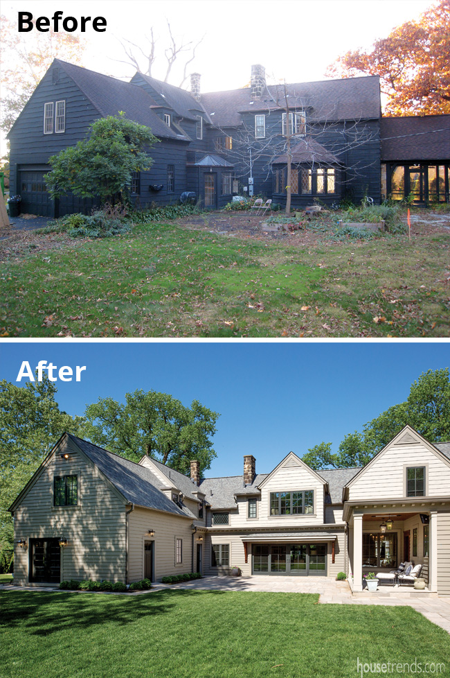
The double lot, appealing because it provided the potential to expand, came with its own unique set of challenges. The driveway needed to shift sideways and all of the main aspects of the home needed to flip to the opposite side. Griffey’s company gutted and reconfigured the entire property but, as he explains, “The homeowner and I both wanted to be sensitive in terms of repurposing and salvaging.” As examples, they removed a screened porch flanked by prominent stone pillars, chipping away stone by stone in order to reuse hundreds of the stone pieces later. The homeowner also salvaged and restored the charming diamond-grid window on the front of the home.
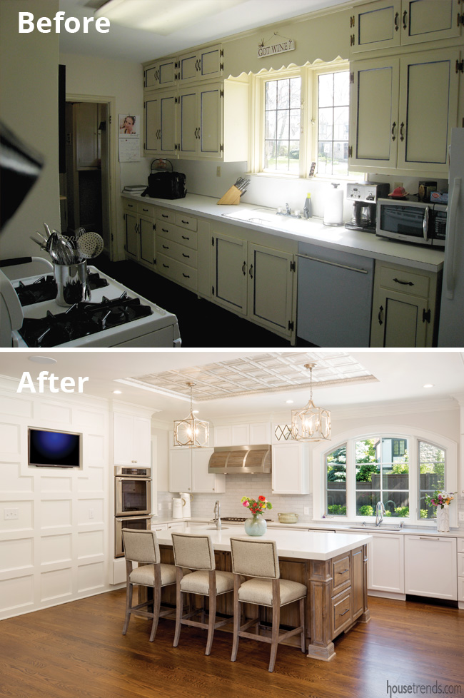
Not only that, she replicated the window’s crisscross pattern for the kitchen cabinetry, office and first floor staircase. “I don’t like going into homes where you know it’s an old house with a new addition. I wanted it all to go together,” she explains.
Attention to detail was the name of the game, particularly in terms of the exterior. An Indiana quarry is the source for the spectacular stone on the front, lightening what was originally a dark Tudor look. The stone walkway leading to the front door is from a Canadian quarry, and there is still a different variation of stone on the side and back patio, but all of the colors and hues mesh.
A brighter future
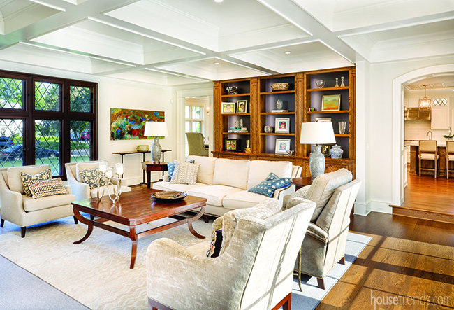
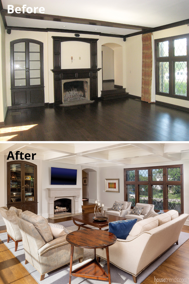
On the interior, sunlight and warmth filter through windows into the formerly dark great room. The homeowners salvaged the dramatic built-in but extended the space, creating a new, arched doorway. They added a custom limestone fireplace, with a design the homeowner had sketched on a slip of paper and which was no easy feat since the 1,500+ pounds of limestone required extra support in the floor. Meanwhile, a large piece of steel rests inside one of the beams of the room’s coffered ceiling, dictating both the depth of the ceiling and the size of its panels. “It explains why the coffered ceiling is that deep. This room could handle it, though, because of the tall ceilings,” says Griffey.
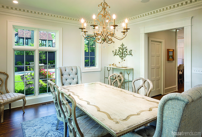
The dining room has countless distinctive features, not the least of which is the custom-made dentil molding that exemplifies the epitome of craftsmanship, rounding each corner in perfect symmetry. Each piece was installed individually, with no visible fasteners. The room’s medallion-patterned carpet gives it a royal feeling, and interior designer Joanie Johnson found the Italian dining room table, Bernhardt chairs, and the exquisite Currey chandelier.
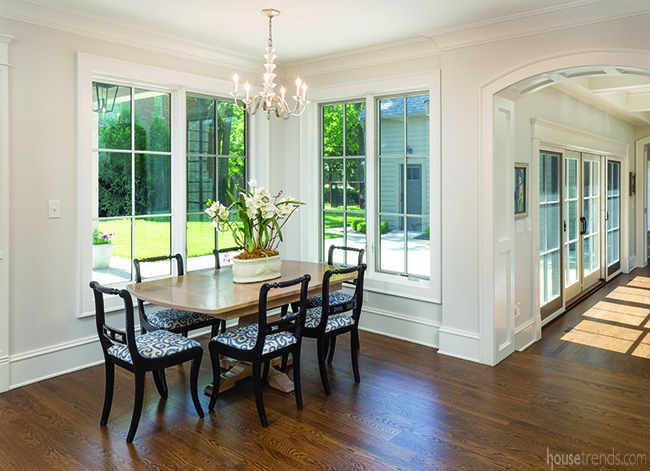
Moving into the light and airy kitchen, which the homeowner calls her favorite room, there are more custom details, from the heft of the baseboard, so chosen to match the strength of the paneling, to the wood grain of the flooring that blends with the floors of the living room. She was able to put her creative juices to work in here, scouring through design photos until she found a hood she favored and could use as the basis for the custom hood she had made. For his part, Griffey suggested lowering the entire ceiling in order to create the recessed, tin look. All of the tin squares are perfectly symmetrical. “I think it’s awesome,” says the homeowner. “It was pretty gutsy but I absolutely love it.”
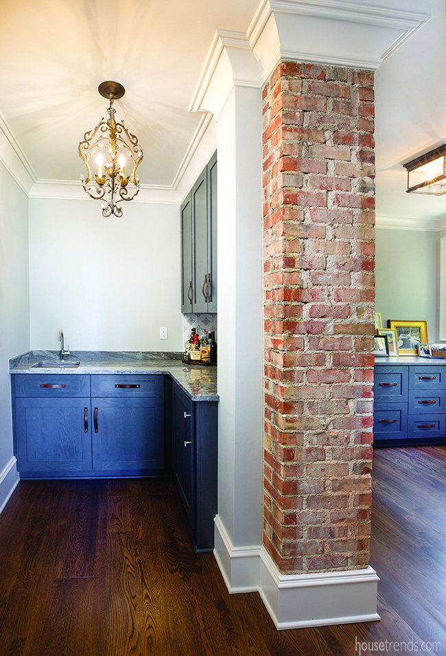
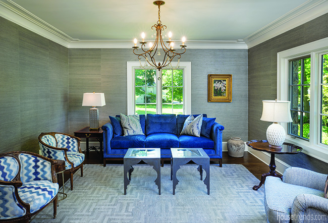
The crown molding continues to the living room in order to add a formal edge to the room and to maintain the home’s clean lines. The blue hues of this room show up again in a nearby space containing a wet bar and brick chimney. ”
“The brick exposure was a bonus,” explains Griffey. “We were able to salvage bricks from the rear foundation, and you can’t even tell it was patched.
Raising the bar
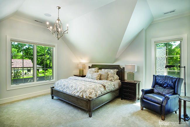
Both the homeowner and Griffey agree that the master bedroom was the most challenging space to renovate due to the steep pitches of the roof. But they were successful, raising the room’s ceiling within the interior yet maintaining the original visual lines on the exterior. The end result is a serene and gracious retreat with lots of wall space for artwork.
Ultimately, says the homeowner, “The house needed love; it didn’t have any. Also, I wanted to make a home my kids would want to come back to.”
As serendipity—and fate—would have it, she did.
Resources: Contractor Griffey Remodeling; Interior designer Joanie Johnson; Cabinetry Dan Johnson; Countertops Modlich Stoneworks; Tile Hamilton Parker; Fixtures and appliances Ferguson; Windows and doors Pella; Garage doors Garage Door Masters; Lumber 5th Ave. Lumber; Landscaping Sue Jacobs Grant, Jacobs Grant Design LTD

