Written by: Amy Howell Hirt/Photos by Mike Kaskel (except where noted)
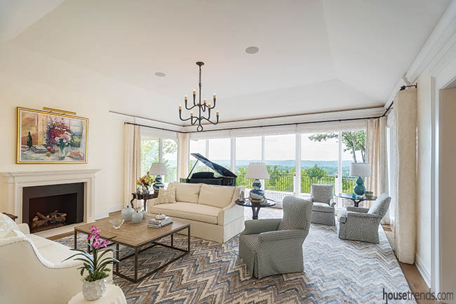
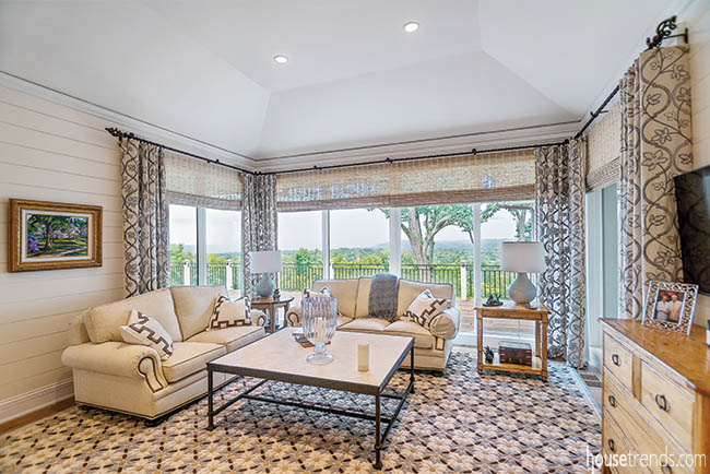
The view from this Indian Hill home is the type that stops you in your tracks—literally. A jogger recently detoured into the back yard just to take it in. Sweeping over a hillside and stretching to Northern Kentucky, it’s the type of view that people, including its current owners, remember and covet.
“Years ago, I sat on a friend’s back porch next door and watched the sun set and said, ‘If they ever sell that house, will you let me know?’” she says. Just a year before the property came on the market, she followed up with a letter to the owner, expressing her interest. She likely wasn’t the only one.
“After we bought it, people would come up to me at parties and say, ‘You got my house!’” she says.
Although the home’s 1970s California contemporary style and sprawling ranch layout didn’t fit the couple’s tastes, they saw the scenic setting as an opportunity to embrace a fresh view. They no longer needed the pool, multiple bedrooms or maintenance of the two-story home where they raised their children. So from the studs up, this design would cater to a casual lifestyle, rather than a busy family.
Starting in the kitchen, the fully renovated home now focuses on curated views, offering features that make it easy to entertain—and look good doing it.
Cooking up a casual flow
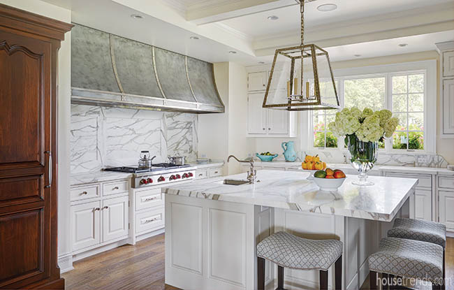
The kitchen is the center of the universe in today’s laid-back lifestyle, and this home’s floor plan extends its influence. Kitchen designer Kimball Derrick, CKD and interior designer Douglas Greiwe worked with Architects Plus and Joe Stewart Builders to expand its footprint.
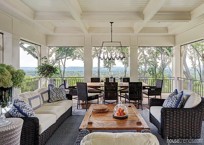
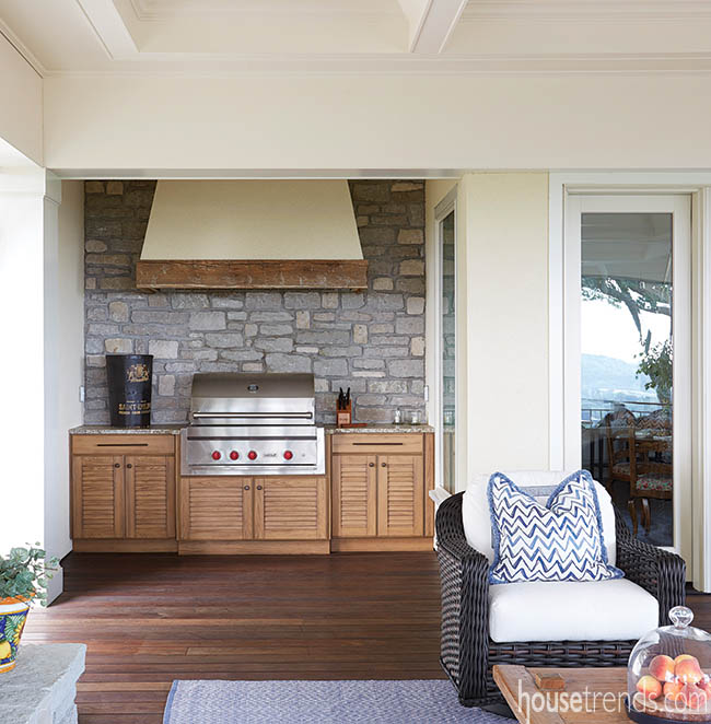
The revised plan allows for a larger, crowd-friendly island and connects the space to a new covered porch. So the party can roll effortlessly outdoors, the porch is smartly outfitted with a grill, expansive dining table and remote-controlled Phantom screens.
“There’s a really nice breeze that comes up the hill, and when we put the screens down, we can leave the doors open,” the homeowner says. “It flows very nice and we can have people sitting out there as well,” she says.
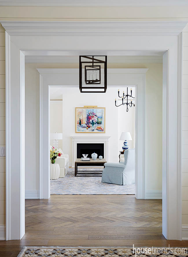
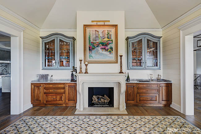
While the floor plan isn’t completely open, wide doorways promote a traffic pattern that entices guests to the adjoining family room, living room and dining room. But Greiwe admits he has another trick for luring them beyond the kitchen: a wet bar in the family room.
“It forces people to move to other parts of the house,” he says.
Kitchen conveniences
The couple has found, however, that it’s not so bad to have people milling about the kitchen—especially when you can put them to work. Cooking isn’t exactly their chosen way to unwind, so in this kitchen, convenience comes first.
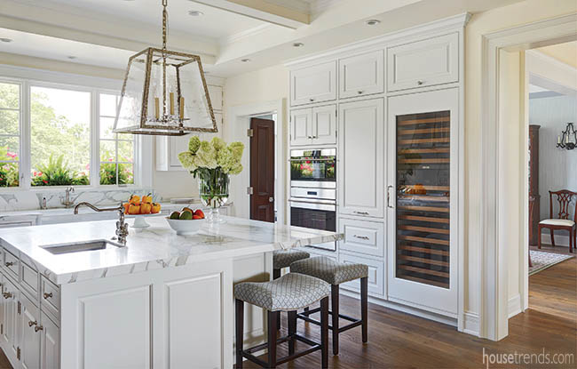
A built-in wine cooler—more convenient than the downstairs wine cellar they considered building—keeps favorite selections in easy reach, while a pull-out pantry cabinet provides quick access to items stored in the front or back.
There are two sink stations, each with a disposal, and a Wolf steam oven—one of those nearly foolproof professional-grade appliances that allow even amateurs to perfectly roast, bake and broil.
“I tell people these Wolf cooking products will make you a better cook,” Derrick says.
With features like these, even meal prep becomes an enjoyable affair.
“Thanksgiving was the big test. We had one person on the side of the island with the range, and another person on the other side, and someone working at the end. I delegated different tasks and it was so much fun to be all together working. It was a great family experience,” the homeowner says.
Masters of illusion
While capitalizing on the home’s dramatic panorama was the number one priority, the designers also considered how interior spaces would be viewed from every angle, and curated picture-perfect compositions.
As a result, many of the kitchen’s handy appliances are hiding in plain sight—concealed or carefully positioned. Sub-Zero freezer drawers are tucked behind cabinet fronts while the island discreetly houses an ice maker, facing the range, and a microwave drawer, facing the main sink on the kitchen’s back wall.
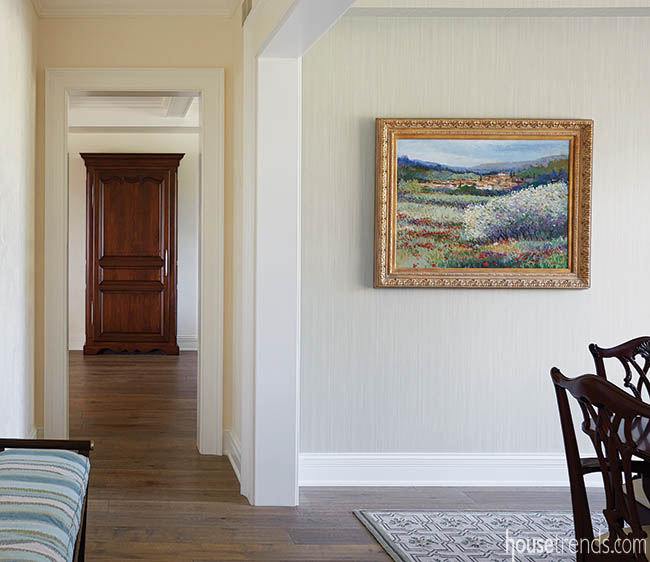
But the home’s refrigerator proves the most difficult to detect. Derrick recessed the back half of the appliance into the wall then encased the front inside a custom-made wood armoire that extends about 15 inches into the kitchen. With French hinges and hardware and a base with disguised ventilation, it mimics a freestanding furniture piece, so Derrick and Greiwe positioned it to serve as a pleasing focal point from the hallway.
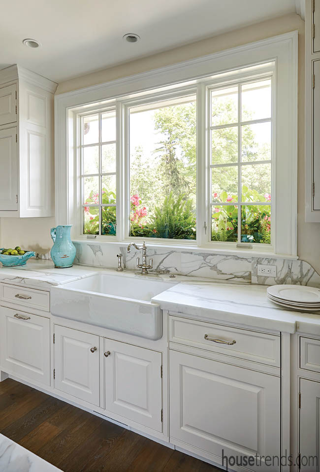
To produce the kitchen’s traditional-yet-fresh feel, Derrick applied his artful skills to more than just appliances. The expansive custom hood looks like zinc with stainless accents, but it’s actually aluminum, hand-brushed by Derrick for an antique appearance. And because thick slabs of Calacatta marble are extremely difficult to find, he improvised by placing 2-centimeter-thick spans of the material on top of a wood substrate. The fabricator mitered the top to wrap around the edge of the countertop so the veining continues unbroken—producing the luxe look of 2-inch-thick marble.
Despite this indoor eye candy, gatherings large and small inevitably find their way out onto the porch, where guests are struck with the same awe that captured these homeowners all those years ago.
“It has to be one of the top outdoor tables in the city,” Derrick says. “To have dinner there is incredible. You’re right at the edge of this unbelievable vista.”
Resources: Architect: Architects Plus; Contractor: Joe Stewart Builders; Kitchen design: Kimball Derrick, CKD; Interior design: Douglas Greiwe, Greiwe Interiors; Kitchen cabinetry: Custom Benchmade; Kitchen countertops: Calacatta Borghini honed marble; Countertop fabrication: Stone Statements; Kitchen sinks and faucets: Rohl; Appliances: Hagedorn; Range hood: Designed by Kimball Derrick, CKD, fabricated by Metalcraft; Bathroom cabinetry: Custom Benchmade; Bathroom countertops: Blue Diamond marble; Flooring: Mansion Hill; Outdoor grill and ventilation: Wolf; Outdoor grill countertop: leathered granite

