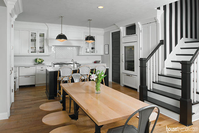
Beauty can often be equated with simplicity, and such is the case with Gena and Casey’s black and white kitchen. It is remarkable how the blending of these two rudimentary colors can spawn a one-of-a-kind and brilliant room. Their use of the black-white duo culminated in a dramatic feast for the eyes. With a passion for the checkered patterns of MacKenzie-Childs kitchenware, the couple strategically integrated some of their favorite pieces around the space, adding whimsy to the kitchen design. “I’ve always been a black and white person,” says Gena. “I love black, wear black, and always knew that I wanted a black and white house one day.”
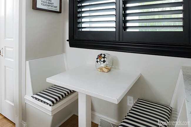
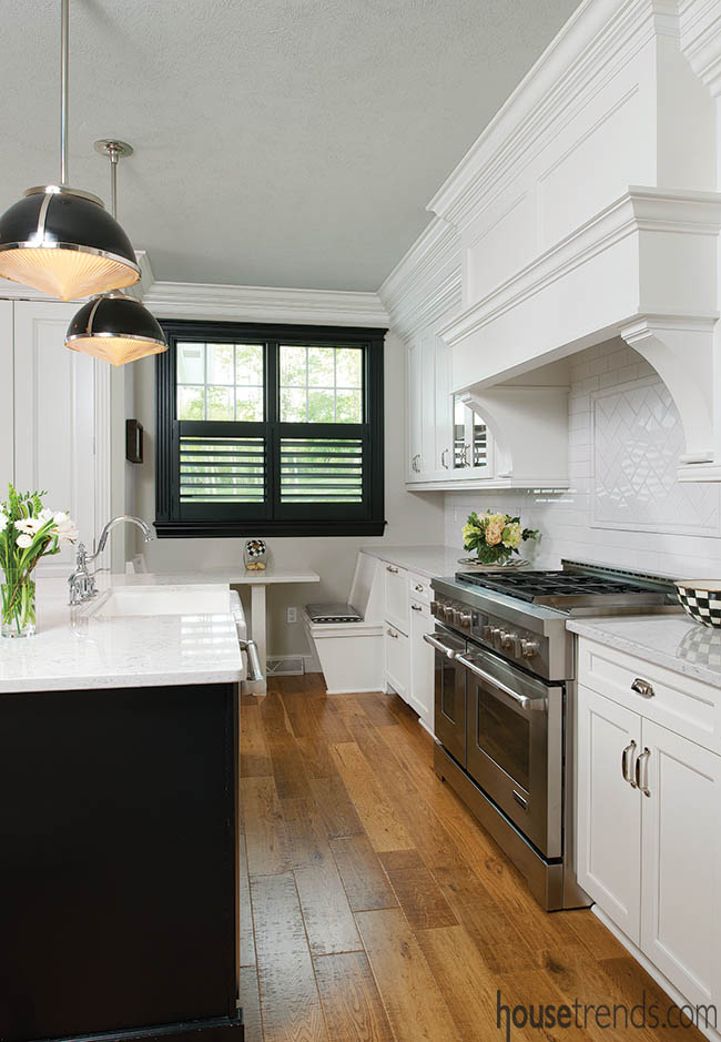
The couple brought in contractor Mark T. Heinauer, president of Barrington Homes Inc., to spearhead and oversee the project. “One of the most challenging aspects of this project was trying to incorporate the many unique ideas and features that Casey and Gena wanted,” points out Heinauer. “The restaurant style bench-seat under the window was included with the kids in mind and really adds a warm and homey touch.”
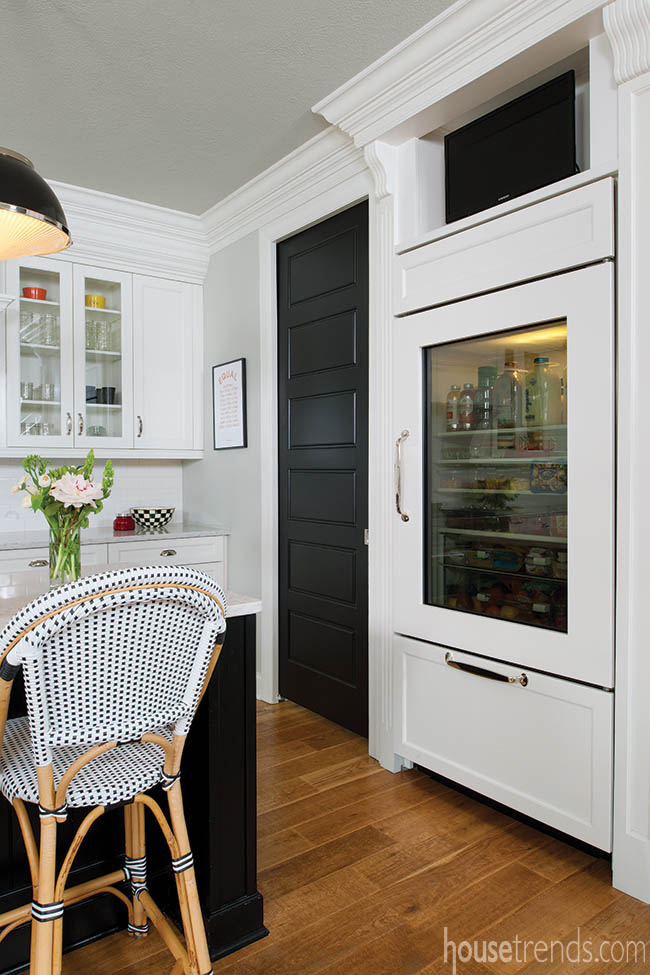
Booth seating complements the space, giving it a vintage and charming vibe, and is a hangout spot for the kids. Looking like two additional cabinets, a refrigerator drawer, and a freezer drawer are stacked and were strategically installed next to the booth. The owner’s kids and their friends are able to grab a smoothie and straw, and then slide right into the booth to sip and socialize.
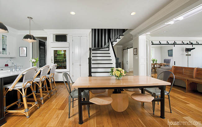
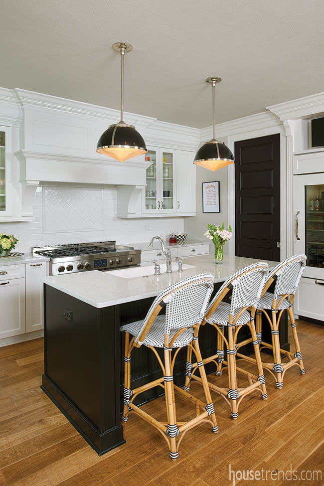
Initially, the couple had some difficulty finding a kitchen table that would suit their needs. “Basically, the area was smaller than expected, so we were having a hard time finding a table that would be substantial enough to suit the area,” points out Gena. After searching through some vintage cafeteria-style tables, the couple landed in the Strip District to have a table custom made. To maximize seating, the table was designed with swivel seats. Two additional seats were added in the middle that can pop out when needed, or stay hidden and tucked underneath when not in use. Three woven wicker chairs line up under the island and add as much charm as they do function. “I’m pretty religious about keeping things off of the counter, so having a sink in the island makes it easy to get the dishes clean and put where they belong.”
A see-through refrigerator door adds a bit of wow factor in the kitchen, while exposing all of the goods inside. “When we first got it, I found myself buying a lot of fancy bottles, like almond milk and specialty items,” tells the owner. “I’ve since found that I really don’t have to do that anymore and just take a few extra minutes each day to keep things looking somewhat orderly.” A dim nightlight is always on and glows through the glass door, making all of the goods look inviting.
Keeping in beat with the simple color scheme, all overhead lighting is black, juxtaposed with white. “I just felt that it would all mesh with the rest of our house.”
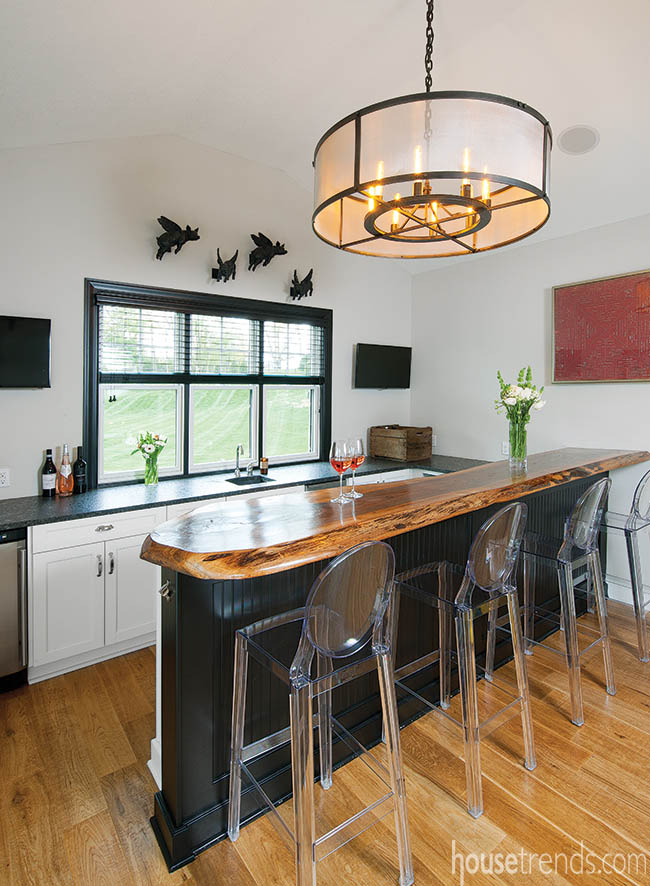
Connected to the kitchen is a bar area with an oversized wood slab that was custom designed for the space. “We met Burt Duerring when we were at the home show, and ended up going to his house to select a slab of wood for the countertop,” says Gena. “He had them everywhere and after we picked one, he worked on it to fit perfectly in the designated spot.”
Mostly used when entertaining guests, the coffee bar was moved there for convenience, and Lucite chairs allow this unique bar to be unhindered. “Working with Gena and Casey was wonderful,” says Heinauer. “Gena’s vision made it much easier to move forward with the building process and selections because she knew from the start what she wanted.”
With everything being open on the first floor, each room spills into the next. The rooms are separate, yet are united through the use of color, design, and an overall clean and sparkling appearance.
The black and white kitchen is a classic that will never go out of style, but designing one isn’t as easy as just buying everything in these two colors and putting it all together in one room. In the case of Gena and Casey’s monochromatic kitchen makeover, it’s all in the strategic detail. They delicately mixed vintage with glamour, and sophistication with simplicity. Finishing off their room with the enchanting patterns of MacKenzie-Childs accessories, makes for a playful and happy room.
Resources: Builder: Mark Heinauer, Barrington Homes, Inc.; Wall paint: PPG Paint; Flooring and backsplash: ProSource; Wall treatments: Nest Expressions; Windows and doors: Proline, Pella; Fireplace: Superior, Masco Contracting; Cabinetry: Kitchen Craft Cabinetry, MasterBrand Cabinets; Countertops: Silestone, Premier Granite; Sink: Kohler, Splash/Nicklas Supply; Faucet: Moen, Splash/Nicklas Supply; Appliances: Jenn-Air Dishwasher, cooktop and oven, Bridgeville Appliance; Refrigerator: Sub-Zero, Hillmon Appliance; Dining table: Bruce Berman, I Design; Bar countertop: Burt Duerring

