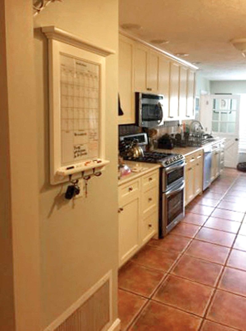
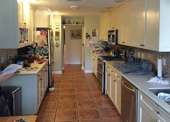
Gina and Mike White moved in to their 1960 split-ranch St. Petersburg home in 2000. They renovated the kitchen at that time, but fast forward 18 years and the galley kitchen started to fall apart. Plus, it was dark and narrow with limited storage space—not functional for a family that loves to cook and entertain. “Mike makes a hot breakfast for our teenage children each morning,” says Gina. “A new kitchen would make it easier to work in, while the kids would have a nice, bright space in which to eat.”
An inviting new layout
With the help of kitchen designer Brooke Eversoll, CMKBD, owner of Bee Studios, Inc. in St. Petersburg, and Erin Lindsey, co-owner of Lindross Remodeling in Oldsmar, the new kitchen is a bright functional space with classic details and unique rustic elements.
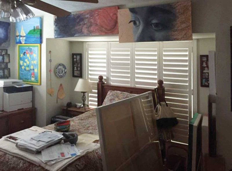
The designer captured almost 200 square feet of additional space by taking over a guest bedroom off the end of the kitchen, which Gina had been using as her art studio. The new kitchen measures a spacious 417 square feet, large enough to accommodate a crowd.
Taking over the guest bedroom gave the former galley kitchen a unique L-shape. Fortunately, reconfiguring the mechanicals of the space wasn’t too much of a challenge; the home rests on a crawl space, so there was no problem with readjusting plumbing or wiring.
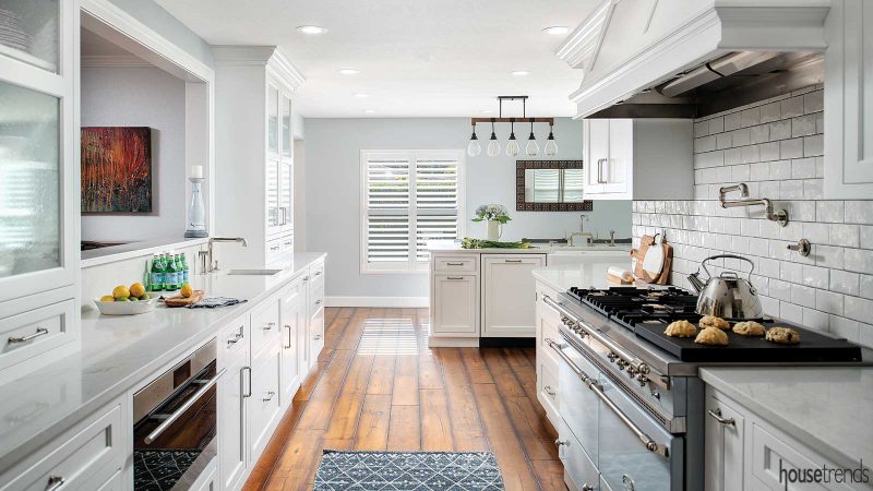
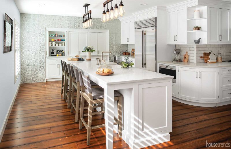
Once the Whites conveyed their wish list and requirements for the new space, the designer had free reign to create a workable layout for the many appliances. “Because the kitchen is so large and the room has a unique layout, I focused on creating different zones to meet the overarching design goal,” says Eversoll. These include a cooking zone; a clean-up zone that contains the dishwashers, large farmhouse sink, trash and recycling bins; a bar zone at the smaller sink and an icemaker; a desk area; and a pantry and coffee zone in the back corner.
The flow of the space is significantly improved now and the kitchen is no longer closed off, but is connected with the rest of the home. “The overall feeling of the kitchen is so cohesive. You’d never know it had been two separate rooms,” says Gina.
A merger of aesthetics
The next hurdle was to compromise on a design style. “My husband is very conservative with colors,” says Gina. “And I do like a little more pop of color here and there.” Specifically, Mike was aiming for an all-white kitchen, as he wanted a classic yet modern look, while Gina, an artist, likes the more rustic elements.
Eversoll says that pure white kitchens can feel cold or sterile without the right balance of materials or textures. On the contrary, the Whites were seeking a warm space, which they achieved with the classic elements, rustic undertones and simple touches.
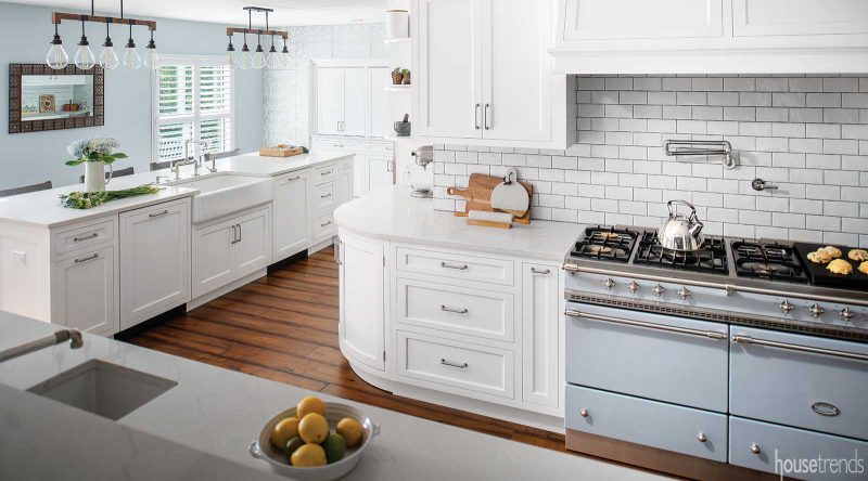
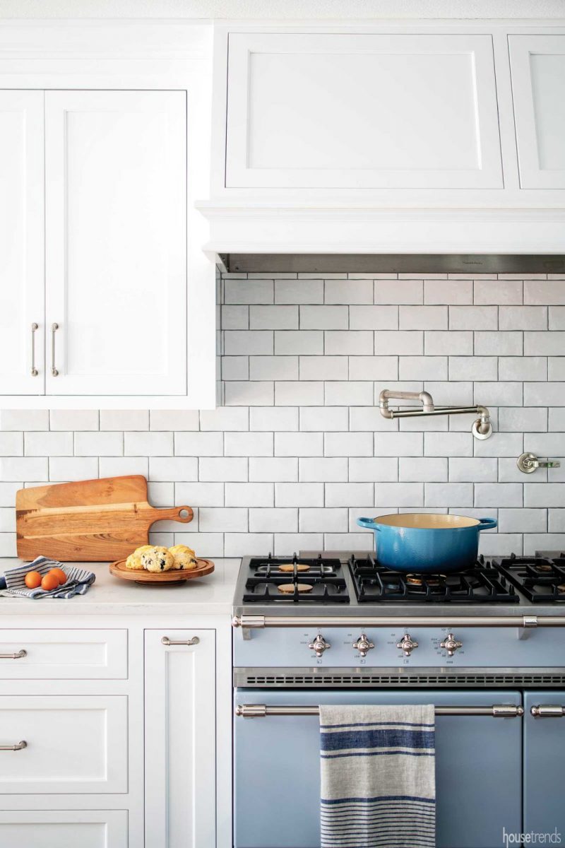
The couple agreed on white inset style cabinetry and a soft white quartz for their countertops, but the distressed oak flooring was Mike’s idea. In fact, Eversoll says they ended up replacing the remaining floors in the house to match the new kitchen floors. The backsplash subway tile is also a soft white, however it incorporates a crackle texture to provide some softness and dimension.
Other small items also fused the couple’s opposing styles. The Watermark plumbing fixtures resemble pipes, adding an industrial look to the space, as does the pair of Hinkley chandeliers positioned over the island. The couple chose a polished nickel finish for the faucets, as well as for all of the other knobs and pulls. The industrial iron look of the light fixtures ties everything together by complementing the brown hue of the hardwood flooring.
Adding in color and texture
In general, ranges are not known for being colorful, but the luxurious double Lacanche gas range, specially ordered from France, is the showstopper. The Whites custom-designed the range, choosing everything from the smoky blue-gray color to how the cooktops function to the size of the burners. The range has a charmingly retro look, but is as modern as it gets. “It’s the piece in the kitchen that you can’t help but stare at,” says Lindsey.
Indeed, the appliance now serves as the focal point when looking into the kitchen from the pass-through, a new feature that connects the whole house, as it looks out into the TV room. This was a primary design feature, and Gina credits Eversoll with the idea and calls the pass-through “a total game changer.”
Gina says that they used the oven color as the jumping off point for painting the whole downstairs a soft gray color.
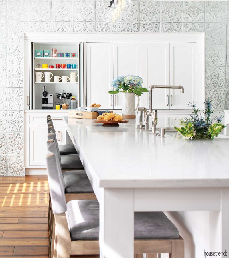
Rounding out the space is the tin patterned wall at the end of the kitchen, which offers a funky backdrop for the coffee bar. The eclectic pattern brings visual interest to the area, while the coffee bar contains doors that pocket into the cabinetry. The doors can be left open when the couple is entertaining or closed for a tidy kitchen.
Finishing touches
Besides the luxury range and coffee bar, the new kitchen has a Wolf steam oven, two Miele dishwashers, a Sub-Zero French door built-in fridge, two sinks, an icemaker, a warming drawer, and a microwave drawer. Eversoll says that they installed the built-in appliances in a flush inset application, so that they are set into the frame of the cabinetry creating a flush look. She adds that it is a “beautiful detail that gives an elevated design element,” one that can be achieved with luxury appliances.
Another touch that makes this a versatile kitchen is a docking drawer—an interior charging station for the family’s electronic devices, something that Lindsey says is becoming more in demand.
“I wanted it to be unique, not just a cookie cutter thing you can find in a showroom. We picked little details here and there, nothing over the top, just a couple of things to set it off,” says Gina. “This is a happy place; you just feel happy when you’re in it.”
RESOURCES Contractor Lindross Remodeling; Kitchen designer Brooke Eversoll, CMKBD, Bee Studios, Inc.; Lighting Hinkley, Ferguson; Wall treatment American Tin Ceilings; Paint Sherwin-Williams; Bar stools Restoration Hardware; Flooring Johnson Hardwood, ProSource of Tampa; Window treatments Universal Window Coverings, Designs by Amy K. Butts; Doors Masonite, Capital Millwork; Cabinetry Plain & Fancy, Lindross Remodeling; Countertops Corian Quartz, Clear Cut Marble & Granite; Backsplash Casale Design Source; Sinks and faucets Kohler; Rohl; Watermark, Ferguson; Hardware Atlas Homewares, Lindross Remodeling; Range Lacanche, Art Culinaire; Appliances Miele dishwasher; Sub-Zero refrigerator and ice maker; Wolf steam oven, warming drawer and microwave drawer; Vent-A-Hood range hood, supplied by Ferguson; Accessories Home Goods
Article appeared in Housetrends Tampa Bay – March/April 2019
To see another kitchen renovation with fun details check out Family-friendly kitchen remodel
