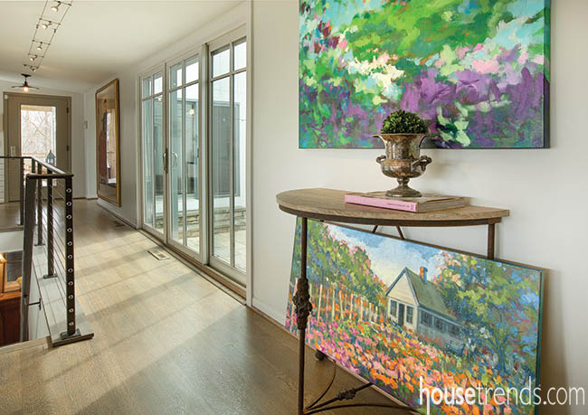
Vibrant color and bold brush strokes characterize the landscape paintings of Westerville artist Laurie Clements. In contrast are the soft gray and cool wood tones she and her husband chose for the finishes in the renovation of their open concept kitchen and great room. But the nature-inspired, neutral palette is more than just a perfect backdrop for Laurie’s colorful artwork that punctuates the space with pops of color and motion.
“Nothing can compete with the outdoors—my first love—and so I wanted the interior of our home to be in harmony with the beautiful views all around us,” Laurie explains.
When she and her husband Tom moved into the late 1960s-era home that overlooks the 18th fairway of the The Lakes Golf & Country Club, they were delighted with their location, but immediately saw the need to remove a wall between the then galley-style kitchen and great room.
The couple called on The Cleary Company, which had renovated the living area in the 1990s for the former owner. In addition to removing the view-obstructing wall, Cleary replaced a stairway enclosure, which had created a dark walkway between the two spaces, with an iron-topped, cable-rail bannister to further enhance the light, open feel of the area.
“Vantage points for enjoying sightlines to the golf course are available throughout the space now—it doesn’t matter where you’re standing or sitting, the views of trees, grasses and sky are so harmonious and soothing,” Laurie notes.
Interior designer Laura Watson, ASID, a universal design certified professional who manages Cleary’s design department, says the Clements rank among her easiest-to-work-with clients.
“With Laurie’s design background and creative talent, she had a vision for exactly what she wanted. It was so enjoyable brainstorming with her, providing confirmation of her ideas and helping to pull it all together,” Watson notes.
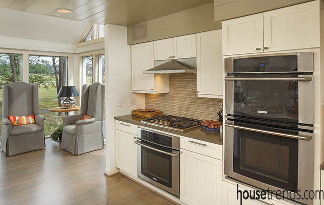
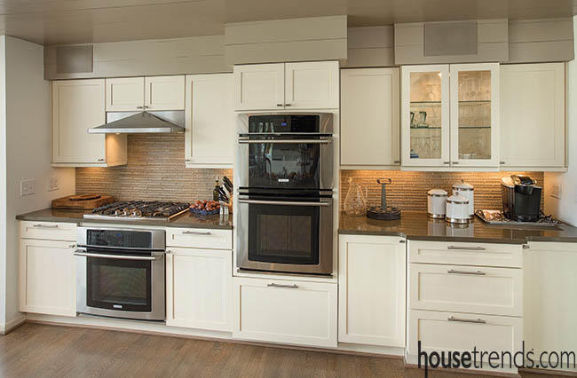
“Among Laurie’s unorthodox ideas was to refinish all the hardwood floors in a Gingrich gray stain with a matte finish. Columbus is a fairly traditional town where most floors are finished with a gloss,” she explains. “But these really work, especially with the flat, white-painted walls and matte overcoat on both the new Shaker-style cabinets and well as repurposed existing cabinets.”
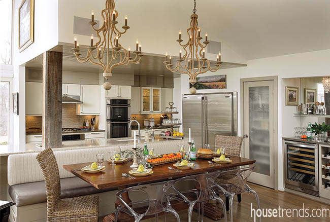
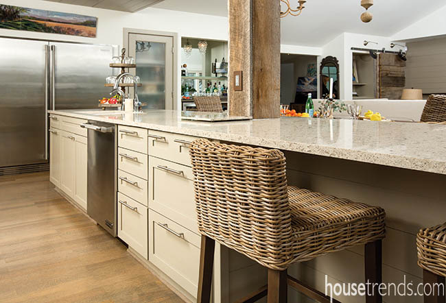
A new backsplash of Sonoma Tilemakers’ Tantrum Duo nicely complements both the cabinetry and the Cambria Windemere countertop. For the custom island – fitted with deep drawers for extra storage—Silestone Grey Amazon adds to the natural, in-harmony-with-nature design aesthetic.
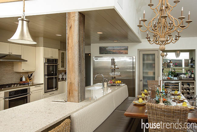
“Functionality is also important to me, because when we entertain, it’s usually buffet style, so I love the extra length of the island,” Laurie says. “Our grown children often bring friends to gatherings so it was important to have enough seating—the banquette is the perfect solution, as it’s flexible enough to seem intimate when it’s just the two of us. But one Thanksgiving, we brought in another table and extra chairs, and hosted a sit-down dinner for 16 with room to spare.”
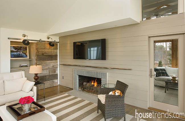
There’s even space for the the family pooch, Lucy, to curl up in her favorite chair by the fireplace.
The overall sense of serenity one finds in entering the Clements’ beautiful home is enhanced by the lack of clutter. In the kitchen area, the large, double-door Electrolux freezer/refrigerator is kept free of notes and photos.
In the living area, a single barn door replaces louvered bi-fold doors whose eight panels covered two shallow closets. The barn door, when slid over the left-hand opening, reveals a wall of entertainment electronics while allowing ease-of-access. When open, the left-hand space—with shelves removed and one of Laurie’s beautiful paintings hung—fools the eye by suggesting another room.
“Remodeling is a process of problem-solving,” Laurie says. “I have enjoyed this entire project and working with Laura has been delightful. We love our new space and enjoy sharing with our family and friends.”

